Photography: Sara Zanoni / Walter Schupfer Management project photography. Images belong to their respective owners.
SIMIHAZE BEAUTY

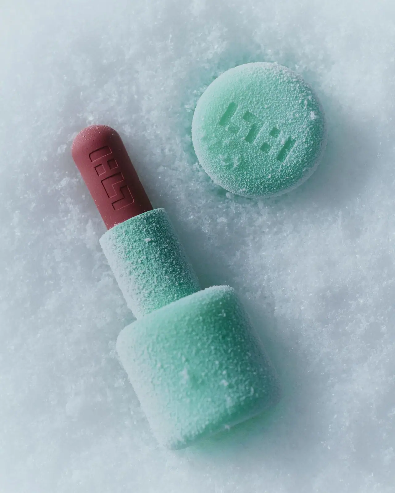
Mint sculptural casing with identity pressed into the surface
The selected Velvet Blur image makes identity tactile: a recessed geometric symbol appears both on the separate mint cap and along the mauve lipstick bullet. A broad rounded base steps into a narrower sleeve, while the product ends in a soft dome instead of an angled point. Ordinary printed product copy is not legible in this view. White snow-like granules cover the case and surrounding surface, so the photograph's grain should not be mistaken for the package's permanent finish. This study follows that specific open-product composition and keeps the photographed shade and exact component materials unverified.
- Make-up
- Light pack
- Playful colour
About this study
The approved Sara Zanoni/WSM image of an open mint Velvet Blur case, detached cap and mauve bullet. Exact shade, size and photography date are not established; other mini or limited-edition cases are excluded.
Sources & evidence · Reviewed 2026-10-19Color Palette
Approximate colours interpreted from photography. These are screen references, not official brand colours or print specifications.
Pack body
Cool mint case
#8BC5B8
Approximate mint visible beneath the white granular styling. The body and detached cap share this colour; lighting and surface coverage prevent a calibrated specification.
Mint relief shadow
#4E8F80
Illustrative darker tone within the recessed cap symbol. It describes shadow and depth rather than a separate ink or moulded-colour component.
Accent
Mauve bullet appearance
#8F4D5A
Approximate exposed formula colour in the photograph. This is a product appearance cue, not a verified shade name or a printed case accent.
Typography
Suggested visual alternatives, not confirmed brand typefaces. Any scale below is an illustrative estimate.
The visible hierarchy is symbol-led rather than a conventional wordmark and product-name stack. A large geometric mark occupies the circular cap face, and a second recessed mark follows the exposed bullet's length. Neither requires contrasting ink. No readable Velvet Blur name or vertical product lettering appears on the visible mint casing in this cover. The actual lettering hierarchy of the retail package therefore cannot be reconstructed from this image.
Fonts
Original supporting identity alternative
Space Grotesk
- Looks like
- Compact geometric sans direction
- Type
- Sans serif
- Weight
- Medium, Semibold
- Case
- Uppercase or mixed case for an independent name
- Tracking
- Normal with careful small-size spacing
- Fallback
- Arial, sans-serif
A possible external carton or base-label voice for a new symbol-led cosmetic. It is not proposed as a transcription of the recessed mark or evidence of the brand's actual typeface.
Original technical-copy alternative
Inter
- Looks like
- Clear neutral sans serif
- Type
- Sans serif
- Weight
- Regular, Medium
- Case
- Sentence case for product and shade details
- Tracking
- Normal
- Fallback
- Arial, sans-serif
Provide readable function and shade information on areas absent from the photograph. Keep this practical copy separate from a sculpted symbol so it can survive reduction to real packaging size.
Structure & Proportions
Visual proportions and finish previews are illustrative. Confirmed construction details and uncertainties are distinguished in the study notes.
Proportions
| Purpose | Value | Preview |
|---|---|---|
| Stepped case | The lower grip is conspicuously wider than the upper sleeve. The rounded shoulder between them gives the open object a sculptural profile rather than a uniformly narrow tube. | — |
| Bullet exposure | A substantial length of formula rises beyond the sleeve, making the dome and recessed identity readable. This display extension is not a verified recommended operating position. | — |
| Cap presentation | The detached cap reads as a broad circular face in this angle. Its apparent diameter can be compared visually with the base, but its actual height cannot be established from this view. | — |
Shapes
| Element | Value | Preview |
|---|---|---|
| Lower case | Broad rounded cylindrical grip with a soft shoulder transitioning to a narrower sleeve. | |
| Upper sleeve | Narrower cylindrical segment surrounding the lower portion of the lipstick bullet. | |
| Product tip | Rounded dome with a continuous soft end, rather than the diagonal cut common to many lipstick bullets. | |
| Cap face | Circular outer face carrying a large recessed geometric identity; side depth is not fully visible. |
Finishes
Mint low-glare appearance
Visible case regions beneath the particles; a permanent soft-touch or frost treatment is not confirmed · matte
Recessed identity relief
Cap face and lipstick surface; preview represents depth and does not identify a manufacturing process · emboss
Formats and materials
| Formats | Open lipstick-balm case with a broad rounded base and narrower upper sleeve, Detached cap shown mainly through its circular outer face, Exposed dome-ended lipstick bullet |
| Materials | Mint opaque casing is visible, but its precise component material is unverified for this pictured edition., The brand's current packaging policy says cellulose acetate is used where possible; that qualified statement does not establish the composition of every part of this case., The white granular covering belongs to the photographic presentation; its composition and any interaction with the actual product are not established. |
| Closures | The cap is removed and placed above the open product. Its circular face is visible, while its full side depth and internal interface are largely hidden by angle and scene material. The cover does not verify a magnetic connection, snap fit, screw thread, stacking system or refill mechanism. Those features must not be imported from another product or mini edition with similar styling. |
| Decoration | Large same-colour geometric symbol on the cap rather than a contrasting printed emblem, Related recessed identity along the exposed formula surface, No legible front product-name panel in the selected view |
Front Panel
Schematic reading order. The diagram’s zone heights do not represent measured artwork proportions.
This photograph reveals a surface-identity system rather than a printed label layout. The cap symbol occupies a large central area and the bullet symbol travels along a narrower elongated face. Their scales respond to different surfaces, but both rely on shadows inside recessed forms. The mint casing otherwise reads as a simple mass. A full retail information hierarchy, including product name, shade and quantity, would require views not supplied by this cover.
| Zone | Content |
|---|---|
| Detached cap face | Large recessed geometric symbol, partly covered by granular white scene material. |
| Exposed formula | Related recessed symbol extending along the mauve bullet, below its rounded tip. |
| Mint sleeve and base | Broad colour surfaces with no ordinary copy legible in this selected view. |
| Unseen information surfaces | Shade, quantity and technical-copy locations are not established; they must not be invented on the visible casing. |
Range System
The official product page confirms the Velvet Blur identity and its dome-shaped tip. It also offers shade choices, but the selected image alone does not establish which shade is shown or whether the case colour changes by shade. The sculptural mint presentation should remain distinct from other products, red limited editions and mini formats. Their closure or finish descriptions are not specifications for this pictured object.
- Observed repetition: the geometric identity links the cap and formula without additional ink colours.
- Observed format cue: the broad base, narrow sleeve and domed bullet create a recognisable open-object silhouette.
- Original-design interpretation: retain a simple relief mark across case and formula while documenting shade identification separately on a readable surface.
Back of Pack & Shelf
The underside, rear casing, cap interior and retail carton are absent. White granules also conceal some exterior detail. No ingredient list, shade sticker, barcode or recycling mark can be located from the photograph. A lack of visible text in this composition does not mean the retail product has no printed information.
- Inspect the base and carton before describing the actual shade and product-information system.
- Check the closure directly before claiming a particular connection or stacking function.
- Treat the absence of a visible label as a limit of this view, not as a complete packaging specification.
On shelf
Interpretation: a broad pastel object and large recessed symbol can create recognition without a large printed wordmark. The open view shows the product's dome, while a closed shelf presentation would rely more heavily on case geometry and cap identity. Same-colour relief needs light and shadow to remain legible, so the mark should be tested under flat retail lighting as well as the directional light used in a close-up photograph.
Imagery
The open lipstick lies diagonally in a pale snow-like surface, with the cap separated above and to the right. Granular material settles across the mint case and partly into the cap symbol. A cooler surrounding colour makes the mauve bullet the main warm accent. This styling emphasises contrast between smooth formula and a visibly granular environment, but it cannot demonstrate cold resistance, product storage conditions or a permanently rough case finish. The detached arrangement also makes both uses of the identity mark visible at once.
Guidelines
Editorial principles for an original design brief, not official brand guidelines.
Do
- Use relief to connect the product surface and outer case.
- Design a broad simple silhouette before adding small copy.
- Keep the rounded application tip distinct from the casing geometry.
- Test same-colour symbols under several lighting conditions.
- Identify the pictured shade independently of a website's default selection.
Don't
- Do not invent vertical Velvet Blur lettering on this visible casing.
- Do not describe the partly hidden cap as a polished tall cylinder.
- Do not treat granular scene styling as permanent case texture.
- Do not transfer another mini product's material or closure specification.
Sources & evidence
- Velvet Blur Matte Lipstick Balm — official product listingproduct
- Sara Zanoni — Walter Schupfer Management portfoliophotographer
- Clean Promise — official packaging policybrand
How this study was built
structure · Sourced fact
The official product description confirms a custom dome-shaped tip, matching the visible rounded formula end.Velvet Blur Matte Lipstick Balm — official product listinglabel · Visual observation
The image shows recessed geometric symbols on cap and bullet, with no readable vertical product name on the mint case.Sara Zanoni — Walter Schupfer Management portfoliostructure · Visual observation
The broad rounded base steps into a narrower sleeve; the cap is shown mainly face-on and does not reveal its full depth.Sara Zanoni — Walter Schupfer Management portfoliopalette · Visual observation
Mint casing and mauve formula are visible beneath white scene particles; exact shade identity is not supplied by the photograph.Sara Zanoni — Walter Schupfer Management portfoliostructure · Sourced fact
The brand qualifies cellulose-acetate use with where possible, so this study does not assign a complete material specification.Clean Promise — official packaging policyimagery · Editorial interpretation
Snow-like granules are part of the presentation and cannot establish a frosted case coating or product temperature performance.Sara Zanoni — Walter Schupfer Management portfolio
What remains unverified
- The photographer portfolio's text does not expose the specific image caption; provenance relies on the approved agency-hosted image record.
- Granular styling obscures the underlying case finish and parts of the surface.
- The current general acetate policy does not verify this exact case's component materials.
- No shade, size, cap depth, closure mechanism, actual printed fonts or hidden information layout is established.
Give your AI
packaging taste
Give your design or image tool a packaging study: palette, type, structure, front panel and principles for an original brief.
Export this styleFree with an email. PACK.md works in Claude, ChatGPT, Cursor and image tools.
More like this

ACURE
Iridescent spectacle with practical, tightly ordered type

Bask
sunny yellow with a playful turquoise signature
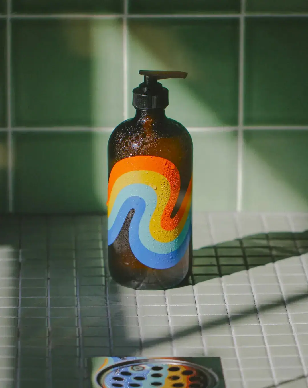
Bathing Culture
Flowing rainbow bands on dark refillable glass

Beame
Orange bubble lettering, pink mascot, clear product badge

Bread Beauty Supply
bubblegum pumps and a fat black wordmark

Byoma
candy-coloured barrier science on a shelf

Cut By Fred
Orange gel, cropped geometry and bold bilingual utility
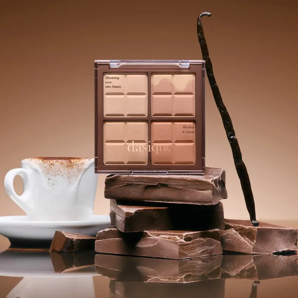
Dasique
Chocolate-segment powders visible beneath a clear serif-marked lid