About this packaging
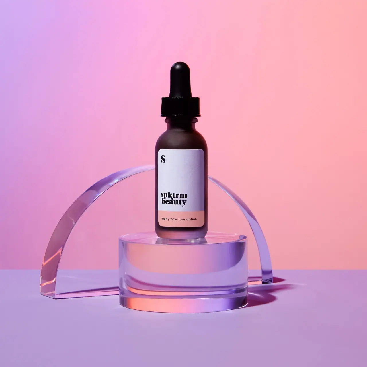
SPKTRM Beauty Happyface Foundation is shown in a dark dropper bottle with a two-part pale and pink label. The label separates the compact brand block from the product name, while the campaign image gives the bottle a vivid studio setting.
Jurada Studio presents this SPKTRM Beauty campaign as a studio project; the campaign image is the source for the pictured bottle and label.[1]
Pack construction & use
- Bottle
- The image shows a dark cylindrical bottle topped with a black dropper closure.Observed in the reference photograph
- Label
- A pale upper panel carries the spktrm beauty wordmark, with a pink lower band identifying happyface foundation.Observed in the reference photograph
What makes the design work
Editorial analysis of this packaging reference.
Distinct label zones
The brand and product name occupy separate fields, which maintains contrast and legibility on the dark bottle.
Small label, clear hierarchy
The wordmark is larger than the product name, but the two-part background gives each a distinct position and enough contrast to read.
Campaign relationship
The pink-and-lavender set echoes the pink label band and frames the bottle without obscuring it. It is a photo treatment, not a package component.
Ideas for your next brief
- Use color-blocked label zones when the vessel itself is dark, keeping brand and variant distinct.
- Let campaign props echo one package accent while leaving the full label unobstructed.
Sources & further reading
Researched 19 October 2026