Photography: Jurada — SPKTRM Beauty brand relaunch. Images belong to their respective owners.
SPKTRM Beauty
heavy lowercase serif anchored above a peach label footer
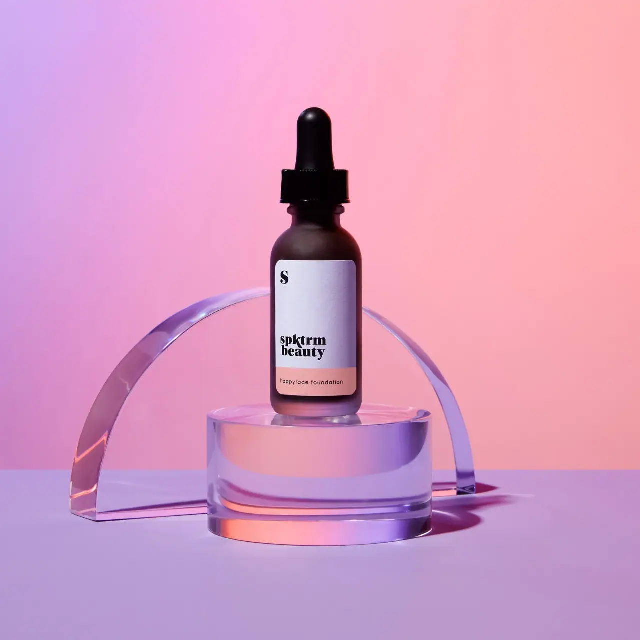
The Happyface Foundation campaign bottle combines a dark rounded-shoulder dropper form with a pale rounded-corner label and a peach lower band. The label is deliberately bottom-weighted: a small S sits alone near the top left, while the heavy two-line spktrm beauty mark sits much lower after a large empty field. The product name occupies the peach footer in a smaller, lighter sans-serif voice. Pink and lavender lighting belongs to Jurada’s campaign setting.
- Make-up
- Light pack
- Apothecary
- Pastel soft-touch
About this study
Selected Happyface Foundation bottle from Jurada’s SPKTRM brand-relaunch campaign. Current availability, shade and capacity are not established.
Sources & evidence · Reviewed 2026-10-19Color Palette
Approximate colours interpreted from photography. These are screen references, not official brand colours or print specifications.
Pack body
Dark brown-looking bottle
#35202A
Approximate shaded body appearance; pink and violet lighting influence it, so intrinsic tint and material remain unverified.
Label
Pale label
#DFDCE7
Approximate light label field under violet scene light, not a calibrated stock colour.
Ink
Black identity
#151215
Approximate letterforms and dropper hardware appearance.
Accent
Peach product band
#DCA29D
Approximate lower label band distinguishing the product name from the maker.
Typography
Suggested visual alternatives, not confirmed brand typefaces. Any scale below is an illustrative estimate.
The isolated S is a bold serif character high at the left. Far below it, spktrm and beauty form a tightly stacked lowercase serif wordmark with substantial weight and rounded, expressive details. The smaller happyface foundation line uses a more geometric sans-serif treatment across the peach band. This creates a deliberate contrast between a characterful maker and a plain functional product line. The large blank interval above the maker is part of the composition rather than missing copy.
Fonts
Expressive maker alternative
DM Serif Display
- Looks like
- DM Serif Display as an independent visual alternative
- Type
- Serif
- Weight
- Regular 400
- Case
- Lowercase
- Tracking
- Close optical spacing
- Fallback
- Arial, sans-serif
Use a short original maker with a strong serif voice and carefully adjusted line breaks. The source mark is heavy and compact; this alternative provides character without tracing its unusual letterforms. Keep the logo artwork separate from ordinary supporting text.
Product-line alternative
Manrope
- Looks like
- Manrope as an independent visual alternative
- Type
- Sans serif
- Weight
- Regular 400
- Case
- Lowercase or sentence case
- Tracking
- Slightly open
- Fallback
- Arial, sans-serif
Set a clear product descriptor inside a separate colour field, preserving contrast and enough margin around rounded corners. Do not make function text so small that the decorative maker becomes the only readable information.
Structure & Proportions
Visual proportions and finish previews are illustrative. Confirmed construction details and uncertainties are distinguished in the study notes.
Proportions
| Purpose | Value | Preview |
|---|---|---|
| Bottom-weighted identity | The main maker sits low within the pale panel, leaving an unusually large empty interval above it. | — |
| Narrow colour footer | The peach band occupies a smaller lower portion of the label and follows its rounded bottom corners. | — |
| Tall closure silhouette | The bulb and collar add a distinct upper shape above the modest bottle shoulders. | — |
Shapes
| Element | Value | Preview |
|---|---|---|
| Bottle | Cylindrical body, rounded shoulders and softened base corners. | |
| Dropper | Tall rounded bulb over a broad collar. | |
| Label | Portrait rectangle with rounded corners and a horizontal lower colour band. |
Finishes
Diffuse bottle appearance
Dark body with broad soft highlights; frosting or coating process unverified. · frosted
Pale label field
Light panel with subtle visible texture; no tactile material claim. · matte
Formats and materials
| Formats | Selected closed cylindrical foundation bottle with rounded shoulders, dark dropper closure and a portrait label. No readable quantity is visible. |
| Materials | The campaign source credits creative direction, photography and production, but gives no packaging component specification., Bottle substrate, tint, label stock, dropper elastomer and pipette material are unverified. A familiar apothecary silhouette is not proof of amber glass or a particular polymer. |
| Closures | A tall rounded black bulb rises above a broad dark collar. The collar meets a narrow neck above the rounded bottle shoulders, making the applicator shape clear even in silhouette. The bottle is closed, so the pipette, internal seal and attachment details are hidden. The photograph does not establish dose, graduations, refill compatibility or whether the collar has a safety feature. The visible closure can be called a dropper form without turning those unseen mechanics into specifications. |
| Decoration | Small isolated S at upper left., Heavy two-line lowercase maker near the bottom of the pale field., Peach footer containing the product name. |
Front Panel
Schematic reading order. The diagram’s zone heights do not represent measured artwork proportions.
The information follows a left margin rather than a centred stack. The S sits high, the main two-line maker sits low, and the product descriptor starts at a similar left position within the peach footer. The label’s right side remains comparatively open. This offset hierarchy is important: describing only a brand block above a product band misses the much larger upper breathing space and the separate initial. The rounded corners soften the tall panel but do not alter the straight horizontal boundary between its pale and peach areas.
| Zone | Content |
|---|---|
| Initial | Bold serif S at the upper left. |
| Open field | Large pale interval with no visible supporting claim. |
| Maker | Heavy lowercase spktrm / beauty near the lower left of the pale area. |
| Product band | Smaller happyface foundation wording on peach. |
Range System
Jurada identifies this work as brand-relaunch campaign creative. That establishes the provenance and purpose of the imagery, not current availability, a complete shade range or physical packaging authorship. The selected bottle is treated as a campaign-edition reference. The peach band must not be called a shade code without comparison evidence, and no volume is inferred from the bottle’s apparent size. Other SPKTRM products require their own imagery and sources.
- Selected Happyface Foundation campaign bottle with pale panel and peach footer.
- No second shade, size or production edition is analysed in this study.
Back of Pack & Shelf
Reverse, base, open pipette and outer packaging are absent. Shade identification, quantity, ingredients and usage information cannot be placed on a diagram from this front alone. The isolated S should not be assumed to be a shade or size code; its meaning is not documented in the campaign page.
- Find a rear or base view before locating shade information.
- Verify component materials from product or supplier documentation.
- Keep campaign authorship separate from physical packaging-design credit.
On shelf
Interpretation: the dark dropper silhouette and pale panel are likely to register before the small product name. The heavy lower maker creates a clear anchor, but the empty upper area may look unusually quiet in a dense retail row. The isolated S offers another recognition point without explaining function. A new design should test whether the product descriptor and shade can be found quickly when the dramatic coloured campaign lighting is removed.
Imagery
The bottle stands on a clear cylindrical plinth with a transparent arch behind it. Pink, coral and lavender light passes through these props and reflects into the dark bottle’s lower edge. The curved props echo the bulb and rounded label corners without belonging to the sold package. The colourful set also amplifies the peach label band. This is a useful example of campaign art direction extending a small accent into a larger scene, while the package itself retains a limited graphic palette.
Guidelines
Editorial principles for an original design brief, not official brand guidelines.
Do
- Use spacing deliberately when identity sits low on a label.
- Keep function readable within a small colour band.
- Distinguish campaign credits from packaging authorship.
- Test the pack outside its coloured photographic set.
Don't
- Do not assign a shade meaning to the peach band without evidence.
- Do not infer glass or bulb chemistry from the silhouette.
- Do not claim current availability from a portfolio project.
- Do not reproduce the S or spktrm beauty wordmark.
Sources & evidence
How this study was built
context · Sourced fact
Jurada credits campaign concept, art direction, photography and production for the brand relaunch.Jurada — SPKTRM Beauty brand launch creativetypography · Visual observation
Isolated upper S and heavy lower two-line maker are separated by a broad empty field.Jurada — SPKTRM Beauty brand launch creativelabel · Visual observation
Peach footer carries a small sans-serif product name aligned toward the left.Jurada — SPKTRM Beauty brand launch creativestructure · Visual observation
Dark rounded-shoulder bottle has a tall bulb-and-collar dropper form.Jurada — SPKTRM Beauty brand launch creativeimagery · Visual observation
Transparent arch and plinth belong to the campaign set.Jurada — SPKTRM Beauty brand launch creativeshelf · Editorial interpretation
Practical product and shade recognition need testing outside the dramatic lighting.
What remains unverified
- Campaign credit does not establish physical packaging-design authorship.
- Bottle material, exact shade, quantity, original fonts and component construction unknown.
- Reverse, base and open dropper unseen; coloured light affects palette.
Give your AI
packaging taste
Give your design or image tool a packaging study: palette, type, structure, front panel and principles for an original brief.
Export this styleFree with an email. PACK.md works in Claude, ChatGPT, Cursor and image tools.
More like this

Aesop
a botanical still life around a disciplined apothecary label

Bread Beauty Supply
bubblegum pumps and a fat black wordmark

Cocokind
sideways lowercase on spa-water pastels
Dae
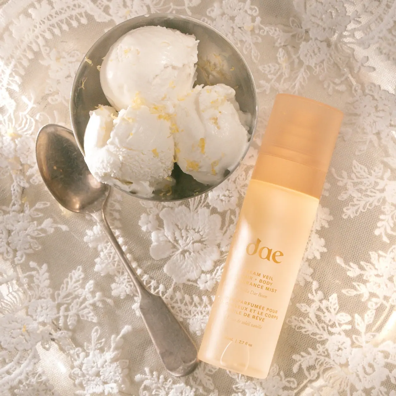
Warm translucent mist with tonal lettering and bilingual rhythm
Dove
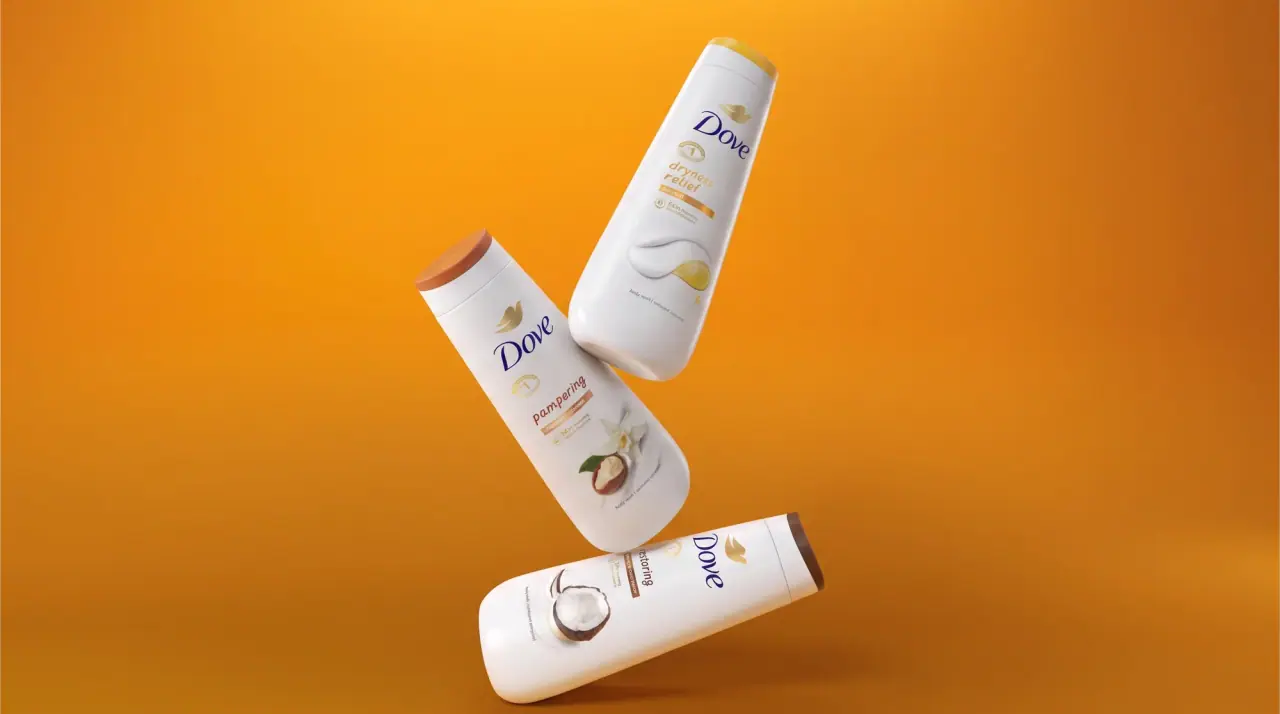
milk-white curves with a gold dove and navy script
Fable & Mane
Arched serif maker, tiger portrait and amber dropper bottle
Farmacy
Golden contents in a faceted jar beneath a wood-toned lid

Fenty Beauty
faceted caps and wide-spaced lilac capitals