About this packaging
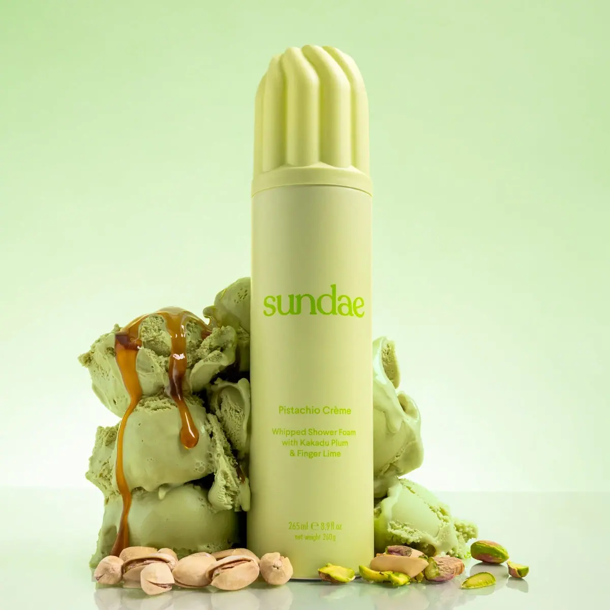
Sundae’s Pistachio Crème body wash uses a tall aerosol format and an oversized ribbed cap to turn a whipped shower foam into an unmistakable bath product. The selected image pairs pale pistachio green with ingredient props, bringing the flavor-coded name into the visual identity.
Sundae identifies Pistachio Crème as a whipped shower foam with fragrance notes of pistachio, cream and caramel. The can’s dessert-like styling connects directly to that scent story.[1]
Pack construction & use
- Container
- A tall cylindrical container meets a fluted, dome-topped cap of the same pale green color. A narrow seam separates the cap from the body; exact component materials remain unconfirmed.Observed in the reference photograph
- Format and use
- The official listing identifies a 265 ml / 260 g foaming wash and instructs users to invert the can before dispensing.[1]
What makes the design work
Editorial analysis of this packaging reference.
Cap as product cue
The fluted cap resembles piped cream, making the foam format legible before the shopper reads the small descriptor. Its added height also gives the can a distinctive silhouette on shelf.
Flavor-coded naming
The bright green wordmark and smaller Pistachio Crème line connect the package to the pictured pistachio and ice-cream props. The ingredient scene clarifies the scent direction without requiring a dense front panel.
Scale the information
The brand name occupies the broad center of the can, while the product name and functional description sit lower in smaller type. This keeps fast recognition and exact product identification distinct.
Ideas for your next brief
- Use a cap silhouette to preview texture or dispensing experience.
- Let a single ingredient color carry through the logo and hero photography, while reserving small type for exact product/function details.
Sources & further reading
Researched 19 October 2026