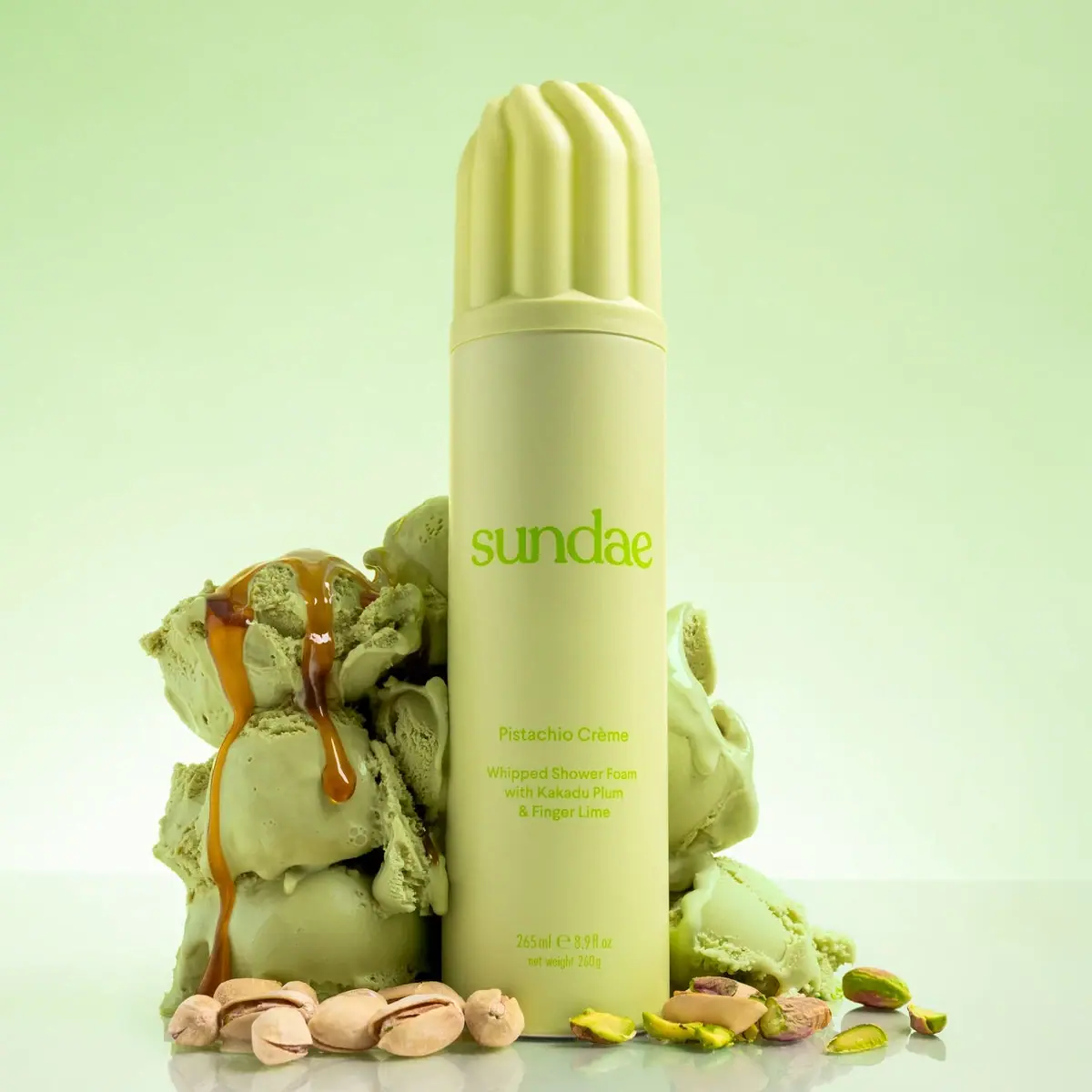
Photography: Sundae Body official photography. Images belong to their respective owners.
Sundae Body

Pistachio cream color and a sculpted whipped cap
Pistachio Crème Whipped Shower Foam combines a very tall pale yellow-green can with a matching sculpted cap. Deep rounded flutes and a domed top suggest piped cream, while the long body stays unusually quiet: a large lowercase serif producer name, a small scent and function block, then the quantity near the base. The product is body wash; dessert references communicate fragrance and texture rather than an edible product. This study covers the selected 265 ml / 260 g presentation and its official pistachio-themed photograph.
- Body & bath
- Light pack
- Playful colour
- Bold typographic
About this study
Selected 265 ml / 260 g Pistachio Crème closed-can edition and official food-styled photograph.
Sources & evidence · Reviewed 2026-10-19Color Palette
Approximate colours interpreted from photography. These are screen references, not official brand colours or print specifications.
Pack body
Pale pistachio cream
#D9DF98
Body and sculpted cap share this pale yellow-green appearance. Lighting creates lighter ridge tops and darker grooves without extra printed colors.
Ink
Fresh pistachio green
#8BB92A
Producer, scent, function and quantity share a brighter green. Approximate photographed color; small-text contrast should be proofed in any adaptation.
Typography
Suggested visual alternatives, not confirmed brand typefaces. Any scale below is an illustrative estimate.
The lowercase producer sits around the upper-middle body with substantial space above and below. Scent name leads a separate small lower block, followed by the shower-foam descriptor and highlighted ingredients. Quantity forms an independent baseline near the bottom rather than joining the descriptive paragraph.
Fonts
Original producer name
DM Serif Text
- Looks like
- Warm lowercase display serif
- Type
- Serif
- Weight
- Regular 400
- Case
- Lowercase
- Tracking
- Natural spacing; preserve individual counters rather than tightly compressing a long name.
- Fallback
- Georgia, serif
A soft but readable original identity that can occupy much of the can width. Its curves should complement the sculpted cap without reproducing Sundae’s specific letterforms.
Scent and practical details
DM Sans
- Looks like
- Simple friendly sans-serif
- Type
- Geometric sans-serif
- Weight
- Regular 400 / Medium 500
- Case
- Title case scent; sentence case function
- Tracking
- Neutral, with enough line spacing for a narrow cylindrical surface.
- Fallback
- Arial, sans-serif
A compact centered scent and functional block. Prioritize the body-wash category even when a food-inspired scent name is more evocative, and keep metric volume separate from net mass.
Structure & Proportions
Visual proportions and finish previews are illustrative. Confirmed construction details and uncertainties are distinguished in the study notes.
Proportions
| Purpose | Value | Preview |
|---|---|---|
| Cap presence | The sculpted cap occupies a substantial upper portion of the total silhouette, roughly a quarter in this frontal photograph; this is not a technical dimension. | — |
| Identity isolation | The producer line is separated from the scent block by a large vertical gap, allowing a small amount of copy to feel deliberate on a tall can. | — |
| Shape continuity | Cap base and body are close in diameter, creating a single tall column despite the strong texture change above the seam. | — |
Shapes
| Element | Value | Preview |
|---|---|---|
| Can body | Tall uninterrupted cylinder with minimal visible shoulder transition beneath the cap. | |
| Fluted dome | Rounded vertical ribs rise into a cream-like domed top; decorative cap silhouette rather than exposed nozzle. | |
| Cap seam | Thin horizontal division under a smooth band separates the removable-looking cover from the body; attachment remains unspecified. |
Finishes
Diffuse tonal body
Pale green can exterior; coating unverified · matte
Sculpted cap highlights
Rounded flutes; appearance only · matte
Formats and materials
| Formats | Tall aerosol-format foaming body wash shown with its cap fitted. The body is straight-sided and ends in a narrow dark-looking base rim., Official listing specifies 265 ml / 260 g; the visible front also prints volume and net weight. These are distinct quantities, not interchangeable measurements. |
| Materials | Exact can alloy, internal coating and cap polymer were not established from the reviewed product page. The photograph alone cannot distinguish component specifications., Body and cap have a closely related pale color despite their different visible surface shapes. Matching appearance does not establish identical materials. |
| Closures | An oversized fluted dome cap covers the dispensing assembly. A horizontal seam and a smooth lower cap band are visible. The actuator is hidden; official instructions say to shake and invert before dispensing, which describes use rather than the unseen valve construction. |
| Decoration | Large bright-green lowercase identity on the otherwise quiet body., Small centered scent and functional text below, with quantity near the base., No pistachio illustration is printed on the visible can; nuts and ice cream are photographic props. |
Front Panel
Schematic reading order. The diagram’s zone heights do not represent measured artwork proportions.
The visible decoration uses an open vertical sequence rather than a framed label. One broad producer line dominates the middle, a compact functional group sits lower, and the amount anchors the base. Keeping those islands separate makes the cap’s complexity compatible with a quiet body.
| Zone | Content |
|---|---|
| Sculpted upper cover | No readable copy; the fluted form supplies the whipped-texture association. |
| Producer island | Large lowercase sundae lettering in brighter green with ample blank space. |
| Scent and function | Pistachio Crème above Whipped Shower Foam, followed by Kakadu Plum and Finger Lime wording. Scent references and formula-highlight wording are distinct roles. |
| Quantity | 265 ml and fluid-ounce volume above net weight 260 g. Keep both dimensions explicit when transcribing product information. |
Range System
Only the Pistachio Crème package is visually studied. The official listing places it in whipped shower foams, but this does not justify a universal color assignment across every Sundae format. An adapted family could use the cap silhouette as a stable cue and scent-specific tonal palettes as variation.
- Keep the sculpted cap recognizable while assigning an original scent a different coherent body-and-ink pair.
- Retain a plainly readable body-wash descriptor even when the scent name evokes dessert.
- Treat volume and mass as separate data fields so a new size does not inherit the selected can’s numbers accidentally.
Back of Pack & Shelf
The reverse, actuator and underside are hidden. The selected image cannot locate the full ingredient declaration, aerosol warnings or manufacturing marks.
- For an original aerosol brief, reserve a legible practical panel with supplier-verified directions and applicable pressure-container information.
- Do not transpose the current web ingredient list as a guaranteed historical pack transcription; the brand explicitly notes formulas may change.
- Verify the actual component system before adding disposal or recycling wording.
On shelf
The high cap gives a familiar can format an unusual top profile, while the tonal green treatment ties the scent name to the product visually. Fine bright-green copy has less contrast than black on white, so a practical adaptation should test actual-size readability under bathroom light. This is an observed design tradeoff, not a measured usability claim. The functional shower-foam wording remains essential beside the dessert styling.
Imagery
Pistachio ice-cream scoops, nuts and caramel-like drips surround the tall container in a pale green environment. Their granular and melting textures contrast with the smooth can and sculpted cap. The official source describes a dessert-like fragrance, so the scene supports a scent story; it is not evidence that the wash contains the pictured foods. The image’s green background should not be sampled as a separate printed shade. Keep the entire cap visible because the silhouette contributes as much recognition as the lettering.
Guidelines
Editorial principles for an original design brief, not official brand guidelines.
Do
- Keep the entire fluted cap visible when choosing the hero crop.
- Give the functional body-wash descriptor enough prominence to clarify the dessert metaphor.
- Maintain separate volume and net-weight lines in product data and artwork.
- Test green-on-pale-green copy at real can size and in lower-contrast lighting.
Don't
- Do not describe the sculpted cover as the exposed foam nozzle.
- Do not infer aluminum, cap polymer or soft-touch treatment from appearance.
- Do not turn fragrance notes or photographic ice cream into ingredient claims.
- Do not place a large illustration over the open gap that gives the identity room to read.
Sources & evidence
How this study was built
edition · Sourced fact
Official listing states 265 ml / 260 g and warns formulas can change.Sundae Body — Pistachio Crème Foaming Body Washstructure · Sourced fact
Official use instructs shaking and inversion before dispensing; hidden mechanism unclaimed.Sundae Body — Pistachio Crème Foaming Body Washpalette · Visual observation
Pale yellow-green body/cap and stronger green text, separate from scene props.typography · Visual observation
Lowercase serif producer above smaller sans function block.label · Visual observation
Separate producer, scent/function and quantity islands.imagery · Sourced fact
Dessert fragrance story supports food styling without proving pictured food ingredients.Sundae Body — Pistachio Crème Foaming Body Washrange · Editorial interpretation
Tonal family adaptation proposed, not a universal brand rule.
What remains unverified
- Exact component materials, coating and actuator unverified.
- Original fonts unknown.
- Back panel and pressure-container markings not visible.
- Colors and cap-height proportion are visual estimates.
Give your AI
packaging taste
Give your design or image tool a packaging study: palette, type, structure, front panel and principles for an original brief.
Export this styleFree with an email. PACK.md works in Claude, ChatGPT, Cursor and image tools.
More like this

ACURE
Iridescent spectacle with practical, tightly ordered type

Bask
sunny yellow with a playful turquoise signature

Beame
Orange bubble lettering, pink mascot, clear product badge

Bread Beauty Supply
bubblegum pumps and a fat black wordmark

Cut By Fred
Orange gel, cropped geometry and bold bilingual utility

Dune Suncare
Coral bottle with striped vertical identity and small left-aligned copy

e.l.f. Cosmetics
Pink tube, black cap, oversized thin lowercase signature
Ethique
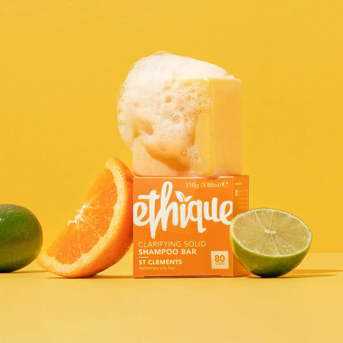
Orange carton, oversized white script and a lathered square bar