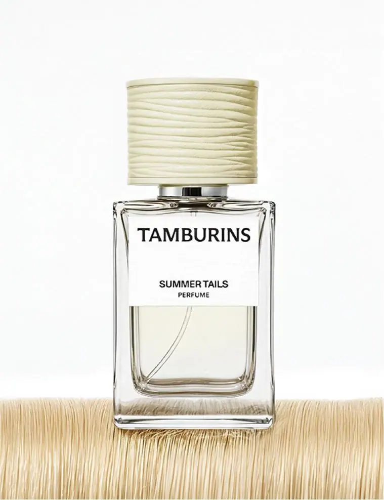
Photography: TAMBURINS official photography. Images belong to their respective owners.
TAMBURINS

striated cream cap above a restrained black-and-white label
Summer Tails combines a clear rectangular body with a wide pale cap whose fine horizontal ridges rise and fall in shallow waves. A broad white label occupies the upper front: a bold serif house name sits high, while the smaller scent and category lines sit low, leaving an intentional blank interval. The visible lower body and dip tube keep part of the object optically open. This study follows the selected official presentation associated with the 50 ml listing, separating cap texture, label appearance and the pale fibres used as scenery.
- Perfume
- Light pack
- Clinical minimal
- Bold typographic
About this study
Summer Tails Perfume in the approved frontal official image associated with the 50 ml product listing. This does not establish identical construction for the 11 ml alternative or other Tamburins categories.
Sources & evidence · Reviewed 2026-10-19Color Palette
Approximate colours interpreted from photography. These are screen references, not official brand colours or print specifications.
Pack body
Clear lower-body appearance
#E1E3D9
Approximate pale optical appearance through the bottle. Contents, scene reflections and lighting contribute; this is not a verified tint or coating formula.
Label
Warm white front field
#F4F4EF
Approximate opaque white label appearance. Fine surface texture is visible, but stock, adhesive and coating are not established.
Ink
Near-black typography
#1B1C17
Approximate house name, scent title and category lettering against the white panel; exact ink and printing process unknown.
Accent
Pale cream cap
#D6D1A8
Approximate cap midtone between raised highlights and recessed shadows. The warmer fibres beneath the bottle belong to the photographic set.
Typography
Suggested visual alternatives, not confirmed brand typefaces. Any scale below is an illustrative estimate.
TAMBURINS is the strongest line, using substantial uppercase serif forms across much of the label width. SUMMER TAILS appears as a smaller, firmer sans-like line lower down, followed closely by a lighter and smaller PERFUME descriptor. These create two groups rather than three evenly spaced lines: the house name above, and the scent/category pair below. The broad blank interval is therefore a functional separator, not simply unused label area.
Fonts
House-name alternative
Lora
- Looks like
- Lora for a substantial contemporary serif voice
- Type
- Contemporary serif
- Weight
- Bold 700
- Case
- Uppercase
- Tracking
- Compact with optical spacing between capitals
- Fallback
- Georgia, serif
Explore an original short maker name that can hold a wide upper line. Lora is a stylistic direction, not the Tamburins logo font; assess the word as a whole rather than copying the source’s width or letter shapes.
Scent and category alternative
Inter
- Looks like
- Inter for a plain compact information group
- Type
- Sans serif
- Weight
- SemiBold 600 / Regular 400
- Case
- Uppercase
- Tracking
- Normal for scent, slightly open for the smaller category
- Fallback
- Arial, sans-serif
Use weight and size to distinguish a scent title from its category while keeping them visibly grouped. This practical pairing is proposed for new work and should be tested with longer names and the actual label surface.
Structure & Proportions
Visual proportions and finish previews are illustrative. Confirmed construction details and uncertainties are distinguished in the study notes.
Proportions
| Purpose | Value | Preview |
|---|---|---|
| Wide cap above narrow collar | The closure is a substantial upper volume, much wider than the short neck connection but still narrower than the bottle face. Exact diameters are not measured. | — |
| Label above visible contents | The label covers the upper front while leaving a large lower area transparent-looking. This division balances readable copy with visible cavity and dip tube. | — |
| Two text groups | A large central interval separates the house name from the tightly related scent/category pair. The spacing hierarchy matters more than any guessed numerical ratio. | — |
| Regular outline, irregular detail | Straight bottle edges and a broadly cylindrical cap outline contain much finer wavy ridges. Their different scales keep the texture from becoming the whole silhouette. | — |
Shapes
| Element | Value | Preview |
|---|---|---|
| Outer flacon | Upright rectangular body with softly bevelled-looking edges and a rounded lower inner cavity. | |
| Cap volume | Wide cylinder-like closure with a near-flat upper edge and short smooth perimeter rims. | |
| Cap striations | Closely spaced horizontal relief lines that undulate rather than forming perfectly straight repeated bands. | |
| Front label | Broad white rectangle across the upper face, leaving the lower body visible. |
Finishes
Transparent reflective body
Outer edges, base and lower front; substrate and actual wall dimensions unverified. · transparent
Low-glare striated appearance
Pale cap. Relief is visible, but its forming process and tactile friction are unknown. · matte
Quiet white label appearance
Upper front panel with slight texture; no verified uncoated stock or soft-touch treatment. · matte
Formats and materials
| Formats | Selected rectangular perfume flacon with upper front label, visible lower cavity and wide cylindrical-looking textured cap. |
| Materials | Body is rigid and transparent-looking; the inspected product text does not establish its component composition or glass specification., Cap, collar, label stock, adhesive and internal closure materials remain unverified. Texture alone does not establish ceramic, wood, fabric or a particular polymer. |
| Closures | A wide pale cap sits above a narrow reflective-looking collar. Its surface carries many shallow, gently uneven horizontal lines, bounded by comparatively smooth top and bottom rims. The selected view is closed; the spray head and attachment mechanism are hidden. A dip tube is visible through the lower bottle, but its presence does not establish refillability, pump output or the composition of other components. |
| Decoration | Bold serif house identity near the upper label edge., Compact scent and category pair near the lower label edge., Structural cap texture supplies ornament while the label remains comparatively spare. |
Front Panel
Schematic reading order. The diagram’s zone heights do not represent measured artwork proportions.
The white panel is substantial and clearly bounded. Its upper house line nearly spans the readable width; the lower scent/category block is narrower and centred. An open interval separates the groups without a rule, icon or coloured strip. The label ends above much of the inner cavity, allowing the object’s transparent-looking lower portion to remain visible. A schematic diagram should retain this division without pretending to supply a measured cutting outline.
| Zone | Content |
|---|---|
| Textured closure | Pale wavy cap relief introduces fine detail above the calmer front graphics. |
| Upper maker line | Large dark TAMBURINS serif capitals placed high on the white panel. |
| Open label interval | A broad blank region gives the upper and lower information groups distinct positions. |
| Scent/category pair | SUMMER TAILS above smaller PERFUME, grouped closely near the lower label edge. |
| Clear lower body | Visible cavity, pale optical appearance and curved dip tube below the opaque panel. |
Range System
The exact official page provides 50 ml and 11 ml options and lists other scent names. This establishes product alternatives but does not prove identical cap dimensions, label ratios or materials across them. The brand also describes an intended contrast between straight first impressions and gentler curves. That design intention can inform the reading of this object without becoming a measured rule for every Tamburins category.
- Selected Summer Tails presentation: pale striated cap, upper white label and visible lower body.
- Source context: 11 ml alternative exists, but its exact construction is not compared in this study.
- Original-design exercise: preserve two clear information groups while testing longer names and different vessel sizes independently.
Back of Pack & Shelf
The reverse, underside, carton and exposed spray head are not visible. No complete ingredients, capacity or batch-code placement can be recovered from this front. The lower transparent area should not be assumed available for every secondary requirement simply because it looks visually empty in the photograph.
- Inspect the reverse and base before creating a full information map.
- Document the cap-off view to distinguish decorative closure from dispensing components.
- For a new design, plan label and information areas that remain readable through curved and reflective surfaces.
On shelf
Interpretation: the large black house name on white provides a more stable reading surface than text directly on transparency would. The pale textured cap may distinguish the silhouette at closer range, while the small scent line could be less immediate when several bottles sit together. A new range should test name recognition and variant selection as separate tasks, rather than assuming that a recognisable maker name makes every scent easy to find.
Imagery
A pale band of densely aligned fibres supports the bottle against a clean white background. Their fine linear texture echoes the cap’s striations, but the fibres are external scenery, not proof that the cap is wrapped in thread or made from a natural material. The frontal view makes the label hierarchy, dip tube and inner cavity unusually easy to study. Soft light preserves the cream cap tone while small shadows reveal its ridges, avoiding a need for stronger printed ornament.
Guidelines
Editorial principles for an original design brief, not official brand guidelines.
Do
- Use different scales of detail: quiet body geometry, finer closure relief and clear text groups.
- Keep scent and category visibly connected while separating them from the maker name.
- Distinguish packaging texture from visually similar props in the photograph.
- Test whether the smaller variant line remains easy to find beside neighbouring products.
Don't
- Do not identify the cap as ceramic, thread-wrapped or wood from appearance alone.
- Do not assign an uncoated paper or soft-touch label finish without a material source.
- Do not treat the 11 ml alternative as a mechanically scaled copy of this presentation.
- Do not copy the Tamburins wordmark, exact wavy closure or complete label arrangement.
Sources & evidence
How this study was built
context · Sourced fact
Exact official page identifies Summer Tails Perfume 50mL and an 11ml alternative.Tamburins — Perfume Summer Tails 50mL, official product and imagerystructure · Sourced fact
Brand describes an intended contrast between straight form and gentle curves; this is design intention rather than a measured ergonomic finding.Tamburins — Perfume Summer Tails 50mL, official product and imagerytypography · Visual observation
Large serif house line is separated from the smaller sans-like scent/category pair by broad blank space.Tamburins — Perfume Summer Tails 50mL, official product and imagerylabel · Visual observation
Substantial white upper panel leaves the lower body and dip tube visible.Tamburins — Perfume Summer Tails 50mL, official product and imageryfinishes · Visual observation
Cap carries fine undulating horizontal relief; surface texture does not identify a substrate or manufacturing process.Tamburins — Perfume Summer Tails 50mL, official product and imageryimagery · Editorial interpretation
External fibres echo the cap’s linear detail but are not packaging components.shelf · Editorial interpretation
Large maker identification and smaller scent identification should be tested separately for a multi-product display.
What remains unverified
- Bottle, cap, collar and label materials, forming techniques and coatings are not specified by the inspected primary text.
- Original fonts, physical dimensions and numerical spacing ratios are unverified.
- Reverse, underside, carton, dispenser and cap attachment are unseen; no refill mechanism inferred.
- Pale fibres are photographic props; colour values describe approximate packaging appearance rather than material samples.
Give your AI
packaging taste
Give your design or image tool a packaging study: palette, type, structure, front panel and principles for an original brief.
Export this styleFree with an email. PACK.md works in Claude, ChatGPT, Cursor and image tools.
More like this
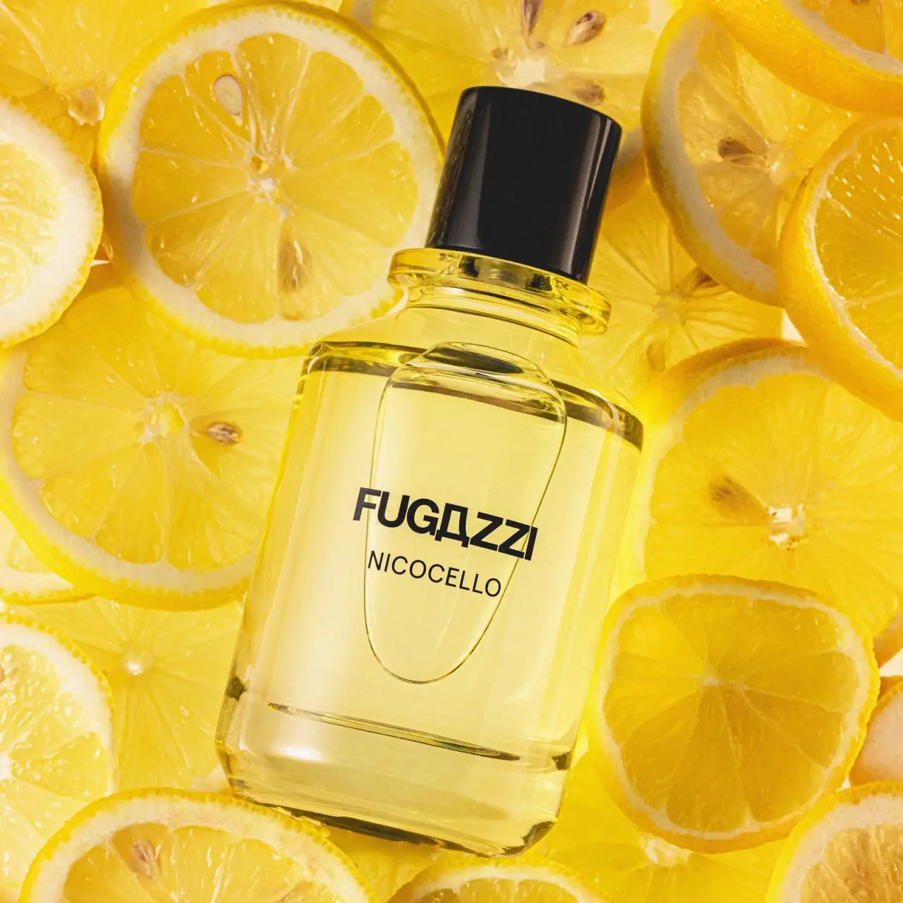
Fugazzi
Clear yellow flacon, bold black name and glossy cap

AussieZinc
Sun-yellow numerals on a tall, information-rich white cylinder

BioSeivas
Vertical serif identity on a mauve treatment band
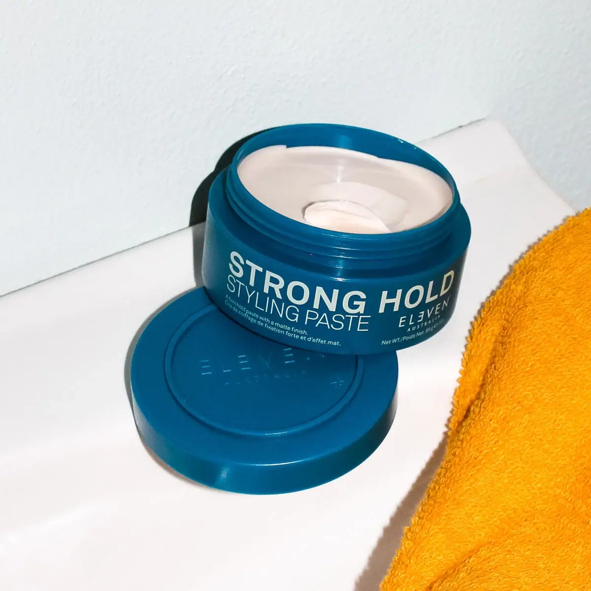
ELEVEN Australia
Deep blue open jar with emphatic hold-first typography
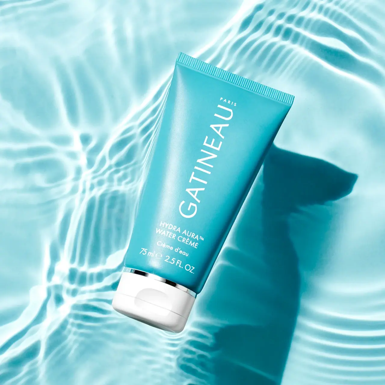
Gatineau
Turquoise tube with lengthwise white name and silver accent

Malin+Goetz
pharmacy label set in bracketed helvetica
Murad
Purple inner field framed by clear walls and silver

Native
white drugstore bottles, scent-tinted vertical caps