About this packaging
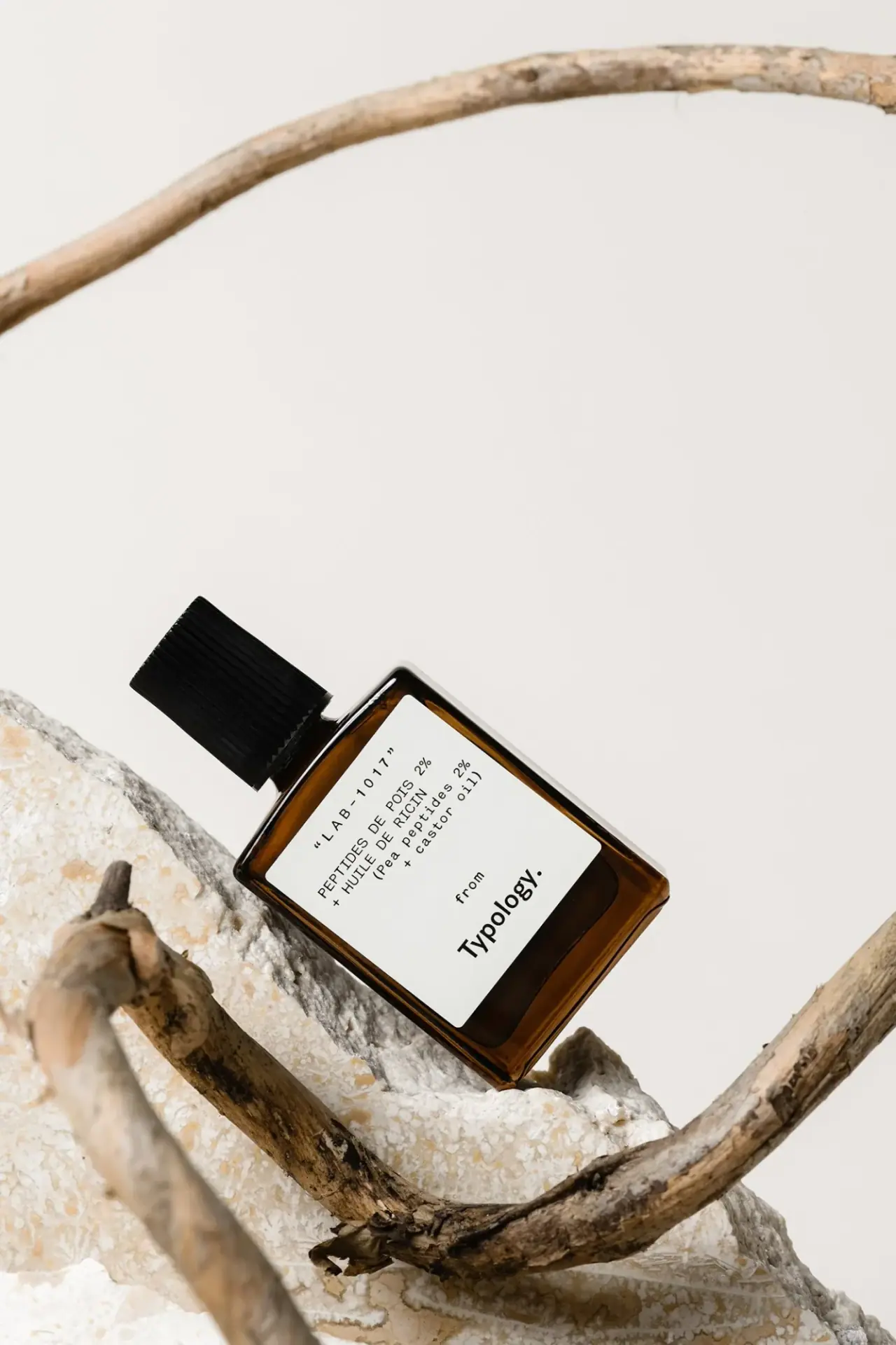
Typology’s photographed LAB-1017 serum uses an amber-colored rectangular bottle, a ribbed black cap and a broad white label. The formula code and ingredient names lead the design, with the brand signature positioned lower down.
Numbered’s account of its collaboration with Typology describes ingredient transparency as a central brand concern. The agency lists art direction, digital branding and e-commerce among its services; this is context for the wider identity, rather than a packaging-design credit.[2]
Pack construction & use
- Bottle and cap
- The closed rectangular bottle has a short neck, a thick-looking base and a cylindrical black cap with vertical ribs. Its material and the applicator hidden beneath the closure cannot be confirmed from this photograph.Observed in the reference photograph
- Formula label
- The front prints LAB-1017 above French and English ingredient lines naming 2% pea peptides and castor oil. Below them, a small “from” introduces the larger Typology wordmark, turning the brand into a signature.Observed in the reference photograph
What makes the design work
Editorial analysis of this packaging reference.
A code-led label feels like a formula record
LAB-1017 is given a prominent position above the ingredient line, while the Typology wordmark anchors the lower portion of the label. This makes the code part of the product’s identity and gives the image a laboratory-note quality without adding decorative graphics.
The white panel interrupts the amber body
A broad white label sits within the dark amber-colored bottle, providing a bright reading surface and a sharply defined rectangle against the container. The black text stays legible even in the angled composition, where the bottle is set among pale stones and branches.
Two typographic voices separate formula and maker
The spaced, typewriter-like ingredient lines resemble a technical record, while the lower wordmark is heavier and more compact. This contrast distinguishes formula information from the maker without adding colored bands, illustrations or a large logo at the top.
Ideas for your next brief
- Use a stable formula code as a repeatable navigation device when the brand sells several targeted serums.
- Reserve a bright label field for small ingredient and use copy on a dark-colored bottle.
- Separate ingredient information and the maker’s signature through type treatment when both need to coexist on a small monochrome label.
Sources & further reading
- 1.Typology — Eyebrow and Eyelash Serum (official French product listing)
- 2.Numbered — Typology art direction and digital branding
Researched 19 October 2026