Photography: Nicola Harger — Typology product photography. Images belong to their respective owners.
Typology

amber rectangle with a code-led bilingual white formula label
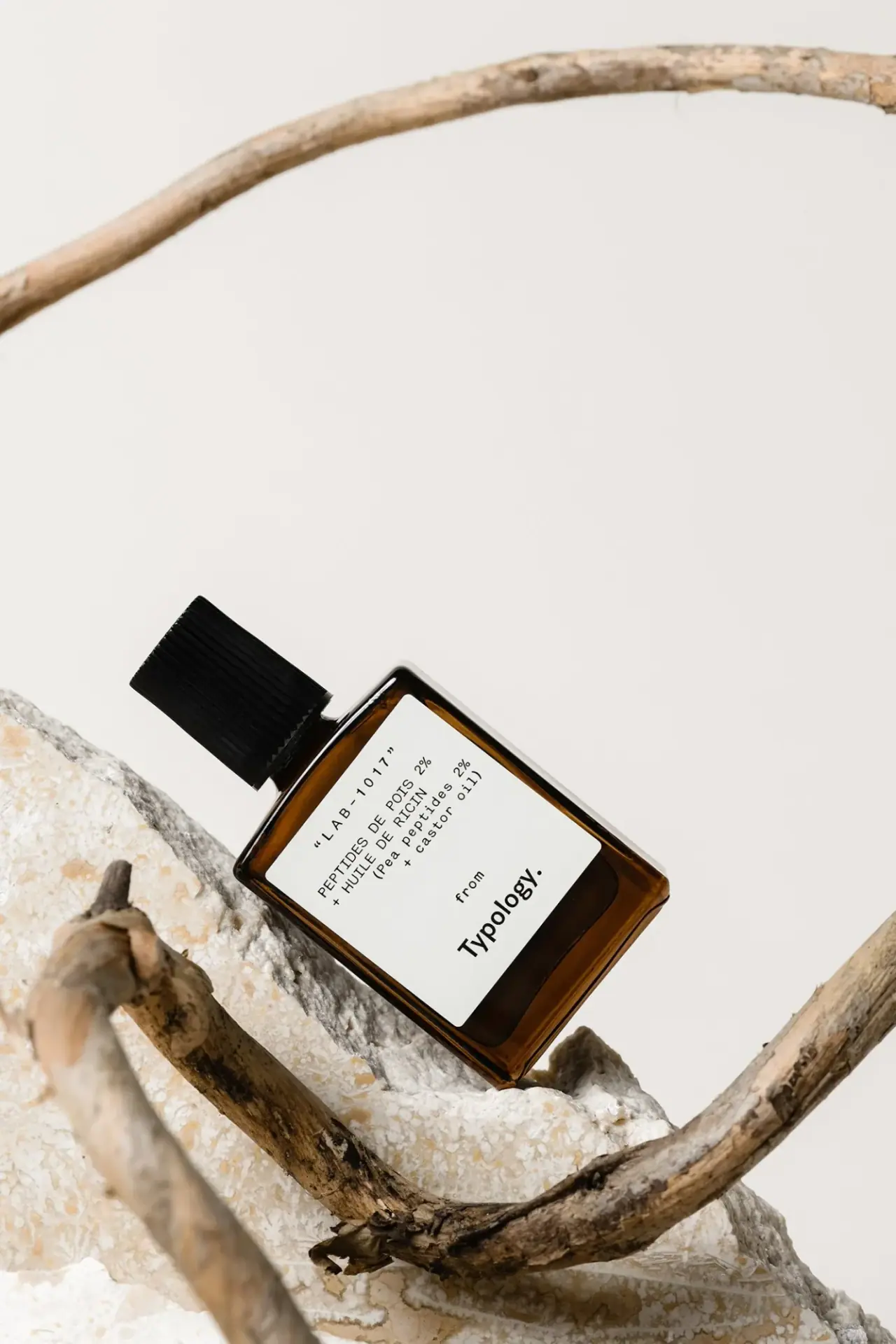
The photographed LAB-1017 bottle puts a formula code and ingredient wording ahead of the maker name. A broad white label sits inside the amber-looking rectangular body, with a spaced code at the top, French and English ingredient groups below, and a small from leading into the heavier Typology signature near the bottom. The black ribbed closure adds functional texture above an otherwise smooth object. This study follows the specific pea-peptide and castor-oil edition shown in Nicola Harger's portfolio, rather than assuming it matches today's lash-serum format.
- Skincare
- Light pack
- Apothecary
- Clinical minimal
About this study
Photographed LAB-1017 pea-peptide/castor-oil edition in Nicola Harger's portfolio. Current lash-serum construction, capacity and artwork are not assumed identical.
Sources & evidence · Reviewed 2026-10-19Color Palette
Approximate colours interpreted from photography. These are screen references, not official brand colours or print specifications.
Pack body
Amber optical appearance
#754016
Approximate warm body colour seen around the label. Thickness, contents and lighting influence it; no glass tint or UV-protection specification is established.
Label
Soft white panel
#EEEEE8
Approximate bright label field, distinct from the textured stone beneath. Paper stock, coating and adhesive are unverified.
Ink
Near-black information
#151612
Approximate code, bilingual copy and maker lettering, repeated visually by the dark closure.
Typography
Suggested visual alternatives, not confirmed brand typefaces. Any scale below is an illustrative estimate.
LAB-1017 is a widely spaced upper line framed by quotation marks. Beneath it, the ingredient statement uses compact uppercase French wording and a parenthesised English counterpart in mixed case. These technical-looking lines contrast with the lower maker signature, which is heavier and more compact. The small word from acts as a hinge between the formula record and the brand. The layout uses changes in spacing, case and weight rather than decorative rules or colour bands to distinguish these roles.
Fonts
Formula record alternative
IBM Plex Mono
- Looks like
- IBM Plex Mono for technical-looking codes and bilingual copy
- Type
- Monospaced sans serif
- Weight
- Regular 400
- Case
- Uppercase code and French, mixed-case English
- Tracking
- Open code spacing, normal descriptor spacing
- Fallback
- monospace
Use a consistent code format and clear bilingual line breaks for a new product system. A monospaced font makes character rhythm explicit, but should not be used to imply laboratory verification. Test long ingredient names before fixing the panel width.
Maker signature alternative
Inter
- Looks like
- Inter for a compact heavier sans-serif signature
- Type
- Sans serif
- Weight
- SemiBold 600
- Case
- Mixed case
- Tracking
- Compact optical spacing
- Fallback
- Arial, sans-serif
Place an original maker name beneath a smaller introductory line. Give it enough weight to anchor the lower panel without displacing the product information. This is not the Typology wordmark font and should not be adjusted to duplicate its proprietary letterforms.
Structure & Proportions
Visual proportions and finish previews are illustrative. Confirmed construction details and uncertainties are distinguished in the study notes.
Proportions
| Purpose | Value | Preview |
|---|---|---|
| Broad bright reading field | The white label covers much of the flat front while leaving an amber perimeter and a deeper visible strip near the base. Exact label and bottle dimensions are not measured. | — |
| Narrow closure above broad body | The cap is a distinct smaller upper volume, making the bottle shoulder and rectangular body easy to identify. | — |
| Information above signature | Code and bilingual ingredients occupy the upper portion; open space separates them from the lower maker group. The maker is visually strong without taking the first reading position. | — |
| Softened panel corners | Small label corner radii echo the bottle's rounded edges while preserving a clearly rectangular information field. | — |
Shapes
| Element | Value | Preview |
|---|---|---|
| Body | Flat upright rectangle with softened corners and rounded shoulder transitions. | |
| Label | Large white rounded-corner rectangle inset within an amber border. | |
| Cap | Narrow black cylindrical closure with closely spaced vertical ribs. |
Finishes
Amber transparent-looking perimeter
Bottle edges and lower strip; substrate and barrier performance unverified. · transparent
Quiet white panel
Main label; no verified uncoated paper, laminate or printing process. · matte
Formats and materials
| Formats | Closed flat rectangular serum bottle with rounded edges, short narrow neck and cylindrical ribbed black cap. |
| Materials | The body is amber and transparent-looking at its edges, but the inspected primary sources do not provide a component declaration for this edition., Cap composition, label stock, adhesive and hidden applicator materials are unverified. No material or capacity is transferred from a current product listing. |
| Closures | The black cap is narrower than the body and carries close vertical ribs. Its regular cylindrical outline contrasts with the broad flat front of the bottle. The photographed closure is on; it does not show a brush, wand, dropper or dispensing opening. Ribs can be described as visible grip-oriented geometry, but opening torque and the exact attachment cannot be determined from the image. |
| Decoration | Quoted LAB-1017 code at the top of the label., French ingredient wording followed by an English parenthetical group., Small introductory from above the lower maker signature., No illustrated ingredient motif on the visible label. |
Front Panel
Schematic reading order. The diagram’s zone heights do not represent measured artwork proportions.
The panel reads like a concise formula record. The code sits at the top with enough spacing to operate as a discrete identifier. Ingredient lines are grouped tightly below, with French and English separated by case and parentheses rather than a rule. A comparatively open interval leads to the small from and larger maker name. The label therefore provides two main information groups: formula identification above and attribution below. Its bright field prevents the amber bottle from becoming the background for the smallest letters.
| Zone | Content |
|---|---|
| Upper code | Spaced LAB-1017 identifier framed by quotation marks. |
| French ingredient group | Pea peptide percentage and castor-oil wording in uppercase lines. |
| English counterpart | Parenthesised mixed-case ingredient wording immediately below. |
| Attribution bridge | Small from introduces the maker without another visual container. |
| Lower signature | Heavier Typology name anchors the bottom of the white panel. |
Range System
Numbered describes a wider collaboration around ingredient transparency, art direction and digital experience. That provides identity context, not a verified packaging-design credit or a complete physical range specification. The selected code can be analysed as a navigation device, but this study does not infer what every LAB number means or whether current products use the same bottle. A new code system should be paired with readable product wording, not require users to memorise codes alone.
- Selected reference: LAB-1017 with pea-peptide and castor-oil wording on the photographed label.
- Documented context: Numbered's Typology project describes transparency and digital branding work.
- Original-design exercise: use stable identifiers alongside descriptive names, with explicit rules for revisions and variant changes.
Back of Pack & Shelf
The reverse, underside and applicator are unseen. No capacity is confidently readable on the selected front. The current French product page could not be inspected beyond its verification screen, so present-day component details and instructions are not substituted for the photographed edition.
- Obtain the reverse and base before assigning quantity or batch-code positions.
- Inspect the open closure before identifying an applicator format.
- For new artwork, allow bilingual copy to expand without compressing the formula code or maker group.
On shelf
Interpretation: the bright label and dark text offer a comparatively stable information surface, but the prominent code may be less helpful to an unfamiliar shopper than a plain product name. The lower maker signature gives a strong ending to the reading sequence. For an independent system, test whether people can distinguish adjacent formulas using the descriptive text as well as the identifier. A code-led appearance should support navigation rather than merely simulate technical authority.
Imagery
Nicola Harger's photograph places the bottle diagonally against pale rough stone, framed by dry curved branches. The dark cap and amber edge separate clearly from the near-white background, while the branches introduce irregular curves around the bottle's regular geometry. The scene supports a material, restrained presentation without inserting botanical illustration into the label. It does not prove ingredient origin or packaging sustainability. The photographer portfolio is the source for this selected image; Numbered is credited only for the services it actually lists.
Guidelines
Editorial principles for an original design brief, not official brand guidelines.
Do
- Give formula codes a consistent role alongside readable descriptions.
- Separate language groups through line breaks and punctuation that remain clear at small size.
- Use a bright panel to stabilise text contrast on a dark transparent-looking bottle.
- Keep photographer, digital agency and packaging designer credits distinct.
Don't
- Do not infer the hidden applicator from the product category.
- Do not transfer current packaging details to the photographed LAB-1017 edition without a match.
- Do not treat amber colour as proof of material composition or UV protection.
- Do not copy the Typology signature or its complete code-and-attribution arrangement.
Sources & evidence
- Nicola Harger — Typology product photography, selected LAB-1017 imagephotographer
- Numbered — Typology art direction and digital branding contextdesigner
How this study was built
edition · Sourced fact
Photographer portfolio contains the selected LAB-1017 bottle image, supporting image provenance.Nicola Harger — Typology product photography, selected LAB-1017 imagecontext · Sourced fact
Numbered lists art direction, digital branding, e-commerce and UX/UI, with ingredient-transparency context.Numbered — Typology art direction and digital branding contexttypography · Visual observation
Spaced code and typewriter-like bilingual copy contrast with the heavier lower maker signature.Nicola Harger — Typology product photography, selected LAB-1017 imagelabel · Visual observation
Broad white rounded panel leaves an amber perimeter and separates formula information from lower attribution.Nicola Harger — Typology product photography, selected LAB-1017 imagestructure · Visual observation
Closed ribbed cap hides the applicator; no brush or dropper is visible.Nicola Harger — Typology product photography, selected LAB-1017 imageshelf · Editorial interpretation
An identifier works best alongside readable descriptions rather than requiring memorisation of codes.
What remains unverified
- Current French product page returned a verification screen; no current component details transferred.
- Bottle and cap composition, label stock and application process are unverified.
- Original fonts, physical dimensions, capacity and production date are unidentified.
- Reverse, underside and applicator are unseen; Numbered is not attributed packaging design without evidence.
Give your AI
packaging taste
Give your design or image tool a packaging study: palette, type, structure, front panel and principles for an original brief.
Export this styleFree with an email. PACK.md works in Claude, ChatGPT, Cursor and image tools.
More like this
Monpure
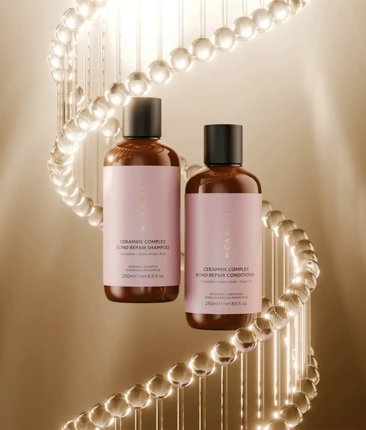
Amber duo with rose labels and vertical gold identities
Norfolk Natural Living
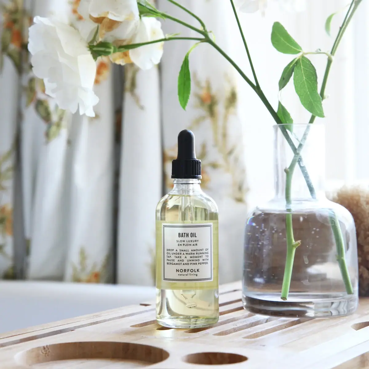
Double-bordered bath-oil label on a clear black-dropper bottle
Palermo Body
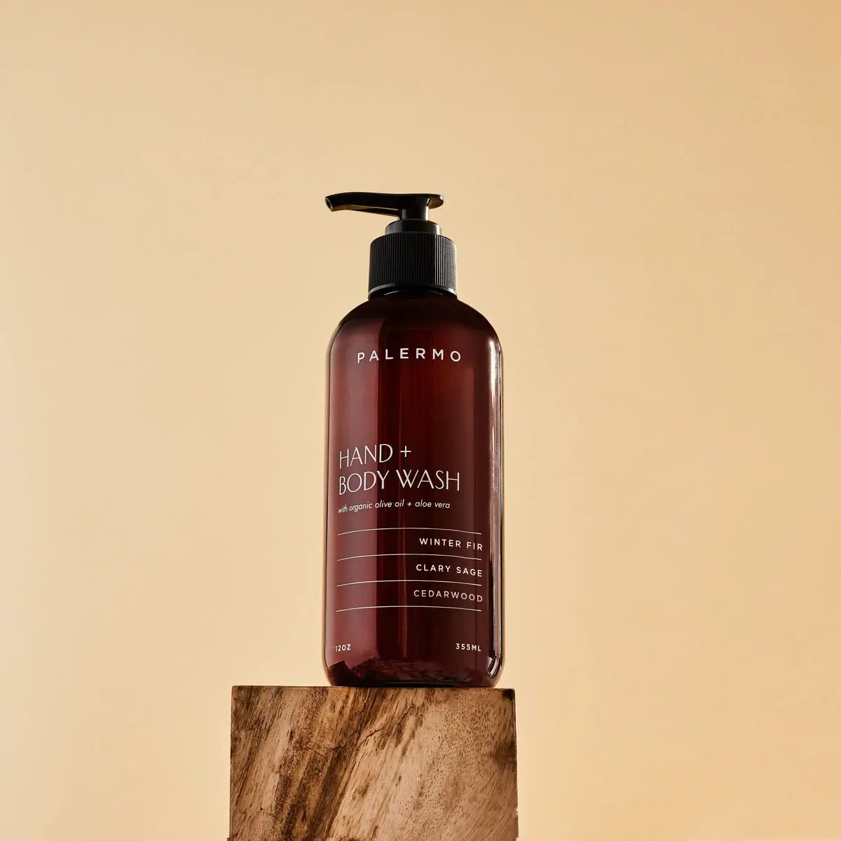
Amber wash bottle with airy maker and ruled scent rows
SKIN1004
cream lid above a brown jar and clinical panel

Aesop
a botanical still life around a disciplined apothecary label

African Botanics
Technical black label with a low serif signature

AussieZinc
Sun-yellow numerals on a tall, information-rich white cylinder

bareMinerals
a restrained black compact framing the powder itself