About this packaging
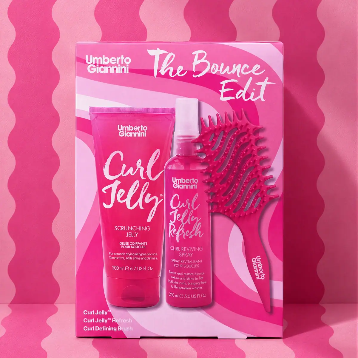
Umberto Giannini's The Bounce Edit uses a vivid pink closed carton with printed depictions of a Curl Jelly tube, Curl Jelly Refresh spray and defining brush. A large brush-script set title, curved tonal bands and a small contents list organise the front.
Umberto Giannini’s product listing identifies The Bounce Edit as a curl-care gift set.[1]
Pack construction & use
- Set contents
- The selected box shows a Curl Jelly tube, Curl Jelly Refresh spray bottle, and curl-defining brush.Observed in the reference photograph
- Outer box
- The selected image shows the assortment as artwork on the pink carton face. A transparent window, open tray and internal product arrangement are not demonstrated.Observed in the reference photograph
What makes the design work
Editorial analysis of this packaging reference.
Product imagery explains the kit
The front depicts the tube, spray and brush together, with a separate three-item list at lower left. These printed representations explain the assortment; the selected image does not show loose products arranged beside the box.
Waves reinforce the name
A repeating wavy pattern on the backdrop and carton evokes bounce and curl movement. The hand-lettered product name adds energy while the brand remains in a consistent top corner.
Pink family coding
The strong pink field unifies all three components, including the brush, so the bundle reads as a dedicated set. White lettering maintains contrast against the saturated background.
Ideas for your next brief
- Pair clear product depictions with a concise contents list so a closed gift carton can explain its assortment.
- Let a vivid outer box act as the set identifier while the products retain their individual names and formats.
Sources & further reading
Researched 19 October 2026