Photography: Umberto Giannini official photography. Images belong to their respective owners.
Umberto Giannini

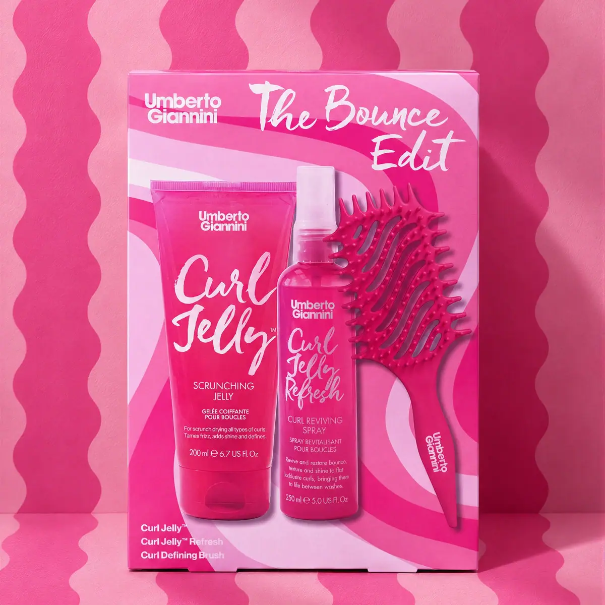
hot-pink gift carton with sweeping stripes and brush-script titles
The Bounce Edit turns a three-part curl-care assortment into one vivid pink front. A small stacked maker mark occupies the upper left, while a much larger brush-script set title sweeps across the upper right. Printed depictions of the tube, spray and defining brush fill most of the remaining face, backed by curved pink bands. A short contents list at the lower left makes the assortment explicit. The selected image shows a closed carton presentation, not a demonstrated window or open tray.
- Hair
- Light pack
- Playful colour
- Bold typographic
About this study
The Bounce Edit gift carton in the approved official pink-wave image. Analysis concerns the visible printed front; internal packing and opening are not documented.
Sources & evidence · Reviewed 2026-10-19Color Palette
Approximate colours interpreted from photography. These are screen references, not official brand colours or print specifications.
Pack body
Vivid pink field
#EA388D
Approximate dominant carton and depicted product colour. The actual set includes several related pink appearances rather than one verified universal colour standard.
Ink
Warm white lettering
#F8F1E6
Approximate maker, set title and contents text. Exact ink formulation and print process are unverified.
Accent
Pale pink sweep
#F1B1D7
Approximate lighter curved bands printed across the carton, providing contrast without introducing a different hue family.
Deep magenta detail
#C91871
Approximate darker bands and depicted brush/body shadows. Some variation comes from printed product imagery rather than a separate structural component.
Typography
Suggested visual alternatives, not confirmed brand typefaces. Any scale below is an illustrative estimate.
The maker name is a compact two-line sans-serif anchor in the upper left. The Bounce Edit uses a much larger handwritten brush-like voice, split across an expansive upper-right area. That expressive voice reappears within the depicted Curl Jelly and Refresh product titles, while smaller sans-serif copy carries category and contents information. The outer set name and the product names therefore share a personality but operate at different levels of the composition. The bottom contents list offers a simpler reading route when the photographed product labels become too small.
Fonts
Expressive title alternative
Caveat
- Looks like
- Caveat for an energetic handwritten title direction
- Type
- Handwriting
- Weight
- Bold 700
- Case
- Mixed case
- Tracking
- Natural flowing spacing with deliberate line breaks
- Fallback
- cursive
Explore an independent short set title with a clear overall silhouette. Caveat suggests informal motion but does not reproduce the source's brush edges. Make the title readable before adding stronger waves or product depictions behind it.
Maker and contents alternative
Inter
- Looks like
- Inter for compact structured information
- Type
- Sans serif
- Weight
- Bold 700 / Regular 400
- Case
- Mixed case for maker and contents
- Tracking
- Compact maker, normal contents spacing
- Fallback
- Arial, sans-serif
Use a stable small maker block and a clearly separated contents list. The latter should remain useful at thumbnail size even when text printed inside product photographs is no longer readable. This is a new-design recommendation, not a measured original type specification.
Structure & Proportions
Visual proportions and finish previews are illustrative. Confirmed construction details and uncertainties are distinguished in the study notes.
Proportions
| Purpose | Value | Preview |
|---|---|---|
| Assortment dominates the face | The depicted tube, spray and brush occupy most of the lower front, giving the kit contents more space than the small maker block. | — |
| Contrasting title widths | The maker forms a compact corner block while the set title spreads widely across the remaining top. Their distinct shapes prevent them from reading as one long headline. | — |
| Overlapping component depictions | The narrow spray overlaps the broader tube and brush imagery, compressing three objects into one coherent group. This is an artwork relationship, not a verified internal packing plan. | — |
| Short secondary list | The lower-left contents wording repeats the three items in a compact block, independent of the much larger product pictures. | — |
Shapes
| Element | Value | Preview |
|---|---|---|
| Outer carton | Upright rectangle with straight edges and a shallow visible top boundary. | |
| Printed curved bands | Broad sweeping pink ribbons that bend around the product depictions. | |
| Tube depiction | Tall tapered cap-down silhouette with a broad sealed upper edge. | |
| Brush depiction | Vented curved head with long handle and comb-like outer profile. |
Finishes
Saturated printed appearance
Carton front; precise board coating and print process unknown. · matte
Depicted product highlights
Printed tube, spray and brush imagery; not a verified tactile finish on the outer box. · gloss
Formats and materials
| Formats | Upright rectangular gift carton showing a printed arrangement of Curl Jelly tube, Curl Jelly Refresh spray and curl-defining brush. |
| Materials | Outer carton stock, coating, internal insert and any protective materials are not specified in the consulted official product information., Component depictions do not establish tube laminate, bottle resin, brush polymer or closure composition. Printed shadows are not evidence of an exposed physical tray. |
| Closures | The box has a thin visible top edge and small lower flap-like details. These show a folded container presentation but not its complete opening sequence or internal restraint. Within the printed depictions, the tube has a cap-down profile and the spray has a pale protective cap. Those illustrations help identify formats, but they do not reveal the actual set's internal arrangement or accessibility. |
| Decoration | Large brush-like set title across the upper right., Compact maker mark at upper left and repeated within product depictions., Sweeping pale and dark pink bands around the assortment., Short three-item contents list near the lower left. |
Front Panel
Schematic reading order. The diagram’s zone heights do not represent measured artwork proportions.
The outer face has three clear jobs: establish the maker, name the bundle and explain its contents. Maker and set title share the top without sharing a typographic style. The product depictions occupy the central and lower area, with curved bands continuing behind them. A lower-left list gives a plain-text inventory. Because the front is visually busy, the list is especially useful: it lets the viewer confirm the assortment without reading every line inside the printed product images.
| Zone | Content |
|---|---|
| Maker corner | Small white stacked Umberto Giannini mark at upper left. |
| Set title | Large white brush-like The Bounce Edit lettering at upper right. |
| Assortment depiction | Pink tube, spray and defining brush shown together as front artwork. |
| Contents list | Three separate item names at lower left. |
| Background rhythm | Broad curved pink bands continue around the product group. |
Range System
The official product description identifies Curl Jelly, Curl Jelly Refresh and a Defining Brush as the set's three components. The selected artwork shows the tube as 200 ml and the spray as 250 ml. These details define this photographed assortment, not every holiday kit or every regional edition. The shared pink treatment makes the three depicted formats read as a family, but no complete brand-wide colour coding rule is established.
- Selected set: Curl Jelly tube, Curl Jelly Refresh spray and curl-defining brush.
- Visible artwork quantities: 200 ml on the tube and 250 ml on the spray depiction.
- Original-design exercise: pair large component images with a separate concise inventory, updating both when an assortment changes.
Back of Pack & Shelf
The reverse, sides and internal tray are not visible. The front does not establish whether the box contains an insert, how the products are restrained or where directions and ingredients are printed. No transparent window is demonstrated by this selected image.
- Inspect an opened set before drawing its internal arrangement.
- Check rear and side panels for contents, quantities and language variants.
- For a new gift box, ensure printed product pictures and the actual assortment remain aligned across editions.
On shelf
Interpretation: the saturated pink field and large casual title can signal a gift bundle quickly, while the product pictures explain the category. The risk in a small thumbnail is that several script titles and many fine product-label lines merge into visual noise. A new composition should test the outer set name and plain contents list at small sizes, letting detailed product photography reward closer inspection rather than carry all essential information.
Imagery
The carton is photographed against a matching pink set with repeated vertical waves on the wall and floor. Those external waves differ from the broader sweeping bands on the box, yet both suggest movement around the curl-care theme. The closely related colours create an immersive scene, while a narrow cast shadow helps separate the rectangular box from its background. The realistic component pictures belong to the carton face; this image does not show loose products arranged outside the box.
Guidelines
Editorial principles for an original design brief, not official brand guidelines.
Do
- Give the bundle a distinct title while keeping the maker easy to locate.
- Repeat the assortment in a concise text list alongside product images.
- Separate carton artwork from the photographic backdrop when documenting patterns.
- Check that component depictions and quantities match the actual set edition.
Don't
- Do not describe a window or open tray when only a printed front is shown.
- Do not treat printed product highlights as embossing or physical relief.
- Do not assume every pink gift set contains the same three items.
- Do not copy the maker mark or exact Curl Jelly brush lettering.
Sources & evidence
How this study was built
context · Sourced fact
Official product description identifies Curl Jelly, Curl Jelly Refresh and Defining Brush as the assortment.Umberto Giannini — The Bounce Edit Gift Set, official product HTML and imagerytypography · Visual observation
Compact sans maker at upper left contrasts with large brush-like set title at upper right.Umberto Giannini — The Bounce Edit Gift Set, official product HTML and imagerylabel · Visual observation
Printed component depictions and a separate three-item contents list explain the closed set.Umberto Giannini — The Bounce Edit Gift Set, official product HTML and imageryrange · Visual observation
Tube and spray depictions visibly show 200 ml and 250 ml respectively.Umberto Giannini — The Bounce Edit Gift Set, official product HTML and imageryimagery · Visual observation
External vertical waves differ from the sweeping bands on the carton face.Umberto Giannini — The Bounce Edit Gift Set, official product HTML and imageryshelf · Editorial interpretation
A plain inventory can remain useful when detailed product-label text becomes too small in thumbnails.
What remains unverified
- Official page was retrieved as HTML after browser extraction failed; product description and structured data were readable.
- Board stock, coating, internal insert and component materials are unverified.
- Reverse, sides and open interior are unseen; no window or exposed tray inferred.
- Original lettering and physical dimensions are unknown; colours are approximate screen appearances.
Give your AI
packaging taste
Give your design or image tool a packaging study: palette, type, structure, front panel and principles for an original brief.
Export this styleFree with an email. PACK.md works in Claude, ChatGPT, Cursor and image tools.
More like this

ACURE
Iridescent spectacle with practical, tightly ordered type

Bask
sunny yellow with a playful turquoise signature

Beame
Orange bubble lettering, pink mascot, clear product badge

Bread Beauty Supply
bubblegum pumps and a fat black wordmark

Cut By Fred
Orange gel, cropped geometry and bold bilingual utility

Dune Suncare
Coral bottle with striped vertical identity and small left-aligned copy

e.l.f. Cosmetics
Pink tube, black cap, oversized thin lowercase signature
Ethique
Orange carton, oversized white script and a lathered square bar