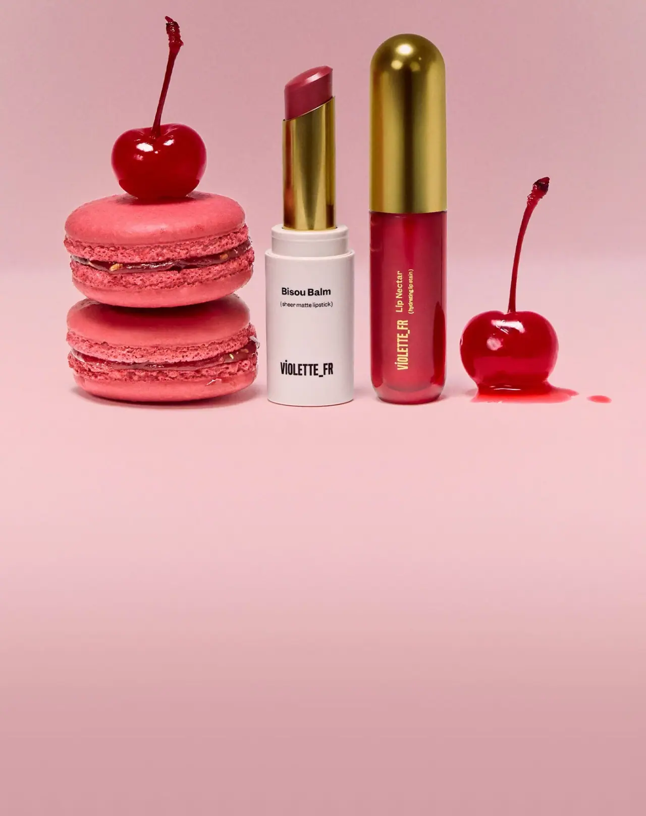
Photography: VIOLETTE_FR official photography. Images belong to their respective owners.
VIOLETTE_FR

Two berry textures, connected by a golden silhouette
The selected Bouche Duo Bêtise image makes a set legible through difference. An open Bisou Balm exposes its berry bullet above an ivory base and reflective gold-tone sleeve; a closed Lip Nectar shows a deeper berry body beneath a tall domed gold-tone cap. Their shared warm metallic appearance creates a family relationship without disguising the two formats. Sparse lettering and a large gap between product name and house mark let the physical forms carry much of the identity. The analysis is limited to this photographed limited-edition duo, rather than the whole VIOLETTE_FR range.
- Make-up
- Light pack
- Luxe monochrome
About this study
Selected Bouche Duo Bêtise campaign image: open Bisou Balm and closed Lip Nectar. Limited to these photographed fronts, not unseen caps, reverse panels or outer set packaging.
Sources & evidence · Reviewed 2026-10-19Color Palette
Approximate colours interpreted from photography. These are screen references, not official brand colours or print specifications.
Pack body
Ivory case
#EEE5DF
Approximate pale balm base. Its opacity provides a calm reading surface for black type and makes the exposed berry bullet more noticeable.
Berry through the nectar body
#A82746
Approximate colour visible through the liquid container. The relative contribution of formula, wall tint, lighting and background is unverified, so it should not become an opaque shell-colour specification.
Ink
Near-black lettering
#171314
Compact product and house information on the ivory base. The nectar instead uses pale gold-looking lettering to contrast with its darker contents.
Accent
Warm gold appearance
#AA842D
Approximate midtone of the balm sleeve and nectar cap. Their reflective surfaces range from dark brown to pale yellow under the lights; this swatch is a visual shorthand, not a metallic ink or plating specification.
Typography
Suggested visual alternatives, not confirmed brand typefaces. Any scale below is an illustrative estimate.
The balm has a small, readable mixed-case product name near the upper part of its ivory base, followed by a parenthetical descriptor. A taller, condensed uppercase house mark anchors the bottom. The nectar rotates its information along the long axis of the container: the house mark occupies the lower section while the product and descriptor continue above. Typography is sparse, but its orientation adapts to each body rather than forcing the same horizontal lockup onto both.
Fonts
Product name and descriptor
Inter
- Looks like
- Inter
- Type
- Sans serif
- Weight
- Regular 400 / SemiBold 600 / Bold 700
- Case
- Mixed case for names and lower case for descriptors
- Tracking
- Normal; keep the descriptor comfortably readable.
- Fallback
- sans-serif
A straightforward alternative for compact names. Use a heavier weight for the product and a smaller regular descriptor, preserving the visible difference in information level without mimicking the exact lettering.
Condensed house mark alternative
Barlow Condensed
- Looks like
- Barlow Condensed
- Type
- Condensed sans serif
- Weight
- Bold 700
- Case
- Uppercase
- Tracking
- Close but not touching
- Fallback
- sans-serif
Use for an original fictional house name that needs a narrow footprint on a cylinder. Its purpose is to reproduce the contrast between narrow brand lettering and ordinary-width product text, not the protected wordmark or underscore arrangement.
Structure & Proportions
Visual proportions and finish previews are illustrative. Confirmed construction details and uncertainties are distinguished in the study notes.
Proportions
| Purpose | Value | Preview |
|---|---|---|
| Duo relationship | Both objects are slender and upright, with the closed nectar slightly taller than the opened balm as staged. This is an image relationship, not a measured product-height comparison. | — |
| Balm segmentation | A substantial ivory lower body supports a narrower gold-tone sleeve and an angled exposed bullet. Each step creates a clear material or colour transition. | — |
| Nectar segmentation | A tall domed cap balances a longer berry body. Its continuous vertical shape feels simpler than the stepped, open balm assembly. | — |
Shapes
| Element | Value | Preview |
|---|---|---|
| Balm base | Straight-sided cylinder with a nearly flat lower edge in the photograph. | |
| Nectar silhouette | Elongated rounded form with a hemispherical-looking cap end. | |
| Exposed bullet | Angled top makes the solid product immediately recognisable without an application demonstration. |
Finishes
Reflective gold-tone appearance
Exposed balm sleeve and closed nectar cap; visual effect only, process unverified. · metallic
Low-sheen ivory appearance
The balm base, relative to its reflective upper sleeve. · matte
Translucent glossy appearance
The berry nectar body, with visible edge highlights and apparent optical depth. · transparent
Formats and materials
| Formats | An open solid lip-colour stick with an ivory cylindrical base and exposed gold-tone inner sleeve., A taller closed liquid lip-colour container with a rounded base and an elongated domed cap. The image does not show its applicator. |
| Materials | No component-level material specification was found on the consulted duo page. Reflective gold colour does not establish solid metal or a particular metallisation process., The nectar body appears transparent or translucent around berry-coloured contents. Glass versus polymer cannot be established from this photograph. |
| Closures | The nectar cap is visibly in place, with a horizontal join above the berry body. The balm is uncapped in the selected scene; its separate cap is not visible. Do not read the exposed gold-tone sleeve as a second closed cap or infer a magnetic fastening. |
| Decoration | Black lettering sits on the ivory base, while light gold-looking text runs vertically on the darker nectar. The exact print or marking processes are not specified. |
Front Panel
Schematic reading order. The diagram’s zone heights do not represent measured artwork proportions.
The pair uses different reading directions while keeping the same separation between house identity and functional product information. There is no large opaque paper label visible. The surfaces remain mostly open, so the contrast between ivory, berry and gold has room to register.
| Zone | Content |
|---|---|
| Balm upper base | A compact product name and a smaller parenthetical descriptor sit together. Their horizontal orientation suits the broader pale base and reads naturally in the front-facing presentation. |
| Balm lower base | The condensed house mark is isolated near the bottom, with a generous interval above it. This gap prevents the front from becoming a single dense text block. |
| Nectar lower body | The narrow house lettering runs vertically, following the long container. It becomes a graphic stroke as well as readable identification. |
| Nectar upper body | The product name and smaller descriptor continue the vertical orientation. Light lettering is chosen against the darker body, keeping the same functional hierarchy as the balm with different contrast. |
| Cap and sleeve | These visible gold-tone surfaces are visually quiet in the selected view. Their contribution is shape and reflected light rather than another headline. |
Range System
The official page defines the set as two products in the same Bêtise berry shade with different cosmetic finishes. This is a format-and-finish pairing rather than evidence of a broad colour-coded packaging range. The selected picture shows how a visible shared shade and matching gold-tone components can unify two visibly different objects.
- The exposed solid bullet supplies a direct colour cue on the opaque balm package; the nectar provides colour through its body. The two cues are related without looking mechanically identical.
- For an original duo, keep one shared component treatment and a coherent typographic voice, while preserving clear format differences. A new shade should be checked on both formula presentations rather than assumed to look identical through different containers.
Back of Pack & Shelf
Neither reverse nor bottom is visible; no outer gift carton is included in the approved image. The set page does not supply a component marking specification used here.
- Shade names, quantities, batch information and required product details need separate artwork verification.
- Do not invent a barcode position or assume the broad blank front means all information is on a carton.
- A proposed reverse must work around cylindrical curvature and the actual seams or joins, which need physical or technical reference.
On shelf
The pale balm and dark berry nectar could remain distinguishable even when the text is too small to read. Their matching gold-tone areas then signal that they belong together. This is a visual reading of the duo, not a tested retail finding. Open-product photography strengthens the shade story but cannot substitute for a closed-pack view when evaluating actual shelf recognition or portability.
Imagery
Pink macarons and glossy cherries frame the two products against a warm pink ground. A double macaron stack sits beside the shorter pale body, while a single cherry balances the taller nectar on the other side. This asymmetry keeps both products distinct. The open balm provides the solid colour sample; the closed nectar preserves its sculptural dome. The image leaves a large quiet lower area suitable for a campaign crop, but that empty pink ground is not part of the packaging palette. Food props express colour and mood here, not a verified ingredient list.
Guidelines
Editorial principles for an original design brief, not official brand guidelines.
Do
- Differentiate each product through structure and contrast before adding explanatory copy.
- Give both components a clear product name even when a shared campaign shade unites them.
- Show one open component when formula visibility is useful, and document the closed state separately for a complete packaging review.
- Treat the gold-tone sleeve and cap as a shared visual accent while preserving their visibly different structural roles.
Don't
- Do not call both visible gold-tone parts caps: the balm shows an exposed sleeve.
- Do not infer metal, glass, plating, refillability or magnetic closure from the photograph.
- Do not turn the pink background into a claimed package colour or confuse cosmetic matte finish with a soft-touch case.
- Do not erase the gap between product name and house mark on the balm; that open interval is part of its restrained hierarchy.
Sources & evidence
How this study was built
edition · Sourced fact
The official page identifies a limited-edition set pairing Bisou Balm and Lip Nectar in Bêtise.Bouche Duo Bêtise Edition — VIOLETTE_FRstructure · Visual observation
The balm is uncapped with a visible gold-tone sleeve; the nectar has a closed domed gold-tone cap.palette · Visual observation
Ivory, visible berry colour, dark lettering and gold-tone reflections belong to the pack; pink ground belongs to the scene.typography · Visual observation
Horizontal balm information contrasts with vertical nectar information; fonts proposed are alternatives.label · Visual observation
Product names and house marks are separated by open space rather than a large printed label field.range · Sourced fact
The source describes one shade in two cosmetic finishes; it does not verify a universal packaging range system.Bouche Duo Bêtise Edition — VIOLETTE_FRimagery · Visual observation
Macarons and cherries stage the duo as a colour story, not ingredient evidence.
What remains unverified
- Materials, marking methods and reflective coating processes are unspecified.
- The balm cap, nectar applicator, reverse panels and outer set packaging are not visible.
- Font alternatives and HEX values are visual approximations.
- Matte and high-shine source descriptions concern formulas, not packaging finishes.
Give your AI
packaging taste
Give your design or image tool a packaging study: palette, type, structure, front panel and principles for an original brief.
Export this styleFree with an email. PACK.md works in Claude, ChatGPT, Cursor and image tools.
More like this

African Botanics
Technical black label with a low serif signature

al.ive body
warm architectural calm, built as a paired vanity object

bareMinerals
a restrained black compact framing the powder itself

BeautyPWR
Clear square shell, white cream cup, black serif identity

Christian Louboutin
Faceted turquoise base beneath an extreme silver taper
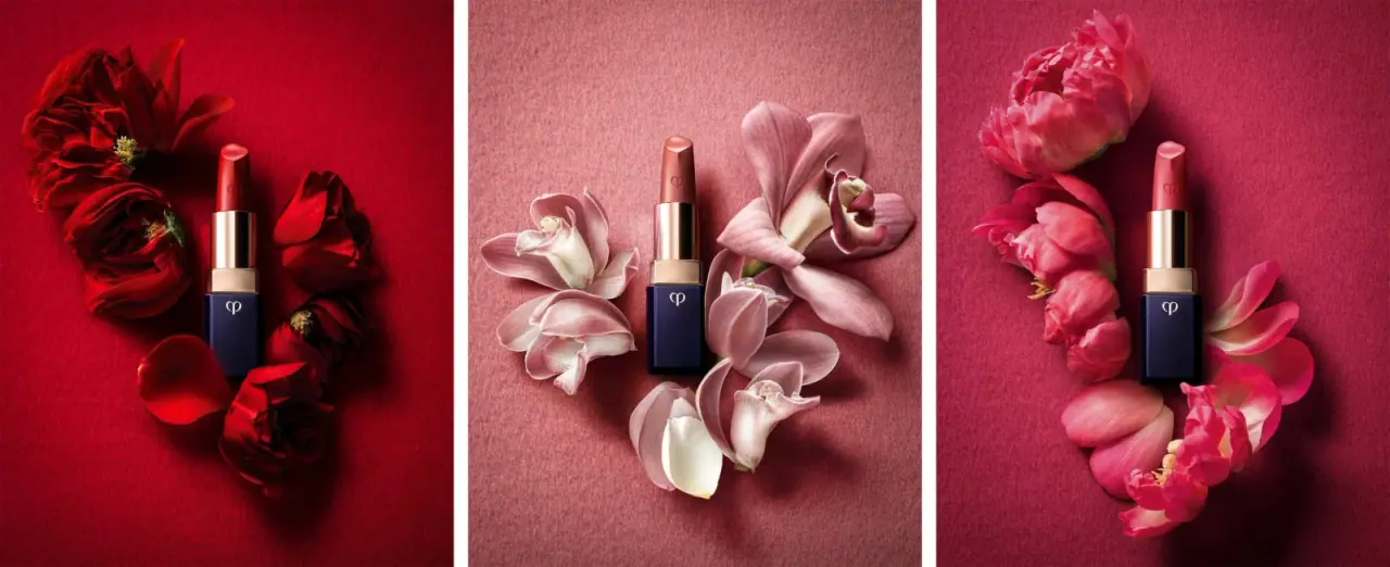
Clé de Peau Beauté
Faceted navy base, reflective gold barrel, discreet repeated emblem

Color Wow
Tall condensed naming on a broad reflective silver jar

Corpus
sage gloss with whispered gold lettering