Byredo
Selected packaging
1 curated reference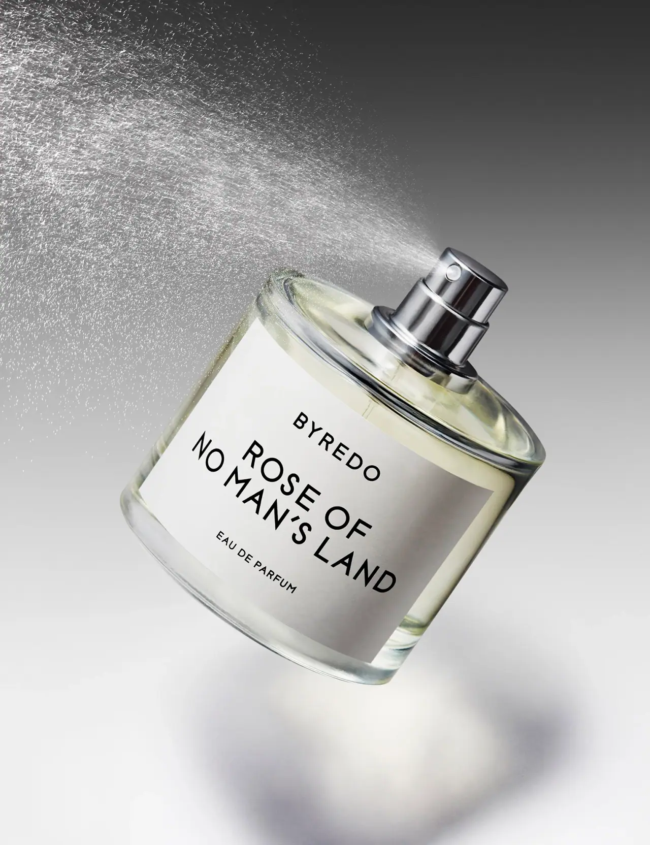
Perfume · Bottle
Rose of No Man’s Land Eau de Parfum
Byredo’s Rose of No Man’s Land uses a restrained fragrance presentation in which label typography remains legible across a close-cropped product view.
Colours in this photograph
Sampled from the curated cover, including background and props. Screen colours, not print specifications.
A closer look
Read the full studyDesign observations from the selected packaging.
Typography bends with the frame
The bottle is rotated so the label becomes a large diagonal plane, and the brand and scent name remain the highest-contrast elements. This gives the close crop a clear reading direction rather than a flat catalogue view.
Label scale and margins
The white panel fills much of the front but leaves a transparent border of glass around it. The margin separates black typography from the pale liquid and preserves the recognizable bottle outline.
More brands to explore
Continue discovering distinctive packaging.