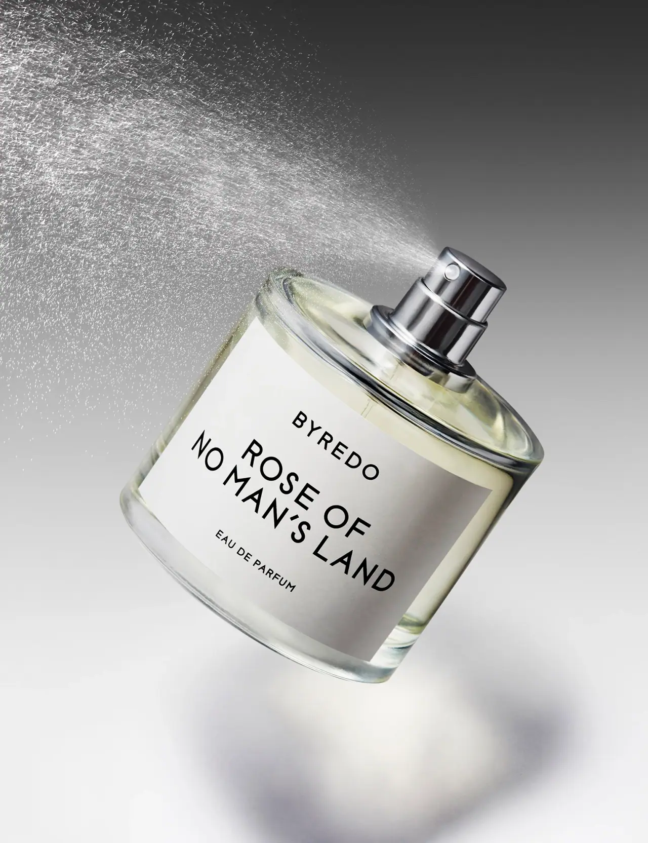
Photography: Josh Caudwell — fragrance still-life photography. Images belong to their respective owners.
Byredo

Broad white fragrance label, clear round bottle, exposed silver atomizer
The selected Rose of No Man's Land photograph reduces the fragrance to three visible elements: a clear rounded bottle, a broad white label and an exposed silver-colored atomizer. Black capitals give the long scent name priority over the smaller maker line and concentration. A visible spray plume introduces movement while the label remains calm and legible. This is a study of Josh Caudwell's uncapped reference; Byredo's current product page explicitly notes a transition between previous and new bottle designs.
- Perfume
- Light pack
- Luxe monochrome
- Clinical minimal
About this study
Josh Caudwell's uncapped Rose of No Man's Land reference. Current brand page acknowledges bottle redesign; selected capacity, cap and exact current equivalence remain unverified.
Sources & evidence · Reviewed 2026-10-19Color Palette
Approximate colours interpreted from photography. These are screen references, not official brand colours or print specifications.
Pack body
Pale liquid appearance
#E2E3C9
Subtle warm tone visible around the white label. This is observed contents appearance, not proof of a tinted bottle.
Label
White label field
#ECECE7
Approximate opaque front panel, creating a stable background independent of the pale liquid and surrounding reflections.
Ink
Black typography
#111210
Maker, fragrance name and concentration share a near-black tone; hierarchy comes from scale, spacing and line breaks.
Accent
Silver atomizer appearance
#B8BDC0
Reflective hardware above the shoulder, with dark and bright bands created by studio light rather than a flat printed color.
Typography
Suggested visual alternatives, not confirmed brand typefaces. Any scale below is an illustrative estimate.
BYREDO sits in spaced uppercase near the top of the label. The fragrance name follows at a larger scale across two lines, with EAU DE PARFUM much smaller below. All three levels use restrained sans-serif capitals, so size and open intervals do the organizational work. The long name is allowed to wrap rather than being reduced to fit one line. Its line breaks create a substantial central text block while the smaller surrounding lines keep enough empty space to distinguish their roles.
Fonts
Original fragrance name
Montserrat
- Looks like
- Plain open geometric sans-serif
- Type
- Geometric sans-serif
- Weight
- Regular, Medium
- Case
- Uppercase
- Tracking
- Moderately open with optical correction
- Fallback
- Arial, sans-serif
Proposed for a new long fragrance name with deliberate line breaks. Preserve clear word grouping rather than copying the source name length and exact two-line composition.
Maker and concentration
Inter
- Looks like
- Quiet neutral sans-serif
- Type
- Neo-grotesque sans-serif
- Weight
- Regular, Medium
- Case
- Uppercase
- Tracking
- Open for a short maker line; natural for concentration
- Fallback
- Arial, sans-serif
Alternative for supporting identity and product-type information. Keep these roles visibly smaller than the fragrance title without making them depend on a different color.
Structure & Proportions
Visual proportions and finish previews are illustrative. Confirmed construction details and uncertainties are distinguished in the study notes.
Proportions
| Purpose | Value | Preview |
|---|---|---|
| Label coverage | The white rectangle occupies much of the visible front while leaving a clear border at the shoulders, sides and base. Exact coverage is not measured. | — |
| Broad bottle stance | The round body appears relatively broad and compact beneath the short neck; the diagonal camera angle prevents reliable dimensional reconstruction. | — |
| Name priority | The two-line fragrance name uses greater cap height and more area than the maker and concentration lines. | — |
| Hardware accent | The exposed atomizer is small compared with the broad label but gains attention through contrast and its position at the origin of the mist. | — |
Shapes
| Element | Value | Preview |
|---|---|---|
| Bottle body | Rounded cylindrical body with a curved shoulder and thick clear-looking lower rim. | |
| White front panel | Broad rectangular label curving around the front of the round vessel. | |
| Atomizer | Short cylindrical button with a circular outlet above a broader reflective neck collar. | |
| Text group | Three centered information levels, with the main scent name spanning two lines. |
Finishes
Clear reflective vessel
Shoulder, sides and base surrounding the opaque label. · transparent
Metallic-looking atomizer
Exposed button and collar; exact material composition unverified. · metallic
Quiet white panel
Front label under studio lighting; no specific uncoated paper or varnish claimed. · matte
Formats and materials
| Formats | Uncapped round fragrance bottle with broad white front panel and exposed spray assembly; selected capacity not readable |
| Materials | The photographed vessel is clear-looking with visible wall depth and a substantial base. Byredo's current product imagery describes glass, but the selected creator image's exact material grade and manufacturing details are not established., The white panel appears opaque; paper stock, film construction, adhesive and coating are not specified., The atomizer has a silver-colored reflective appearance, without evidence identifying its alloy or internal component materials. |
| Closures | The visible assembly has a cylindrical spray button, small circular front outlet and broader collar at the neck. No cap is shown. The current brand page says its black cap is retained through a bottle redesign, but this study does not reconstruct that absent component or infer how it attaches. |
| Decoration | Small uppercase maker line, Larger two-line fragrance name, Small concentration line, No visible border ornament, illustration or colored variant badge |
Front Panel
Schematic reading order. The diagram’s zone heights do not represent measured artwork proportions.
A single white rectangle provides the complete visible reading surface. The maker, larger scent title and smaller concentration form a centered vertical hierarchy with generous intervals. Because the bottle is tilted, the panel becomes a diagonal plane in the image; the artwork itself is not printed diagonally relative to the bottle. The opaque field prevents pale liquid and complex reflections from disrupting most of the text.
| Zone | Content |
|---|---|
| Maker | BYREDO appears near the top in smaller spaced capitals, identifying the brand without consuming the largest type area. |
| Fragrance name | The larger uppercase scent title occupies the center and wraps over two lines. The line break is part of a deliberate reading block, not a separate variant badge. |
| Concentration | EAU DE PARFUM sits lower at a small size, clearly separated from the evocative name. |
| Clear perimeter | The visible vessel border around the label preserves the bottle outline and a glimpse of the contents without requiring transparent text areas. |
Range System
The current official page lists several capacities and explicitly acknowledges old and new bottle designs during a transition. None of those current sizes can be assigned to this selected photograph from its visible label. The study therefore extracts a limited principle: a stable white reading field can carry different name lengths while the surrounding vessel remains visible. It does not define a single immutable Byredo bottle specification.
- For an original fragrance family, test long names with intentional line breaks rather than reducing them until every variant has the same line length.
- Preserve a clear maker/name/concentration hierarchy when changing bottle size, but recheck margins against the new curvature.
- Document redesign editions separately so an older photograph is not silently used as a current dimensional reference.
Back of Pack & Shelf
No reverse, underside, cap or carton is visible in the selected composition. Quantity, ingredients, batch marks and retail box information remain undocumented.
- Obtain a base or reverse view before assigning the photographed capacity.
- Inspect the actual edition's cap and neck interface before describing retention or refillability.
- Do not import current carton graphics into this older creator reference without a matching source.
On shelf
Interpretively, the white panel creates a reliable high-contrast reading area that can survive close cropping and changes in liquid color. The broad scent name may be recognized before the smaller maker line. The uncapped shot communicates fragrance function through exposed hardware, but it cannot show the recognition contribution of the absent closed cap or retail box. An original adaptation should be checked in both complete and open presentations.
Imagery
The bottle tilts diagonally above a soft shadow against a neutral gray background while a bright mist fans out from the exposed atomizer. The dynamic spray contrasts with the quiet rectangular label. Backlighting makes individual droplets visible and gives the hardware crisp reflections. This is a styled motion image, not a measured specification for spray angle, droplet size, dose or normal storage orientation.
Guidelines
Editorial principles for an original design brief, not official brand guidelines.
Do
- Give long fragrance names intentional line breaks.
- Leave a visible vessel border around an opaque label.
- Distinguish photographic tilt from printed orientation.
- Keep redesign editions and current source claims separate.
- Test a label both with and without the closed cap in view.
Don't
- Do not assign the current default 50 mL size to this image without evidence.
- Do not infer exact atomizer metals or spray metrics.
- Do not reconstruct the absent black cap from memory.
- Do not copy the BYREDO wordmark or label proportions.
- Do not treat a stylized mist plume as a performance test.
Sources & evidence
- Byredo — Rose of No Man's Land Eau de Parfumproduct
- Josh Caudwell — Product and fragrance photographyphotographer
How this study was built
edition · Sourced fact
Official product page confirms the fragrance and explicitly notes previous and new bottle designs during a transition.Byredo — Rose of No Man's Land Eau de Parfumstructure · Visual observation
Selected image shows a clear rounded bottle with exposed reflective atomizer and no cap.Josh Caudwell — Product and fragrance photographylabel · Visual observation
Broad white panel leaves a visible transparent-looking shoulder, side and base perimeter.Josh Caudwell — Product and fragrance photographytypography · Visual observation
Smaller maker capitals lead a larger two-line scent name and small concentration line.Josh Caudwell — Product and fragrance photographypalette · Visual observation
White panel and black text dominate, with pale contents and silver-colored hardware as secondary appearances.Josh Caudwell — Product and fragrance photographyimagery · Visual observation
Diagonal bottle and backlit spray create motion while the label remains readable; no spray metrics are inferred.Josh Caudwell — Product and fragrance photographyrange · Editorial interpretation
An opaque reading field can support name variation in an original range, without asserting universal Byredo dimensions or edition continuity.
What remains unverified
- Exact selected capacity and edition date not established.
- Current source notes previous/new bottle transition.
- Label stock, adhesive, hardware composition and mechanism unspecified.
- Cap, reverse, underside and carton absent.
- Fonts, dimensions and spray performance are not measured.
Give your AI
packaging taste
Give your design or image tool a packaging study: palette, type, structure, front panel and principles for an original brief.
Export this styleFree with an email. PACK.md works in Claude, ChatGPT, Cursor and image tools.
More like this

African Botanics
Technical black label with a low serif signature

bareMinerals
a restrained black compact framing the powder itself

BeautyPWR
Clear square shell, white cream cup, black serif identity

Corpus
sage gloss with whispered gold lettering

Costa Brazil
Pale matching vessels with small, deliberate bilingual labels

Crown Affair
Pale frosted-looking bottle, black pump and small looping emblem

HAKU
Pearly narrow tube with stacked serif identity and clear base

Haus Labs
mirror chrome hardware over frosted shade