Function of Beauty
Selected packaging
1 curated reference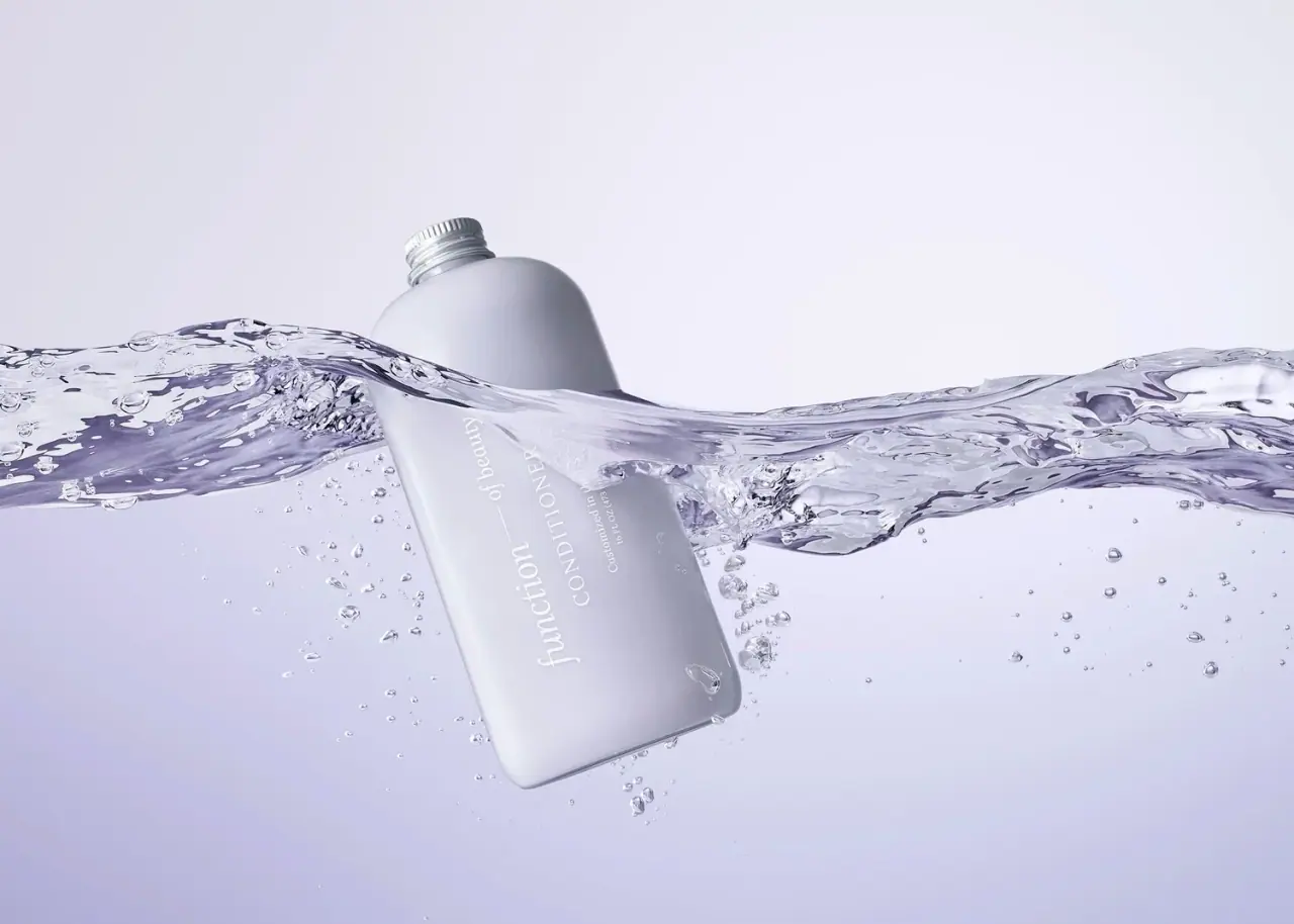
Haircare · Bottle
Custom Conditioner — Earlier Purple Packaging
Function of Beauty’s conditioner bottle is pictured half-submerged, with its gray-lavender body and white lettering softened by the water and lighting. The clean front panel remains visible through the image’s muted, aquatic palette.
The cover’s underwater lighting softens the bottle color; the catalog calls this an earlier purple treatment.
Colours in this photograph
Sampled from the curated cover, including background and props. Screen colours, not print specifications.
A closer look
Read the full studyDesign observations from the selected packaging.
Personalized label hierarchy
The front gives Function of Beauty the largest typographic role, followed by conditioner and the customization statement. This keeps the product category visible even when the personalized content is not legible in the campaign shot.
Submerged photography
A water sweep crosses the bottle and partly obscures it, turning a straightforward container into a movement-led campaign image. The white vertical lettering stays readable where it sits against the bottle, but the composition is less suited to inspecting variant details.
More brands to explore
Continue discovering distinctive packaging.