Photography: Aurélie Graillot portfolio photography. Images belong to their respective owners.
Function of Beauty

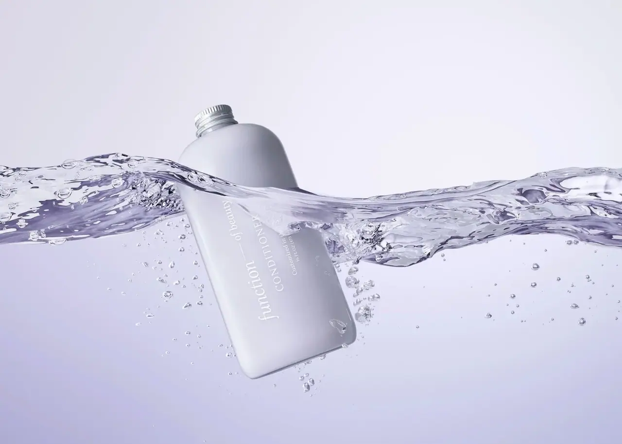
Lavender bottle with longitudinal white serif lettering
The selected earlier conditioner bottle has a broad rounded rectangular face, a pale lavender-grey body and a small silver-coloured ribbed cap. White serif lettering runs along the body’s long axis, with the producer line larger than the category and customization statement. A moving waterline crosses the bottle in the approved photograph. The visible 16 fl oz / 473 ml size belongs to this archival specimen; the current official conditioner page lists a different 11 oz format.
- Hair
- Light pack
- Pastel soft-touch
- Bold typographic
About this study
Earlier 16 fl oz / 473 ml lavender conditioner bottle in Aurélie Graillot water photograph; current 11 oz listing is contextual only.
Sources & evidence · Reviewed 2026-10-19Color Palette
Approximate colours interpreted from photography. These are screen references, not official brand colours or print specifications.
Pack body
Cool lavender-grey
#BEBCCC
Approximate body colour in the aquatic photograph. The photographer identifies it as lavender; lighting and refraction prevent a production colour match.
Ink
White serif lettering
#F3F3F2
The sole clearly visible front text colour, used for producer, category, customization and quantity.
Accent
Silver cap appearance
#A8ACB1
Approximate ribbed cap appearance, with brighter reflections on the raised edges. This does not establish an aluminium or other metal specification.
Typography
Suggested visual alternatives, not confirmed brand typefaces. Any scale below is an illustrative estimate.
The main line reads function followed by a fine connecting rule and smaller of beauty. Its lower-case serif voice is paired with an uppercase CONDITIONER line and a smaller customization statement. All lines follow the bottle’s long axis rather than a conventional short horizontal label across its width. The producer therefore occupies a long reading span while the category remains compact and clearly separate. The rotated photographic pose adds another angle, but the longitudinal orientation is part of the actual pack artwork.
Fonts
Producer alternative
Libre Baskerville
- Looks like
- Libre Baskerville
- Type
- Serif
- Weight
- Regular 400
- Case
- Lowercase
- Tracking
- Neutral to slightly close
- Fallback
- serif
Use a distinct lower-case serif producer name with controlled spacing. A fine connector can express a relationship between words, but the exact function-of-beauty construction should not be copied.
Category and small text alternative
Lora
- Looks like
- Lora
- Type
- Serif
- Weight
- Regular 400 / Medium 500
- Case
- Uppercase category; sentence-case secondary copy
- Tracking
- Modestly open capitals, neutral small text
- Fallback
- serif
A readable serif option for the category and short supporting lines. Test white strokes on pale material under wet conditions because this palette has limited tonal contrast.
Structure & Proportions
Visual proportions and finish previews are illustrative. Confirmed construction details and uncertainties are distinguished in the study notes.
Proportions
| Purpose | Value | Preview |
|---|---|---|
| Broad front face | The flattened-looking body offers a wide uninterrupted area, while soft corners prevent a rigid rectangular impression. | — |
| Longitudinal copy block | The text follows the long dimension, leaving generous pale space beside the main identity rather than filling the full face. | — |
| Small closure | The short cap is narrow relative to the bottle body and remains visually secondary to the long white lettering. | — |
Shapes
| Element | Value | Preview |
|---|---|---|
| Bottle face | Tall rounded rectangle with a broad softly curved shoulder. | |
| Cap | Short ribbed screw-style closure with a silver appearance. | |
| Identity connector | Thin straight rule joining the two parts of the producer line. |
Finishes
Muted pastel body
Bottle face; smooth appearance, coating and tactility unverified. · matte
Reflective silver cap
Ribbed closure; material unknown. · metallic
Formats and materials
| Formats | A broad flattened-looking bottle with a rounded rectangular face, softened shoulder and short central neck. The front visibly states 16 fl oz / 473 ml., The current official custom conditioner listing states 11 oz. That current size is contextual evidence and must not replace the quantity visible on this earlier bottle. |
| Materials | The approved photograph and accessed current product page do not verify the substrate of this earlier bottle or the composition of its silver-coloured cap., An opaque-looking pastel body may be coloured substrate, coating or another construction. No material or recycled-content claim is assigned from the image alone. |
| Closures | A short ribbed screw-style cap sits above the rounded shoulder, with thread-like rings visible around the neck area. The top remains closed; liner, seal and dispensing opening are not visible. No pump is fitted in this selected image. |
| Decoration | White longitudinal lettering forms the visible front decoration. There is no distinct bordered paper label or pictorial illustration visible., The producer line contains a thin rule between its differently sized word groups, creating a simple typographic connection without a decorative badge. |
Front Panel
Schematic reading order. The diagram’s zone heights do not represent measured artwork proportions.
The front uses a small number of parallel text lines arranged along the long body dimension. The producer has the largest letters, the uppercase category follows, and the customization statement and quantity sit at a smaller size. This orientation turns a large bottle face into a restrained typographic plane. The water wave partly interrupts the upper text, so the photograph cannot serve as a complete transcription of every small line.
| Zone | Content |
|---|---|
| Producer line | Lowercase function is followed by a fine rule and smaller of beauty. The unequal word sizes create hierarchy within one line. |
| Product category | CONDITIONER appears in uppercase serif lettering parallel to the producer. Its consistent orientation keeps the unusual layout coherent. |
| Customization statement | The visible front includes Customized in the USA. No individual customer name or readable hair-goal list is established in this image. |
| Quantity | 16 fl oz / 473 ml appears beneath the small statement. This observed archival quantity is kept separate from the current product page’s 11 oz listing. |
Range System
The current official page confirms a custom conditioner proposition, while the photographer’s portfolio identifies the selected image as a lavender conditioner bottle and includes other Function of Beauty imagery. This study does not derive a full colour-to-hair-type system from those captions. The archive title’s purple wording is treated as a catalogue descriptor, with lavender-grey used for the observed colour.
- A bespoke haircare range can reserve a stable location for product category while allowing verified personalization elsewhere. This image does not prove which personal fields were printed for a particular customer.
- A longitudinal layout can transfer across compatible bottle sizes only after testing reading distance and curvature. Scaling every line mechanically would risk making the smallest white copy disappear on the pale ground.
Back of Pack & Shelf
The reverse and narrow side faces are not visible. The photograph does not establish ingredient layout, directions, batch information or recycling symbols. Current website content cannot reconstruct an earlier printed back.
- Obtain a dated reverse view before documenting the historical ingredient or instruction panel.
- Keep material and recycling information unassigned until the actual edition is documented.
- Verify any personalised field with a legible label photograph rather than inferring it from the custom-product proposition.
On shelf
The broad pastel silhouette and white longitudinal lettering provide recognition without a large badge or illustration. Low contrast makes the result sensitive to lighting: the producer can remain legible in a large image while small supporting text fades quickly. This is an interpretation of the photograph, not a measured usability result. A catalogue should pair this expressive water scene with a dry front view and a dated product record to clarify both colour and edition.
Imagery
A horizontal wave crosses the diagonally suspended bottle, with bubbles around the lower body and a pale lavender background. The cap and upper shoulder remain above the waterline, while the front lettering is partly refracted beneath it. The photographer’s own caption describes the lavender conditioner in a wave of water and bubbles, supporting the scene identification. The wave is not a printed graphic, and its darker violet edges should not become extra package colours.
Guidelines
Editorial principles for an original design brief, not official brand guidelines.
Do
- Keep the archival 16 fl oz quantity distinct from the current 11 oz listing.
- Test white serif strokes under wet and dry lighting.
- Preserve a clear product-category line within a personalised system.
- Use a neutral dry photograph to verify colour and small copy.
Don't
- Do not infer aluminium, plastic or recycled content from appearance.
- Do not call the body soft-touch without tactile or source evidence.
- Do not invent a customer name or hair-goal list hidden by water.
- Do not treat the wave or its dark edges as printed decoration.
Sources & evidence
- Custom Conditioner — Function of Beautyproduct
- Beauty photography — Aurélie Graillotphotographer
How this study was built
edition · Sourced fact
Current official custom conditioner page lists 11 oz, which differs from this photographed earlier quantity.Custom Conditioner — Function of Beautyimagery · Sourced fact
Photographer explicitly captions a lavender conditioner suspended in a wave of water and bubbles.Beauty photography — Aurélie Graillotstructure · Visual observation
Rounded rectangular bottle, short ribbed cap and 16 fl oz / 473 ml front line are visible.typography · Visual observation
White serif lines follow the long axis; producer is larger than category and supporting copy.label · Visual observation
No readable customer name or hair-goal list appears in the water-obscured front.palette · Visual observation
Body reads lavender-grey with white lettering and silver cap; water changes apparent hue.range · Editorial interpretation
One archival bottle does not establish a universal colour-to-formula system.
What remains unverified
- Earlier body and cap materials and finish process unverified.
- Current official size differs from the photographed archival quantity.
- No dated original packaging specification, reverse or personalised fields verified.
- Fonts are proposed alternatives; water affects colour and legibility.
Give your AI
packaging taste
Give your design or image tool a packaging study: palette, type, structure, front panel and principles for an original brief.
Export this styleFree with an email. PACK.md works in Claude, ChatGPT, Cursor and image tools.
More like this

Bread Beauty Supply
bubblegum pumps and a fat black wordmark
Dae
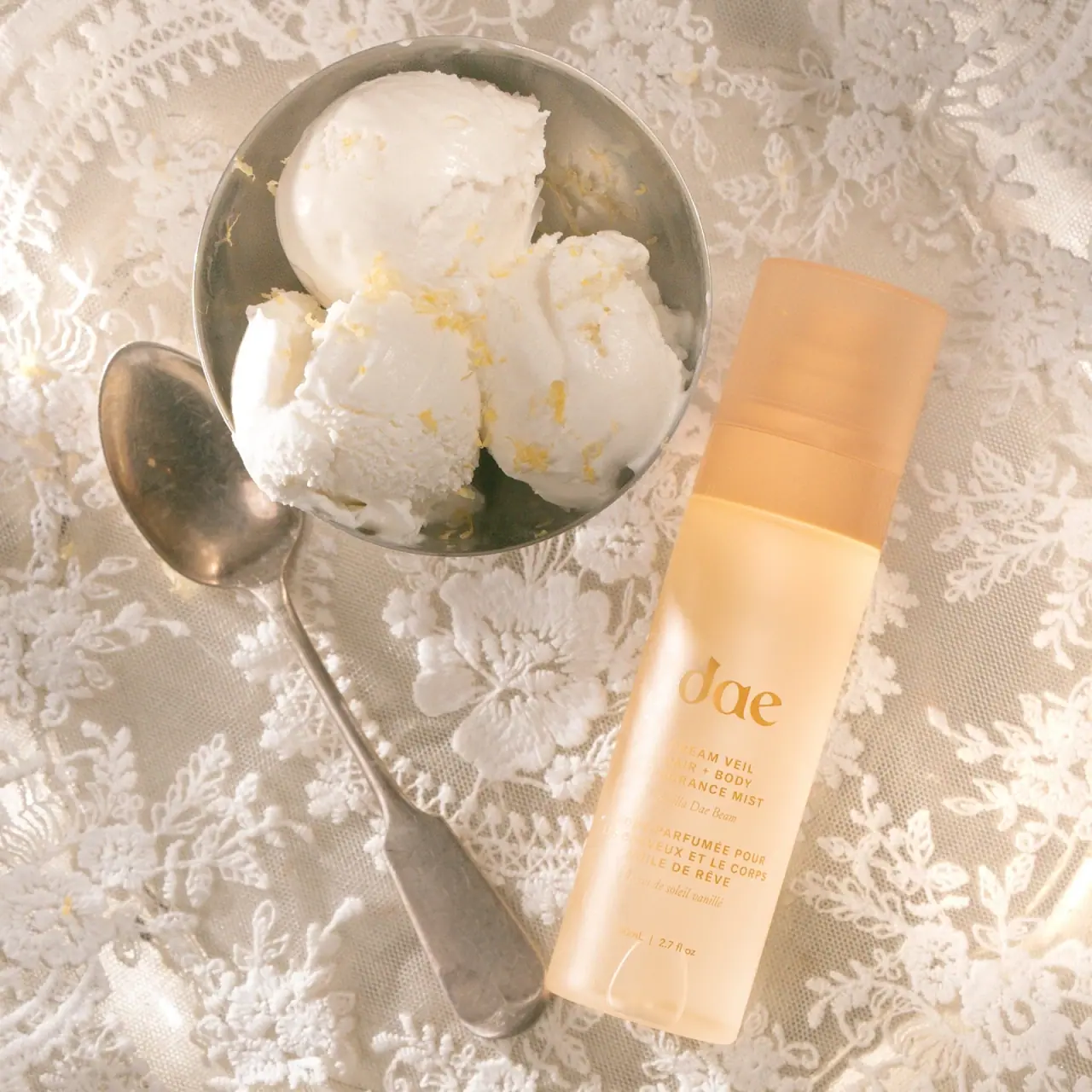
Warm translucent mist with tonal lettering and bilingual rhythm

Fenty Beauty
faceted caps and wide-spaced lilac capitals
Go-To
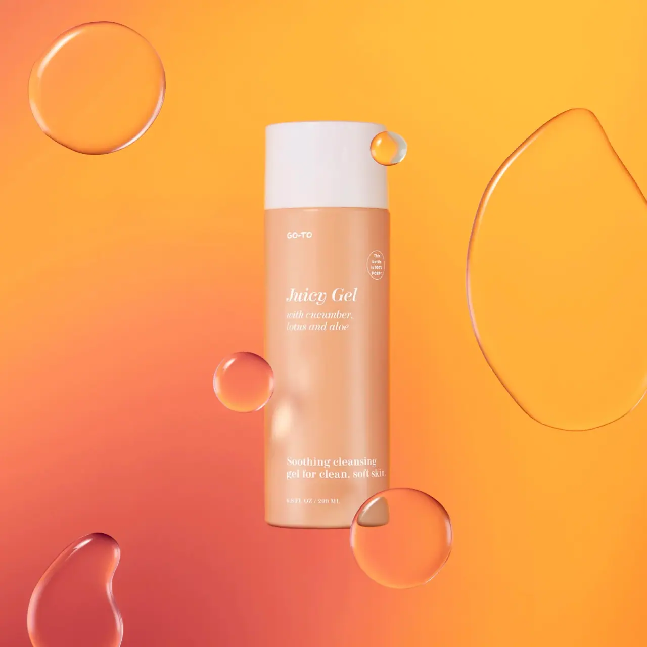
Peach cylinder, white cap and airy italic serif copy

Kosas
lavender chrome and candy-pink acrylic
LAWLESS
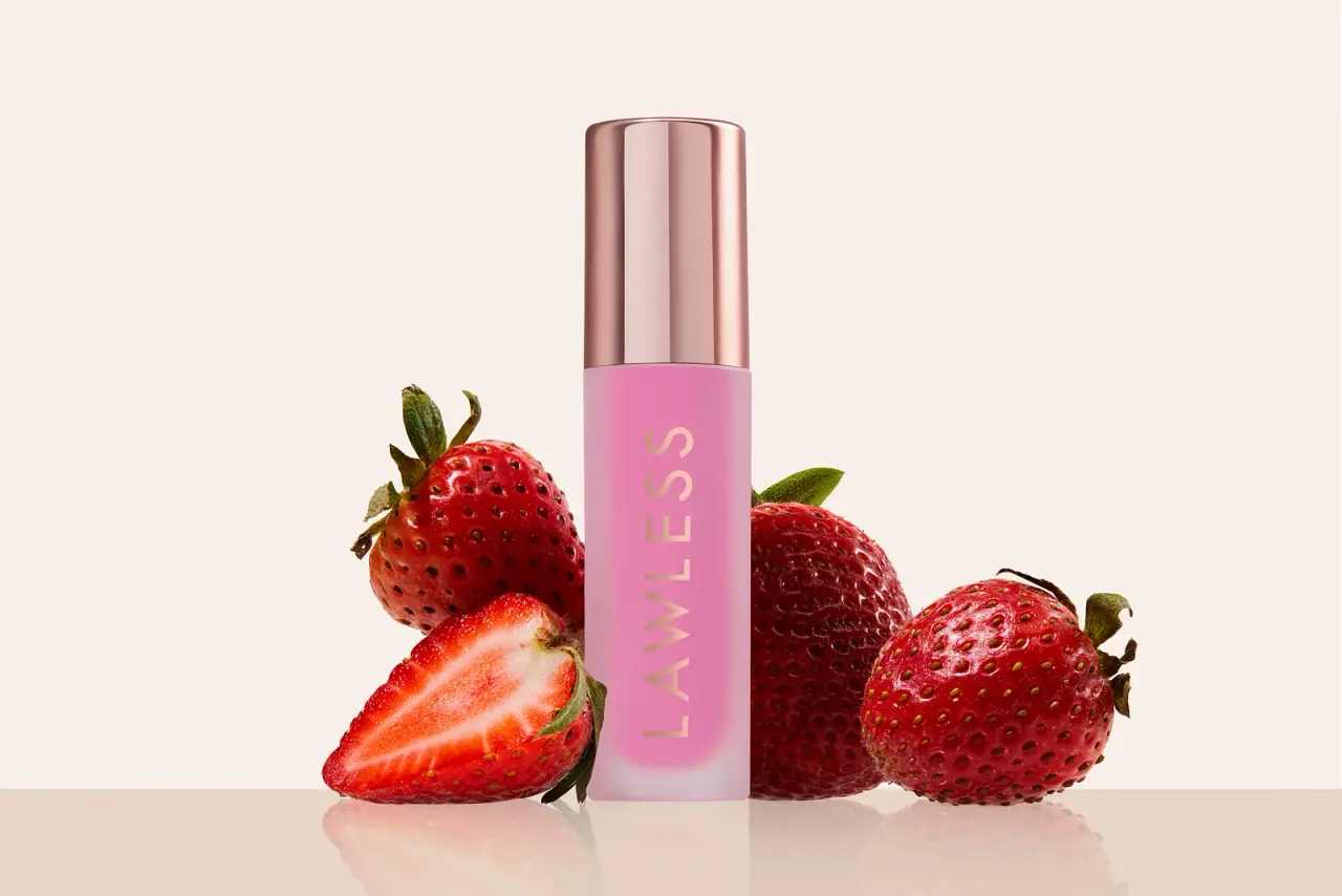
Pink diffused gloss vial with a reflective rose-toned cap
Odyskin
Mint tube with rotated serif lettering and circular protection badge
Overose
Lavender glossy cylinder with a spare black-and-white scent label