About this packaging
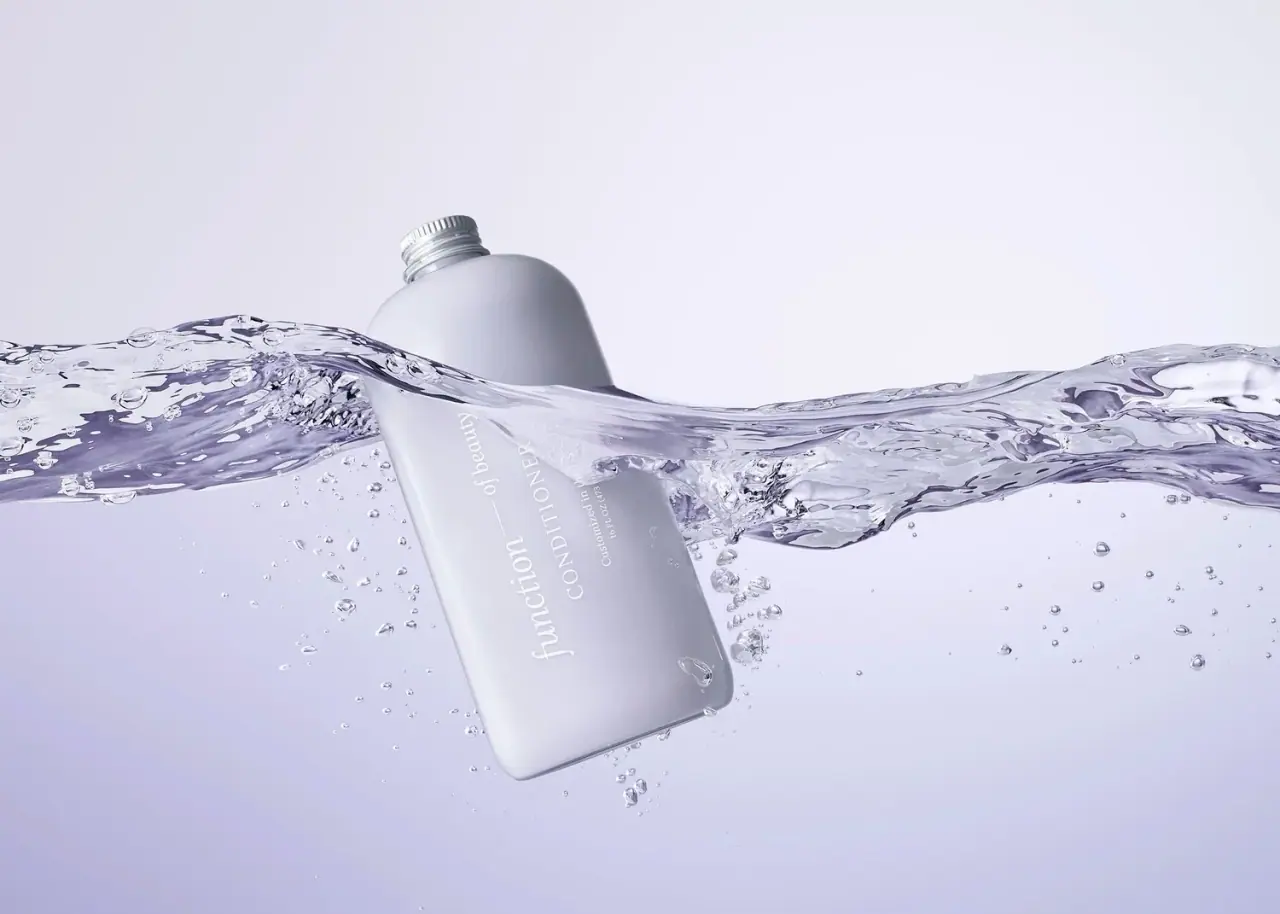
Function of Beauty’s conditioner bottle is pictured half-submerged, with its gray-lavender body and white lettering softened by the water and lighting. The clean front panel remains visible through the image’s muted, aquatic palette.
Function of Beauty describes its conditioners as personalized hair-care products, with formulas and labels tailored to customer preferences.[1]
Edition note. The cover’s underwater lighting softens the bottle color; the catalog calls this an earlier purple treatment.
Pack construction & use
- Container
- The cover shows a rounded rectangular bottle with CONDITIONER on the front and a 16 fl oz / 473 ml line near the base.Observed in the reference photograph
- Customization
- The official product page describes the product as custom conditioner. The visible front text includes “Customized in the USA”; no individual hair-goal label is legible in the selected image.[1]
- Edition
- The archive listing labels this a purple earlier-package reference, whereas the selected cover reads as pale cool gray/lavender. The older variant cannot be independently confirmed from current brand documentation.Observed in the reference photograph
What makes the design work
Editorial analysis of this packaging reference.
Personalized label hierarchy
The front gives Function of Beauty the largest typographic role, followed by conditioner and the customization statement. This keeps the product category visible even when the personalized content is not legible in the campaign shot.
Submerged photography
A water sweep crosses the bottle and partly obscures it, turning a straightforward container into a movement-led campaign image. The white vertical lettering stays readable where it sits against the bottle, but the composition is less suited to inspecting variant details.
Archive color caution
The catalogue title associates the pack with purple, while this cover’s lighting and water tint it pale violet. Without an archived manufacturer image or dated source, treat the hue as an image observation rather than a reliable edition specification.
Ideas for your next brief
- Keep the product type prominent when customer-specific formula details vary.
- Check color against neutral product imagery before using a strongly color-graded campaign image as an archive reference.
Sources & further reading
Researched 19 October 2026