Hiyo
Soft drinksUnited States
Selected packaging
1 curated reference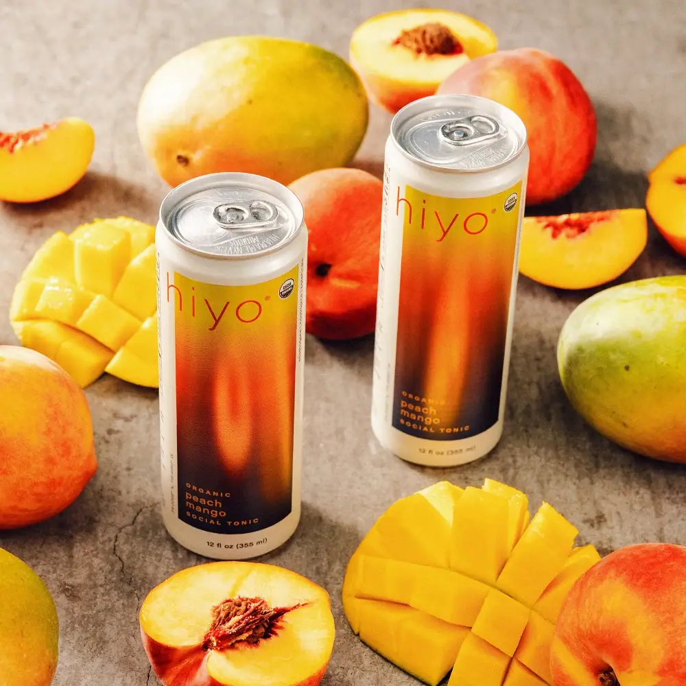
Soft drinks · Can
Peach Mango
Hiyo’s Peach Mango social tonic uses a slim can with a cream border framing a saturated fruit-color gradient. The selected campaign image repeats the flavor’s peaches and mangoes around the can, making the color field and ingredient cues work together.
Colours in this photograph
Sampled from the curated cover, including background and props. Screen colours, not print specifications.
A closer look
Read the full studyDesign observations from the selected packaging.
A gradient carries the flavor palette
The panel shifts through yellow, orange and deep plum, connecting bright fruit colors to the can’s tall vertical form. The cream frame keeps the saturated field contained and visually distinct.
Small type creates a relaxed hierarchy
The fine lowercase wordmark does not overpower the composition. The flavor is stacked in short lines near the base, allowing the gradient itself to provide the immediate visual signal.
Product archive 1
Additional Hiyo catalogue entries. These are separate from the curated selection.
1 product
More brands to explore
Continue discovering distinctive packaging.