Photography: Hiyo official photography. Images belong to their respective owners.
Hiyo

a warm fruit gradient framed with quiet cream
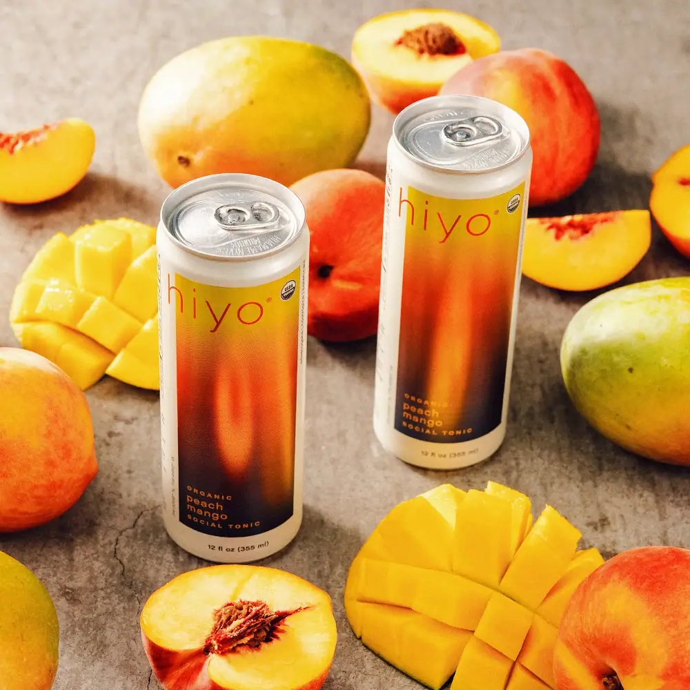
Peach Mango uses a slim can as a frame for a tall, saturated colour field. The panel glows yellow at the top, warms through orange and deepens toward a dark plum base, while pale cream bands and side borders keep it contained. A fine lowercase wordmark occupies the upper area; much smaller flavour text sits near the lower left. The contrast between luminous colour and restrained typography is the defining move. This study concerns the selected Peach Mango can, not a universal specification for every Hiyo flavour or packaging generation.
- Soft drinks
- Light pack
- Colour-coded range
- Playful colour
About this study
Selected Peach Mango 12 fl oz can artwork in the approved official two-can fruit photograph. Other flavour names supply range context only, not a comprehensive colour-system audit.
Sources & evidence · Reviewed 2026-10-19Color Palette
Approximate colours interpreted from photography. These are screen references, not official brand colours or print specifications.
Pack body
Cream frame
#E9DEC6
Approximate pale border and upper/lower body bands. This is part of the can graphics, unlike the surrounding stone-coloured photographic ground.
Label
Golden gradient top
#E6BA19
Approximate warm yellow at the top of the front panel; its position is part of a continuous gradient, not a solid spot-colour specification.
Orange glow
#DF6C23
Approximate central luminous orange. Uneven vertical glow gives the panel depth without a literal fruit illustration.
Deep plum base
#302126
Approximate lower dark field behind small flavour text. It creates a contrast endpoint within the gradient.
Ink
Red-orange wordmark
#C94F1C
Approximate fine lowercase identity over the lighter upper field; no original ink standard is established.
Typography
Suggested visual alternatives, not confirmed brand typefaces. Any scale below is an illustrative estimate.
The wide, fine lowercase hiyo wordmark reads first as a light linear gesture near the panel top. It is large in width but not heavy in stroke. Organic, peach, mango and social tonic form a small lower-left stack, using a more substantial weight and short line lengths. The volume sits outside the gradient on the cream base band. This creates three reading zones without enclosing each in a separate badge or box.
Fonts
Light identity alternative
Raleway
- Looks like
- Raleway Light for an airy geometric name
- Type
- Geometric sans serif
- Weight
- Light
- Case
- Lowercase
- Tracking
- Open but optically balanced
- Fallback
- Arial, sans-serif
Explore a broad, light-stroke original name over the brightest part of a gradient. Check that thin lines remain visible on printed material and at thumbnail scale; avoid copying the hiyo letter shapes.
Flavour information alternative
DM Sans
- Looks like
- DM Sans for compact rounded supporting text
- Type
- Low-contrast sans serif
- Weight
- Medium and Bold
- Case
- Lowercase flavour with short uppercase descriptors
- Tracking
- Normal for flavour, moderately open for short descriptors
- Fallback
- Arial, sans-serif
Give the flavour a compact stacked block in a contrasting warm tone. Test the dark gradient behind it so variation in print does not make small letters disappear.
Structure & Proportions
Visual proportions and finish previews are illustrative. Confirmed construction details and uncertainties are distinguished in the study notes.
Proportions
| Purpose | Value | Preview |
|---|---|---|
| Panel orientation | The colour field is tall and narrow, following the upright can. Pale side margins separate it from information curving out of frontal view. | — |
| Type versus colour | Most of the panel remains available for the gradient. Large wordmark width is balanced by fine strokes rather than a heavy block of lettering. | — |
| Lower band | A cream strip below the panel holds volume information and gives the dark gradient a clean endpoint before the base. | — |
| Cylinder distortion | The front panel edges curve with the can in perspective. No flat artwork width or coverage percentage has been measured. | — |
Shapes
| Element | Value | Preview |
|---|---|---|
| Can | Tall slim cylinder with slightly narrowed upper shoulder and recessed top end. | |
| Front panel | Vertical rectangular colour field within a pale frame. | |
| Small upper mark | Circular certification-looking device near the wordmark; not an invented decorative seal. |
Finishes
Printed gradient appearance
Main colour panel; print technology and protective coating are unverified. · matte
Reflective end appearance
Visible top and ring-pull tab; no alloy specification is inferred. · metallic
Formats and materials
| Formats | Selected object: slim cylindrical beverage can with a visible pull-tab end; the front base band reads 12 fl oz / 355 mL. |
| Materials | The silver-looking end is visible, but no formal substrate or alloy specification was identified in the consulted product content. The body decoration method is also unverified. |
| Closures | A conventional-looking ring-pull tab sits within the recessed top end, surrounded by a raised rim. The image reveals the opening interface but does not establish end dimensions, coating, liner composition or manufacturing supplier. |
| Decoration | Tall rectangular gradient field contained by cream margins., Fine lowercase name high on the panel, small flavour stack low on the left., Small circular certification-looking mark near the upper right and a separate base volume line. |
Front Panel
Schematic reading order. The diagram’s zone heights do not represent measured artwork proportions.
The front uses a contained rectangular panel, leaving cream visible around it. Identity and flavour occupy opposite ends of the vertical field, while volume moves below the panel. The gradient itself supplies the middle content, so the face does not require an illustration, slogan or large benefit statement to feel complete. Side text is partly visible but not reconstructed.
| Zone | Content |
|---|---|
| Upper identity | Fine lowercase hiyo name crosses the lighter yellow area. A small circular mark sits near its right side. |
| Colour interval | A long transition through orange into dark plum occupies most of the centre. It provides mood and flavour association without literal fruit graphics. |
| Lower flavour stack | Small organic descriptor above stacked peach and mango words, followed by social tonic. The block sits toward the left of the dark lower panel. |
| Base information | 12 fl oz / 355 mL appears on the pale band below, separated from the flavour artwork. |
| Curved side | Fine text extends along the can side, but its content and full organisation are outside this frontal study. |
Range System
The official page lists other fruit pairings, including Blackberry Lemon and Watermelon Lime. That establishes a flavour-naming family, but this study does not inspect their artwork. A fixed frame with changing gradient colours is a plausible transferable approach, not a verified universal Hiyo production rule.
- Peach Mango: the selected warm yellow, orange and dark lower-field composition.
- Blackberry Lemon and Watermelon Lime: officially named flavours, without assigning them uninspected palettes here.
- Interpretation: an original range should pair colour differentiation with explicit flavour names so colour is not the only identification cue.
Back of Pack & Shelf
A complete reverse view is not part of the selected image. The official webpage provides ingredients and nutrition information, but that does not establish their exact printed arrangement on this can. Barcode, seam and manufacturing-code locations remain unverified.
- Inspect a reverse image or approved dieline before positioning a nutrition panel.
- Keep mandatory information legible when translating the gradient idea to a new drink.
- Do not turn the visible circular mark into a generic certification device for an unverified product.
On shelf
Interpretation: the bounded gradient should create a recognisable vertical block among other cans, and the cream margins may keep the front readable in a crowded image. Fine wordmark strokes could become vulnerable at small scale, while the lower flavour stack asks for closer reading. An original design should test both cold-shelf visibility and a small e-commerce thumbnail, especially where gradients become darker in print.
Imagery
Two cans of the same flavour sit among whole and cut peaches and mangoes on a textured neutral surface. The orange fruit flesh echoes the printed glow, while the pale can borders keep the packages distinct from the busy scene. Showing two cans reinforces the repeated front system without adding a second brand or flavour. The arrangement communicates fruit flavour; it does not establish that every depicted fruit piece appears in the formulation at a particular quantity. No wellness or functional-effect claims are needed to analyse this packaging.
Guidelines
Editorial principles for an original design brief, not official brand guidelines.
Do
- Give a complex gradient a clear boundary so it reads as an intentional graphic field.
- Separate identity, flavour and volume into distinct reading zones.
- Check thin lettering and small flavour text against actual printed gradient values.
- Keep fruit photography and printed artwork conceptually separate.
Don't
- Do not assume a luminous gradient means foil or holographic material.
- Do not use the scene background as a primary pack swatch.
- Do not copy the Hiyo wordmark, gradient shape or certification marks.
- Do not add unsupported functional or health claims to an original design.
Sources & evidence
How this study was built
edition · Sourced fact
Official page identifies Peach Mango as a non-alcoholic social tonic; the selected front states 12 fl oz / 355 mL.Hiyo — Peach Mango, official product and photographystructure · Visual observation
Slim cylindrical body, pale border and reflective ring-pull end are visible.Hiyo — Peach Mango, official product and photographytypography · Visual observation
Fine wide lowercase identity contrasts with a compact heavier flavour stack at the lower left.Hiyo — Peach Mango, official product and photographylabel · Visual observation
The gradient is bounded by cream; volume sits outside it on the base band.Hiyo — Peach Mango, official product and photographypalette · Visual observation
Cream, yellow, orange, dark plum and warm wordmark tones are approximate pack readings, not fruit or background sampling.Hiyo — Peach Mango, official product and photographyrange · Sourced fact
The page lists other fruit-pair flavour names, without establishing their exact artwork in this review.Hiyo — Peach Mango, official product and photographyimagery · Editorial interpretation
Fruit props echo the artwork colour and clarify flavour; they do not establish quantities or health effects.
What remains unverified
- Original fonts, exact gradient stops, print method and coating are unverified.
- A formal can material specification was not established; incidental image alt text is not treated as a production document.
- Full reverse, seam and manufacturing marks were not inspected.
- No functional-effect claim or health recommendation is inferred from the packaging study.
Give your AI
packaging taste
Give your design or image tool a packaging study: palette, type, structure, front panel and principles for an original brief.
Export this styleFree with an email. PACK.md works in Claude, ChatGPT, Cursor and image tools.
More like this

Culture Pop
fruit-for-an-o wordmark on dewy cans
Olipop
sunny soda fountain in flat colour

Behave
struck-through wordmark on sour neon pouches

Boy Smells
candy-shell flacons over blush pink glass
Brightland
painterly swatches on milk-white glass

Byoma
candy-coloured barrier science on a shelf
Diaspora Co.
marigold tins with a tiger crest
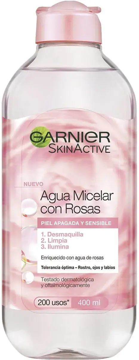
Garnier
green-leaf mark over fruit-bright sub-brand bottles