About this packaging
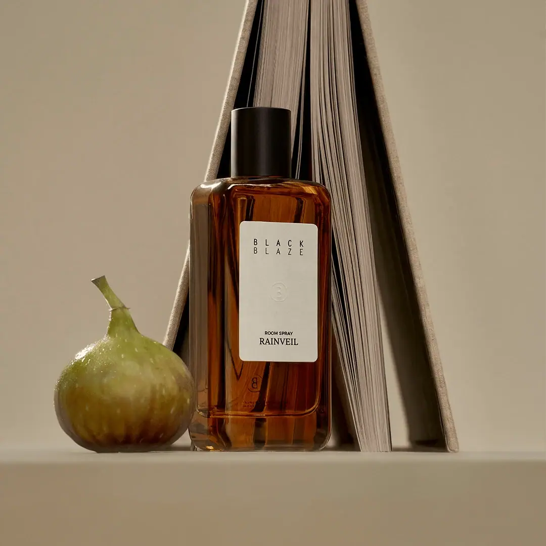
Black Blaze Rainveil Room Spray is shown as an amber-looking rectangular bottle with a black cylindrical cap and a substantial tall ivory label. Widely spaced house lettering, a faint central emblem and a lower category/scent block divide the panel into three quiet zones.
Black Blaze names Rainveil as part of its home-fragrance collection.[1]
Pack construction & use
- Bottle form
- The selected image shows a tall rectangular bottle with rounded corners and a black cylindrical cap.Observed in the reference photograph
- Front label
- A tall ivory rectangle with rounded corners carries the two-line house name, a faint circular emblem and a small category line above the serif Rainveil name. Amber margins remain visible around the substantial central panel.Observed in the reference photograph
What makes the design work
Editorial analysis of this packaging reference.
Space inside the label
The label occupies a substantial central area, but its upper identity and lower product block are separated by a generous quiet interval. Restraint comes from sparse information inside the panel rather than an exceptionally small label.
Centered reading order
Brand sits above the category and product name, with the circular mark acting as a spacer between them. This creates a simple vertical sequence.
Color restraint
The pale label contrasts with the amber-colored appearance of the bottle and black cap. The fig and book in the photograph are styling props, not package decoration.
Ideas for your next brief
- A substantial label can still feel restrained when its information groups have clear positions and generous space between them.
- Use a small emblem as a divider within a vertical label hierarchy instead of adding another graphic element.
Sources & further reading
Researched 19 October 2026