Photography: Black Blaze official photography. Images belong to their respective owners.
Black Blaze

Warm amber, quiet paper and a deliberate vertical rhythm
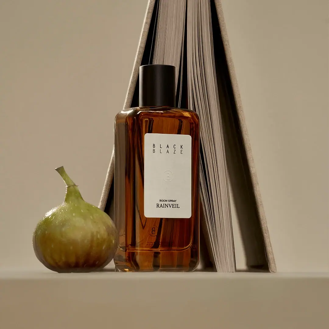
Rainveil Room Spray places a tall ivory label on an amber-looking rectangular bottle, capped by a plain black cylinder. The label is not a tiny badge: it occupies a substantial central part of the front, while a clear-looking perimeter preserves the bottle’s depth. Its widely spaced two-line house name sits high, a faint circular emblem rests in the middle, and the category and serif scent name sit low. The distance between these groups is the principal graphic device. This study follows the selected bottle photograph, where a book and fig create a domestic still life without becoming package decoration.
- Candles & home scent
- Light pack
- Apothecary
- Luxe monochrome
About this study
Selected Rainveil Room Spray bottle with ivory label, central pale emblem and black cap. Only the approved front/side still life is visually analysed.
Sources & evidence · Reviewed 2026-10-19Color Palette
Approximate colours interpreted from photography. These are screen references, not official brand colours or print specifications.
Pack body
Amber optical colour
#8C480E
Approximate midtone from the bottle’s warm transparent-looking body. Formula colour, wall tint and reflected light may all contribute; the image does not establish an amber-coloured resin or glass specification.
Label
Warm ivory
#D7D2BE
The comparatively opaque pale label creates a stable reading area against the varied amber reflections. Its photographed warmth is influenced by the scene, so this is not a paper-stock colour reference.
Ink
Near-black
#191710
Shared visual tone for the label lettering and dark cap. The cap has its own subtle highlights and should not be rendered as a completely flat black cutout.
Typography
Suggested visual alternatives, not confirmed brand typefaces. Any scale below is an illustrative estimate.
The house name uses narrow uppercase letters spread across two short rows. Lower on the label, a very small sans-serif category sits directly above the serif scent name. The scent has a more compact, conventional word shape than the widely spaced house name, so the two can be recognised by texture even before they are read. A large quiet interval between top and bottom makes both groups feel intentional rather than crowded.
Fonts
Spaced house-name alternative
Barlow Condensed
- Looks like
- Barlow Condensed
- Type
- Condensed sans serif
- Weight
- Regular 400 / Medium 500
- Case
- Uppercase
- Tracking
- Generous, especially across short words
- Fallback
- sans-serif
Use for a new two-word house name with narrow letters and carefully balanced spacing. The original two-line wordmark should not be copied; the useful principle is the difference between letter spacing and the compact scent name below.
Scent name
Libre Baskerville
- Looks like
- Libre Baskerville
- Type
- Serif
- Weight
- Regular 400
- Case
- Uppercase
- Tracking
- Neutral to slightly open
- Fallback
- serif
An alternative for the small but distinct serif variant. Keep the actual word legible rather than stretching it to the same width as the house name. The contrast in letter structure adds personality without another colour.
Product category
Inter
- Looks like
- Inter
- Type
- Sans serif
- Weight
- Medium 500 / SemiBold 600
- Case
- Uppercase
- Tracking
- Neutral
- Fallback
- sans-serif
Use for a very short functional descriptor immediately above the scent. It should remain clear in print even though it is subordinate in the hierarchy; the screen photograph provides no verified minimum point size.
Structure & Proportions
Visual proportions and finish previews are illustrative. Confirmed construction details and uncertainties are distinguished in the study notes.
Proportions
| Purpose | Value | Preview |
|---|---|---|
| Bottle | Upright rectangular body with a narrower cylindrical cap and rounded shoulder transitions. Exact capacity and dimensions are not inferred from the fig or book. | — |
| Label | Tall central rectangle covering a substantial portion of the front, with amber margins on every side and a deeper exposed area below. | — |
| Text distribution | A high house-name block and low category/scent block are separated by a long quiet middle zone. The faint emblem occupies that interval without filling it. | — |
Shapes
| Element | Value | Preview |
|---|---|---|
| Bottle | Rectangular front with softened corners and gently rounded shoulders. | |
| Ivory label | Tall rectangle with visibly rounded corners, echoing the softened bottle rather than introducing a hard-edged graphic panel. | |
| Central emblem | Small circular outline with a subtle internal character, visible mainly through tonal relief. | |
| Cap | Simple dark cylinder with a flat-looking top and no visible ornament in this view. |
Finishes
Glossy transparent-looking body
Amber bottle margins, shoulder and base; substrate unverified. · transparent
Low-sheen label
Ivory front field, with faint tactile-looking detail but no confirmed stock or emboss specification. · matte
Restrained dark cap
Closure exterior; a softer reflection than the bottle body. · matte
Formats and materials
| Formats | A tall rectangular spray bottle with rounded shoulders, softened corners and a substantial clear-looking base. Its side is visible, revealing a flattened front-to-back depth rather than a simple cylindrical body. |
| Materials | The photograph reveals a transparent-looking vessel, opaque label and dark cap, but the accessible official collection page does not specify their substrates. Glass, polymer, paper stock and coating composition remain unverified. |
| Closures | A plain cylindrical cap sits over the narrow neck. The spray head is hidden, so nozzle geometry, pump construction and closure attachment cannot be assessed from the selected view. The official collection identifies the object as a room spray. |
| Decoration | Dark lettering is restricted to the upper and lower label zones. A pale central emblem supplies a near-tonal detail rather than a contrasting illustration. A small mark visible through the lower bottle is not sufficiently clear to map as a separate front design element. |
Front Panel
Schematic reading order. The diagram’s zone heights do not represent measured artwork proportions.
The tall pale panel is organised as three separated events: an airy house name, a near-tonal emblem and a compact functional block. Its rounded corners keep the panel visually compatible with the bottle. The layout feels quiet because information is sparse within a substantial label area, not because the label itself is exceptionally small.
| Zone | Content |
|---|---|
| Upper identity | Two rows of spaced narrow capitals establish the brand near the upper edge. Their short line lengths and alignment create a compact rectangular silhouette that echoes the label. |
| Middle emblem | A small faint circle sits in the otherwise open field. It is a close-view detail and should not be relied upon as the only identifier at small image sizes. |
| Lower functional block | The small room-spray category appears immediately above the Rainveil scent name. This keeps format and variant together while giving the serif word a separate typographic voice. |
| Outer margins | The pale panel stops before the shoulders and rounded base. Visible amber areas reveal the container’s physical depth and keep it recognisable as a bottle rather than a flat printed rectangle. |
Range System
The accessible official interior-fragrance collection lists Rainveil among other room sprays, supporting a scent-led offer. The packaging system of the other variants was not independently inspected here. Rainveil demonstrates how a named scent can occupy a predictable lower position while the house identity remains separate above.
- An original extension could retain the top identity, central subtle emblem and lower category/variant grouping, changing the scent name only after checking its length and legibility. This is a design proposal, not a documented Black Blaze production rule.
- The selected label contains no obvious bright variant colour patch. Do not invent a colour code from the green fig: the prop belongs to the photographed setting, and the official Rainveil scent listing does not make that fig an ingredient label.
Back of Pack & Shelf
The back is not presented as a readable panel. Reflected or transmitted marks through the amber body are insufficient evidence for a transcription or exact layout.
- Verify actual quantity, use information and required warnings from production artwork before mapping the reverse.
- Keep any original-design rear text readable against the liquid and tinted wall; an opaque label may be needed depending on the construction.
- Do not infer a refill opening or reusable pump from the simple removable-looking outer cap.
On shelf
The amber, ivory and black combination suggests a familiar apothecary vocabulary, while the spaced two-line name and the long internal pause give this specimen its more specific character. At thumbnail scale, the label shape and dark cap are likely to persist after the faint emblem disappears. This is a visual interpretation, not measured retail evidence. A plain packshot would be useful for comparing the label proportions without the book’s strong vertical background.
Imagery
A book stands partly open behind the bottle, creating a narrow architectural backdrop of pages and a triangular dark gap. A fig sits at the lower left and contrasts its organic rounded surface with the bottle’s upright rectangle. The earthy background lets the ivory label remain the brightest stable graphic area. Side lighting exposes the vessel’s depth and gives the central emblem a faint shadow. These props establish a domestic mood; they do not verify the bottle materials, fragrance ingredients or a connection to books in the printed identity.
Guidelines
Editorial principles for an original design brief, not official brand guidelines.
Do
- Preserve a substantial label field with generous internal space rather than making every element smaller.
- Keep category and scent together at the lower label edge, with enough margin to avoid a cramped footer.
- Test the subtle central emblem under different lighting before treating it as an essential recognition cue.
- Separate the atmospheric styling palette from the actual bottle, label and ink colours.
Don't
- Do not call the label a tiny badge or imply that most of the frontal face is blank bottle.
- Do not infer glass, paper grade or embossing from amber transparency and relief-like shadows.
- Do not treat the photographed fig as a verified Rainveil ingredient claim.
- Do not place key product information on the strongest reflective bottle margins when the pale label offers clearer contrast.
Sources & evidence
How this study was built
edition · Sourced fact
The official room-fragrance collection lists Rainveil Room Spray; the selected front visibly carries that name.Black Blaze — Interior Fragrance Spray collectionstructure · Visual observation
Tall softened rectangular vessel, black cylindrical cap and substantial ivory label are visible.label · Visual observation
The label has separate upper house, faint middle emblem and lower category/scent zones.typography · Visual observation
Spaced narrow capitals contrast with a compact serif scent name; original fonts are unverified.palette · Visual observation
Amber appearance, ivory and near-black belong to the package; the fig and book colours are scenery.imagery · Visual observation
An open book and fig form a domestic still life around the bottle.range · Editorial interpretation
A consistent lower scent zone is proposed as a transferable principle; other variants were not visually audited.
What remains unverified
- Exact product URL failed with and without www; accessible official collection confirms Rainveil but does not supply verified component specifications.
- Bottle substrate, tint origin, label stock and emblem process are unverified.
- The spray mechanism, reverse artwork and capacity are not established by the selected image.
- Font suggestions, colour values and relative proportions are visual alternatives or estimates.
Give your AI
packaging taste
Give your design or image tool a packaging study: palette, type, structure, front panel and principles for an original brief.
Export this styleFree with an email. PACK.md works in Claude, ChatGPT, Cursor and image tools.
More like this
AMASS
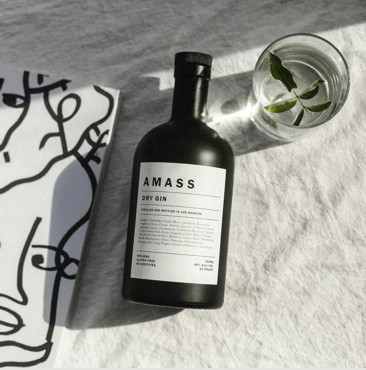
A ruled botanical document on a dark rounded bottle
Odacité
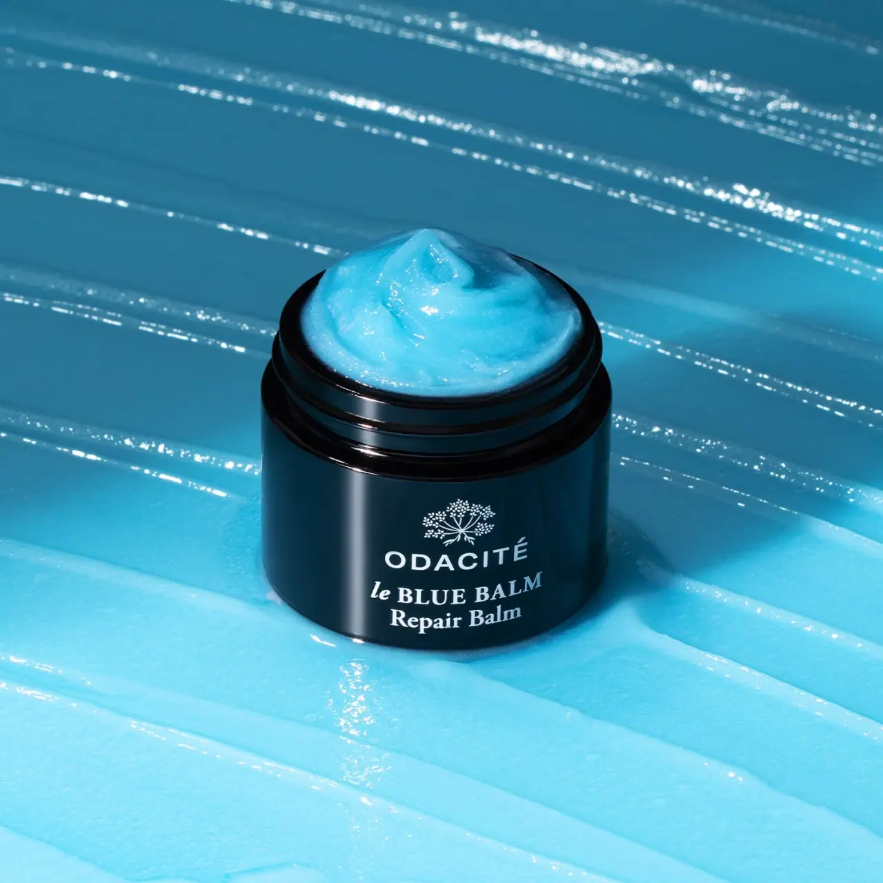
Open dark balm jar with white type and blue contents
Olverum
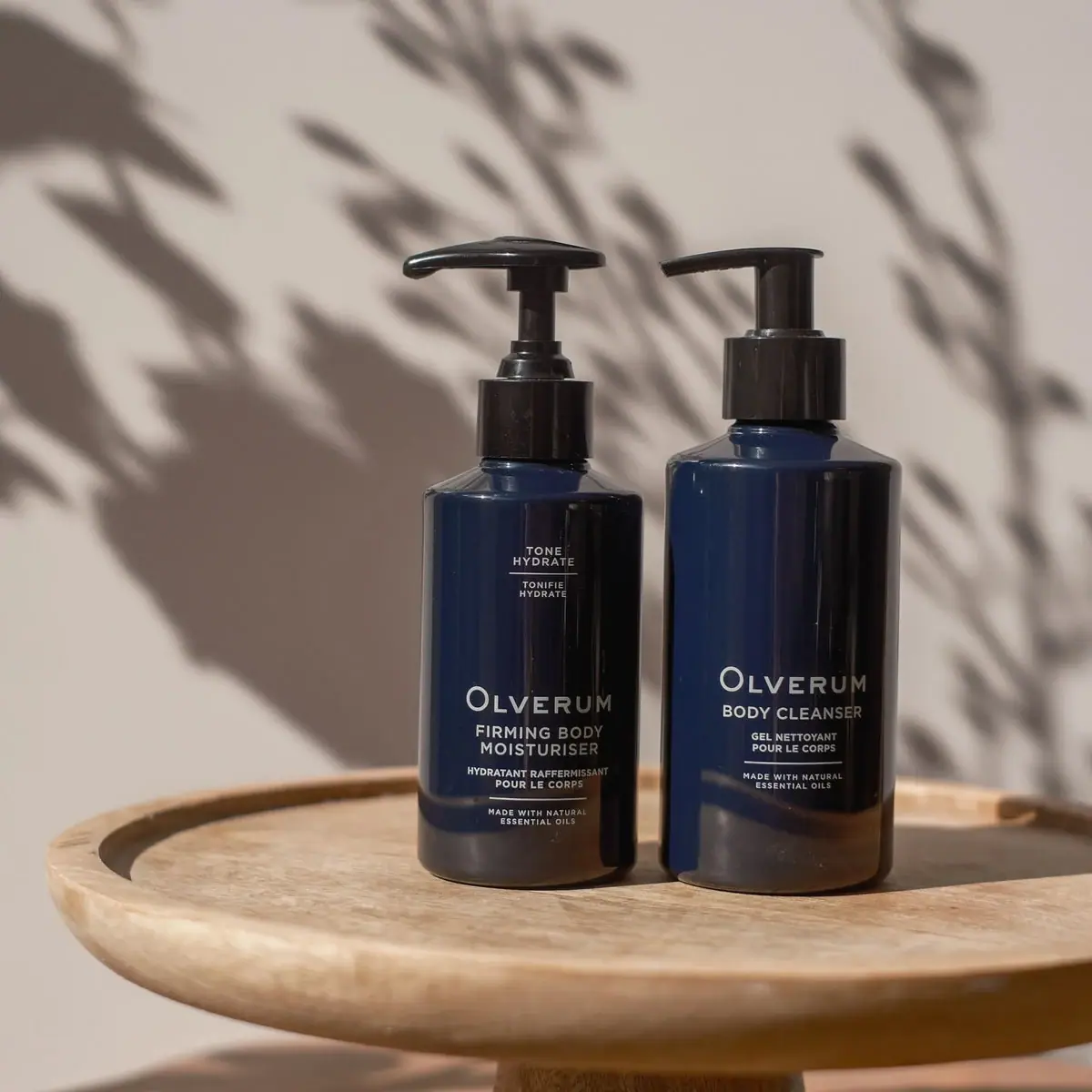
Navy bodycare pair with pale centered copy and black pumps
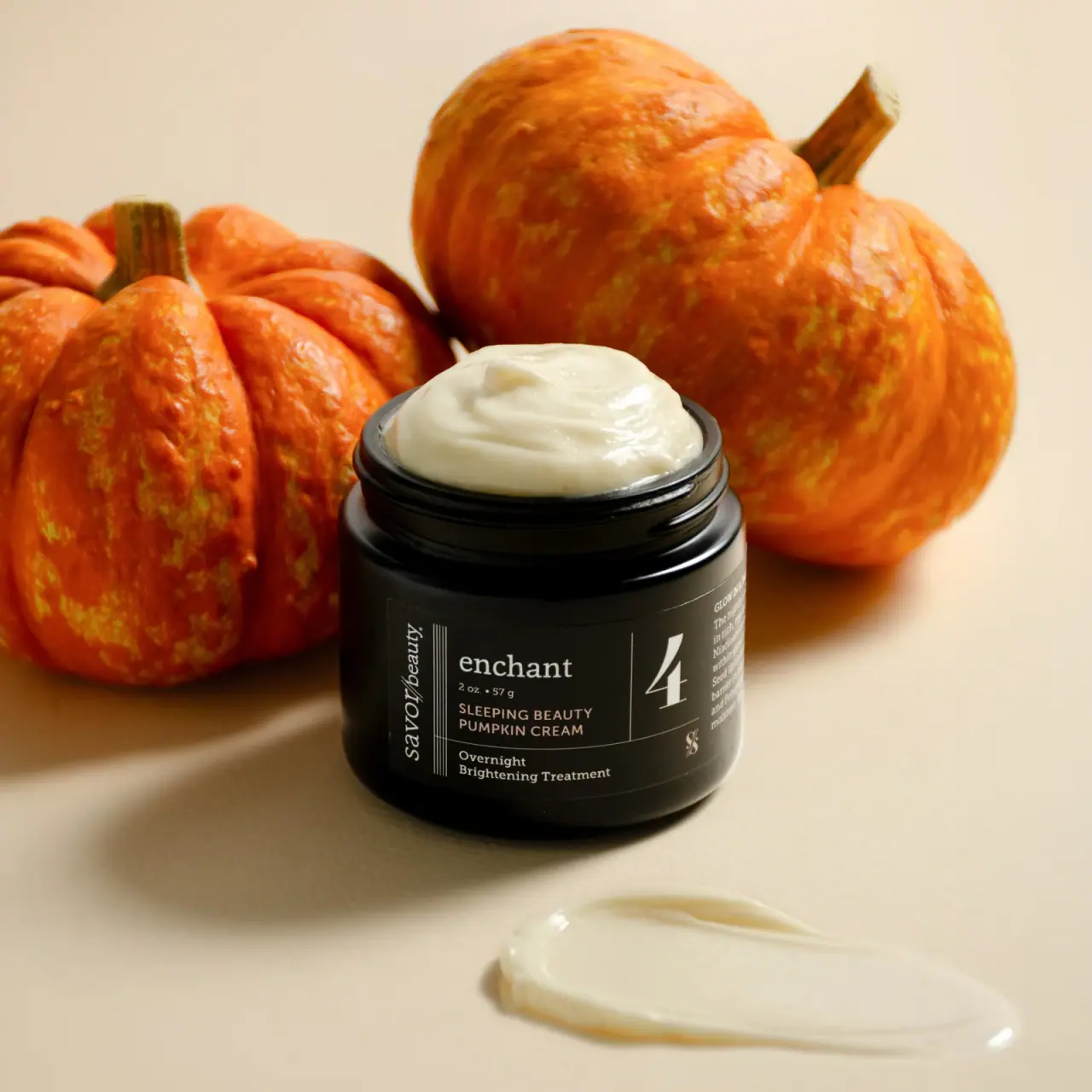
Savor Beauty
Black ruled jar label with vertical maker and routine numeral
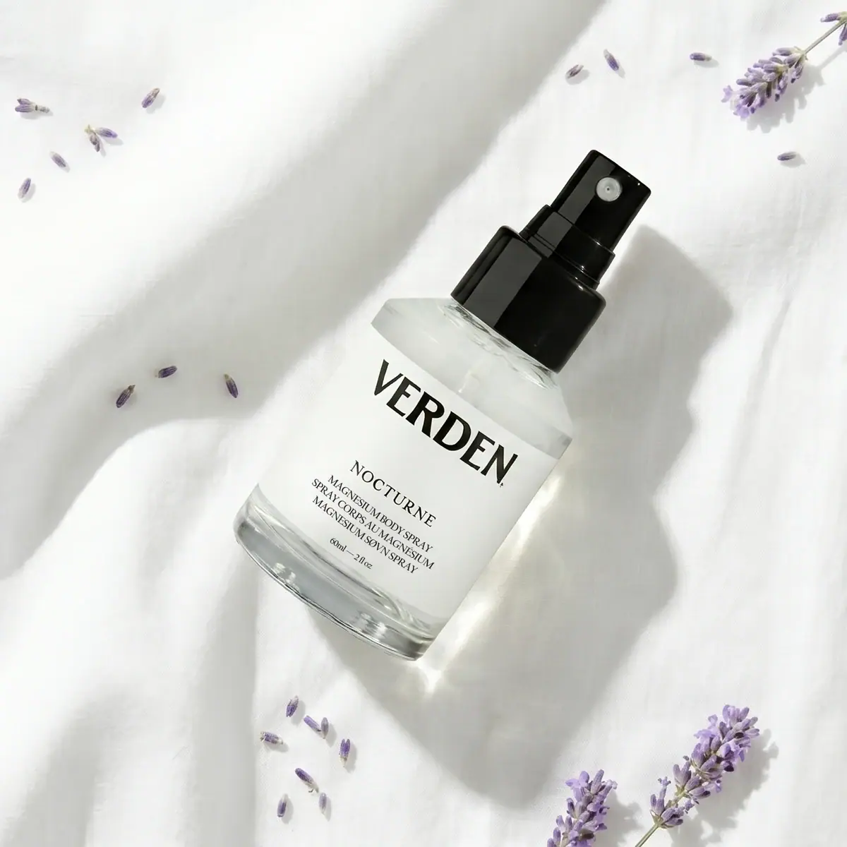
Verden
Bold serif identity on a quiet white spray label

Aerangis
a quiet numbered object, an intimate scent memory

Akro
soft pink interrupted by an assertive black signature

Alexander McQueen
An oval flacon crowned with dense black relief