Photography: Bouclème official photography. Images belong to their respective owners.
Bouclème

warm colour blocks crossed by flowing white ribbons
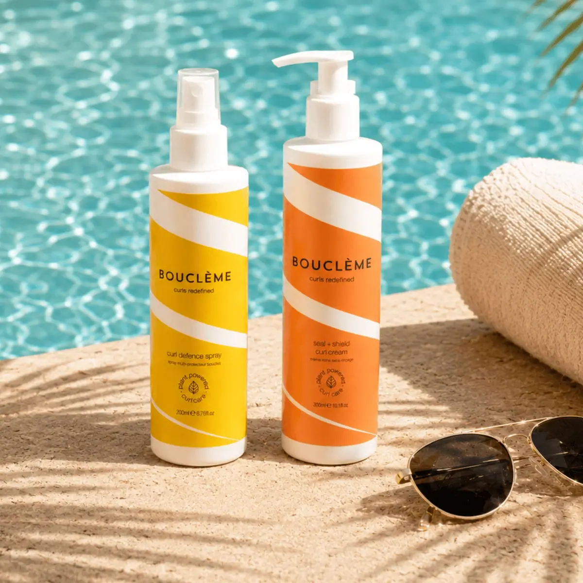
The Summer Curl Protection Duo connects two different dispensers through a repeated graphic rhythm. Yellow and orange fields are crossed by broad white bands that curve diagonally around the cylinders. Black centred lettering gives each face a stable reading point despite the directional artwork. A capped spray and a taller pump make the products functionally distinct, while colour, typography and the small lower device make them feel related. This study concerns the selected Curl Defence Spray and Seal + Shield Curl Cream pair, not a claim that the entire Bouclème range uses identical colours or hardware.
- Hair
- Light pack
- Colour-coded range
- Bold typographic
About this study
Selected Summer Curl Protection Duo comprising the pictured 200 mL spray and 300 mL cream. This is a set-level study of two linked products, not a universal Bouclème packaging manual.
Sources & evidence · Reviewed 2026-10-19Color Palette
Approximate colours interpreted from photography. These are screen references, not official brand colours or print specifications.
Pack body
Warm white structure
#F0EADF
Approximate bottle shoulders, bases, closures and graphic bands. The image alone does not establish whether all white areas share a substrate or printing method.
Ink
Near-black information
#292419
Approximate wordmark, product names, lower leaf device and volume. Pool turquoise belongs to the scene and is excluded.
Range coding
Spray yellow
#F0C419
Approximate field on the photographed Curl Defence Spray. A visible product distinction within this pair, not a verified brand-wide category code.
Cream orange
#EE8B2B
Approximate field on the selected Seal + Shield Curl Cream. Lighting affects the apparent saturation; no production swatch is supplied.
Typography
Suggested visual alternatives, not confirmed brand typefaces. Any scale below is an illustrative estimate.
The uppercase BOUCLÈME wordmark sits around the middle of each bottle, with a small tagline immediately below. Product names sit lower in a compact, more ordinary type voice, followed by a circular leaf device and volume. The wordmark is not tilted with the white bands: its horizontal baseline stabilises the whole front. The cream name breaks into two lines, while the shorter spray name uses a more compact arrangement. This shows how shared hierarchy can tolerate different copy lengths.
Fonts
Identity alternative
Jost
- Looks like
- Jost for a clean geometric uppercase name
- Type
- Geometric sans serif
- Weight
- Medium
- Case
- Uppercase
- Tracking
- Moderately open
- Fallback
- Arial, sans-serif
Develop an original horizontal brand line over directional artwork. Preserve accented characters when relevant and avoid copying the distinctive BOUCLÈME letter shapes.
Product information alternative
DM Sans
- Looks like
- DM Sans for compact functional names
- Type
- Low-contrast sans serif
- Weight
- Regular
- Case
- Lowercase or sentence case
- Tracking
- Normal
- Fallback
- Arial, sans-serif
Use for variant names and practical information, with deliberate line breaks on narrow cylindrical fronts. Keep a strong contrast against the warm field rather than letting artwork pass through small text.
Structure & Proportions
Visual proportions and finish previews are illustrative. Confirmed construction details and uncertainties are distinguished in the study notes.
Proportions
| Purpose | Value | Preview |
|---|---|---|
| Paired heights | The cream bottle appears taller and carries a wider exposed pump assembly; the spray is shorter with a narrow capped head. Perspective prevents precise dimensional comparison. | — |
| Ribbon rhythm | Broad diagonal bands alternate with warm fields, then narrow toward the lower area. Their changing apparent width gives movement rather than a rigid straight-stripe effect. | — |
| Information position | The brand sits in a clear central field, with product-specific details in a lower field. The two bottles share this sequence without requiring identical line breaks. | — |
| White margins | White shoulder and base areas frame the coloured body graphics and connect them visually to the closures. | — |
Shapes
| Element | Value | Preview |
|---|---|---|
| Bodies | Straight cylindrical bottles with short shoulder transitions. | |
| Graphic ribbon | Broad white band curving diagonally across the cylindrical front. | |
| Cream dispenser | White pump with horizontal projecting spout. | |
| Spray dispenser | White spray head beneath a clear-looking cylindrical cover. | |
| Lower device | Small circular arrangement around a leaf motif. |
Finishes
Subdued printed-field appearance
Yellow and orange graphics; no specific coating or print technology verified. · matte
Transparent cap appearance
Protective cover on the spray; material unknown. · transparent
Formats and materials
| Formats | Official duo contents: Curl Defence Spray 200 mL and Seal + Shield Curl Cream 300 mL., The selected image shows two individual upright cylindrical bottles, not a single combined dispenser. |
| Materials | Specific bottle, label, cap, spray and pump materials are unverified. A generic brand statement about recycled and renewable packaging does not identify the components in this photograph. |
| Closures | The yellow spray has a white dispenser under a transparent-looking protective cap. The orange cream has an exposed white pump with a horizontal spout. These visible differences help distinguish the functions; internal mechanisms, thread dimensions, output and component composition are not established. |
| Decoration | Curving diagonal white ribbons across yellow or orange fields., Horizontally centred black wordmark and lower product information., Small circular leaf device above the volume line. |
Front Panel
Schematic reading order. The diagram’s zone heights do not represent measured artwork proportions.
The fronts are organised around horizontal text zones set against moving white ribbons. A broad coloured area holds the wordmark, another lower area holds product details, and white bands separate them without becoming rectangular boxes. The shared motif works across the pair while colour and dispenser make the individual roles distinct. No complete wrap or seam is visible.
| Zone | Content |
|---|---|
| Upper ribbon | A white curved diagonal band crosses the warm field below the shoulder, establishing the motif before the name. |
| Brand anchor | BOUCLÈME and a small tagline sit horizontally in a clear central coloured area. |
| Product identity | Curl Defence Spray on yellow; Seal + Shield Curl Cream on orange. Smaller secondary wording is present but not fully transcribed. |
| Lower device | A small circular leaf motif and associated wording sit below the product name. Its graphic presence does not by itself verify an environmental certification. |
| Volume | The selected fronts show 200 mL for the spray and 300 mL for the cream, matching the official set listing. |
Range System
This image supplies direct comparison between two coordinated products with different functions, sizes and closures. The common ribbons and wordmark placement create family identity; yellow and orange distinguish the individual items. This supports a rule for the selected pair, not a universal colour taxonomy across all Bouclème products.
- Curl Defence Spray: yellow field, capped spray and 200 mL marking.
- Seal + Shield Curl Cream: orange field, exposed white pump and 300 mL marking.
- Interpretation: a shared directional motif can link formats without forcing identical hardware, but practical names must remain clear when colours appear similar under warm lighting.
Back of Pack & Shelf
Only front-facing areas are inspected. Reverse instructions, ingredients, barcode and label seam are not visible. The official page describes a two-step routine, but the photograph does not establish whether steps are numbered or explained on the physical backs.
- Obtain reverse views before describing instruction placement or regulatory panels.
- For an original paired routine, distinguish functions through words and dispensing format as well as colour.
- Verify component-specific environmental information before adding recycling or renewable-material statements.
On shelf
Interpretation: the white ribbons could create a recognisable repeating rhythm when the bottles stand together. Different closure silhouettes offer a second way to tell spray from cream before reading small text. At a distance, the near-related warm colours might be less discriminating than the names and hardware, so an original system should not rely on colour alone. No consumer identification or shelf-performance testing was consulted.
Imagery
The bottles stand beside a pool on a pale textured surface, accompanied by a rolled towel and sunglasses. Warm yellow and orange graphics contrast with the turquoise water, making the pair visually separate from its surroundings. Sunlight casts clear shadows and reinforces the seasonal setting. These props explain an occasion, not the composition of the formulas or a tested level of protection. The selected photo also shows the pair without an outer box, so no special gift-pack construction is inferred.
Guidelines
Editorial principles for an original design brief, not official brand guidelines.
Do
- Keep typography stable when the artwork carries movement.
- Use shared motifs to connect different formats without hiding their functions.
- Test the same hierarchy with different product-name lengths.
- Separate component material facts from generic sustainability language.
Don't
- Do not treat the pool colour as a packaging swatch.
- Do not infer identical materials from matching white closures.
- Do not copy Bouclème lettering, ribbon paths or its lower leaf device.
- Do not call the bundle a new seasonal pack redesign without specific evidence.
Sources & evidence
How this study was built
edition · Sourced fact
Official listing names both products and their200mL/300mL sizes.Bouclème — Summer Curl Protection Duo, official contents and photographystructure · Visual observation
Capped spray and exposed pump distinguish two individual cylindrical containers.Bouclème — Summer Curl Protection Duo, official contents and photographytypography · Visual observation
Horizontal uppercase wordmark anchors moving graphics; lower names adapt to different lengths.Bouclème — Summer Curl Protection Duo, official contents and photographylabel · Visual observation
Curving diagonal white bands leave clear warm fields for brand and product information.Bouclème — Summer Curl Protection Duo, official contents and photographypalette · Visual observation
Yellow and orange distinguish the pair, with white structure and dark type; pool turquoise is scenery.Bouclème — Summer Curl Protection Duo, official contents and photographyrange · Visual observation
Two inspected products demonstrate a shared motif with different colours and hardware, without universal brand claims.Bouclème — Summer Curl Protection Duo, official contents and photographyimagery · Editorial interpretation
Pool props explain seasonal occasion but do not establish formula composition or efficacy.
What remains unverified
- Individual bottle, label and dispenser materials are not verified by the generic packaging statement.
- Original fonts, exact colour values and print process are unknown.
- Reverse, seam and disassembled closures were not inspected.
- Seasonal merchandising does not establish that the artwork was created only for this bundle.
Give your AI
packaging taste
Give your design or image tool a packaging study: palette, type, structure, front panel and principles for an original brief.
Export this styleFree with an email. PACK.md works in Claude, ChatGPT, Cursor and image tools.
More like this

AKT
Lilac stage directions with a quiet metallic detail
Ceremonia
Warm colour labels bounded by upright and inverted wordmarks

Dr. Bronner’s
A bright soap wrapper with a densely ordered voice
Essie
Visible red colour, clear relief and a white cap
KraveBeauty
cropped wordmarks on minty skincare bottles
L'Oréal Paris
translucent amber shampoo under a gilded serif masthead

Malin+Goetz
pharmacy label set in bracketed helvetica

Native
white drugstore bottles, scent-tinted vertical caps