Hydrating Facial Cleanser
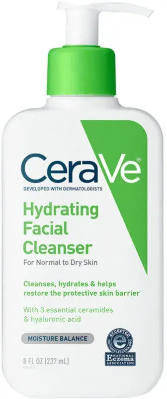
Photography: Open Beauty Facts · CC BY-SA. All imagery belongs to its respective owner.
What makes the design work
CeraVe brand studyVisual observations across the brand’s packaging. Individual formats and editions may vary.
Diagonal band
Solid colour wedge about 30% of the front width at the top, tapering diagonally down the right edge to a point at about 65% height.
Wordmark lockup
Slate geometric wordmark with an oversized capital V at about 70% of front width, top left, overlapping the band, with a tiny uppercase tagline beneath.
Stacked product name
Bold semi-condensed name in the band colour, broken over two or three left-aligned lines just below the wordmark.
Reading the label
White front with a colour band entering from the top right and slanting down to a point; all type left-aligned in the remaining white.
- Top
- Wordmark and dermatologist line, overlapping the band; value or new flag above on some packs
- Middle
- Stacked product name in range colour, skin-type line, benefit copy
- Bottom
- Ingredient line, grey concern pill, volume; association seal on some packs
Typography & hierarchy
The wordmark reads first, large and top left, overlapping the diagonal band. The product name is next, bold and condensed in the band colour, left-aligned and stacked over two or three lines. Below it a grey skin-type line, two bold benefit lines in the band colour, an ingredient line in grey, then the grey concern pill and the volume at the base.
Display
Custom geometric sans close to Avenir Medium
Geometric humanist sans with an oversized capital V
Mixed case, capital C and V · SemiBold
Headline
DIN Next Bold, FF DIN Condensed Bold
Bold semi-condensed industrial grotesque
Title case · Bold
Body
DIN Next Regular
Industrial grotesque
Sentence case · Regular, Medium
Typeface suggestions based on visual similarity. These are not verified font identifications.
How the range holds together
Colour coding with a fixed layout: each product line owns one band colour, matched by its pump or cap and product name, on an identical white pack.
Shelf presence
On shelf the identical white bottles form a clinical white wall, and the diagonal bands line up into a repeating stripe pattern whose colour sorts the range by step.
Related packaging
More curated references in skincare, matched by format and visual style.