About this packaging
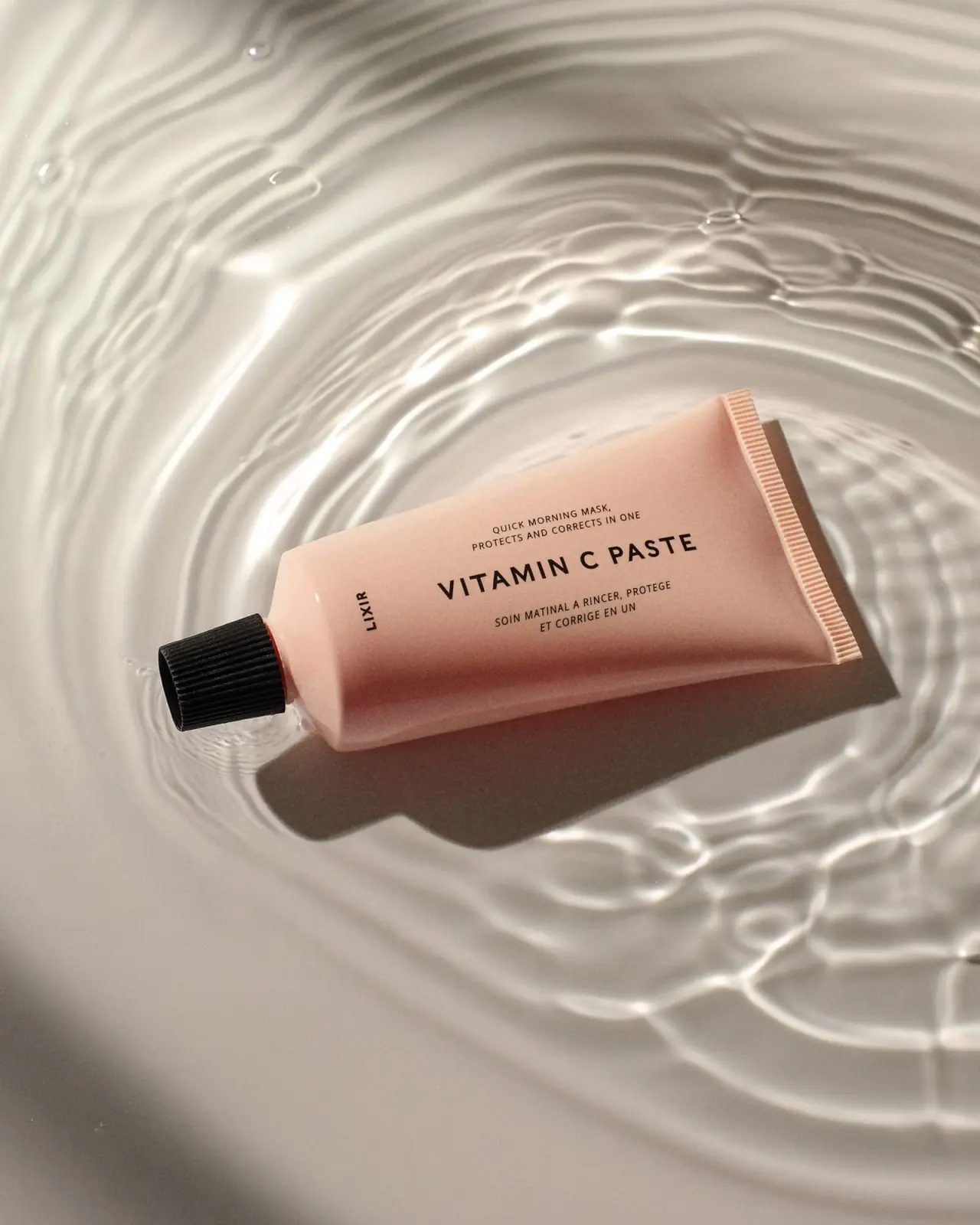
This Vitamin C Paste reference captures an earlier LIXIR label treatment: a pale peach tube, ribbed black cap and centered uppercase product title. The current brand listing confirms the product identity, while the selected photograph preserves the earlier short maker name and comes from an archival filename carrying a 2018 date cue.
Lixirskin’s current product page continues to list Vitamin C Paste. The selected earlier LIXIR label is sourced from Franco Guidi’s portfolio; the approved image filename carries a 2018 date cue rather than a separately verified publication date.[1][3]
Edition note. The selected image uses the earlier short LIXIR identity. Its approved original photographer filename contains a 2018-04-11 date cue, but the accessed portfolio text does not independently establish a publication or launch date. Current Lixirskin size information does not confirm historical pack specifications.
Pack construction & use
- Tube and cap
- The selected image shows a pale peach squeeze tube with a ribbed black screw cap and a crimped seam at the opposite end. Material composition is not documented in the product source reviewed.Observed in the reference photograph
- Current size reference
- Lixirskin’s Good Skin System lists the current Vitamin C Paste at 50 mL; this current size does not establish the dimensions of the photographed older edition.[2]
What makes the design work
Editorial analysis of this packaging reference.
Centered naming balances a horizontal tube
The tube is arranged horizontally, but the main VITAMIN C PASTE line remains centered across the broad face. Smaller descriptor lines above and below support the title without breaking its simple block.
A vertical brand mark provides a counterpoint
The short LIXIR wordmark sits vertically beside the cap, interrupting the otherwise centered composition. This small side placement acts as a signature without competing with the product name.
The peach field keeps monochrome type calm
Black copy against the muted peach tube gives the label contrast while preserving a soft overall impression. The ribbed cap supplies the strongest dark accent and a tactile visual endpoint.
Ideas for your next brief
- Center the product name across a broad tube face, even when the pack is photographed horizontally.
- Use a small rotated wordmark as a secondary anchor rather than adding another graphic panel.
Sources & further reading
- 1.Lixirskin — Vitamin C Paste
- 2.Lixirskin — The Good Skin System
- 3.Franco Guidi — Still Life Portfolio
Researched 19 October 2026