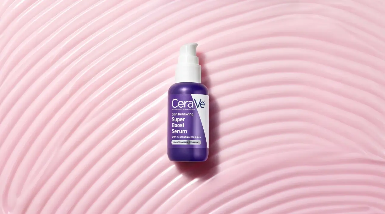
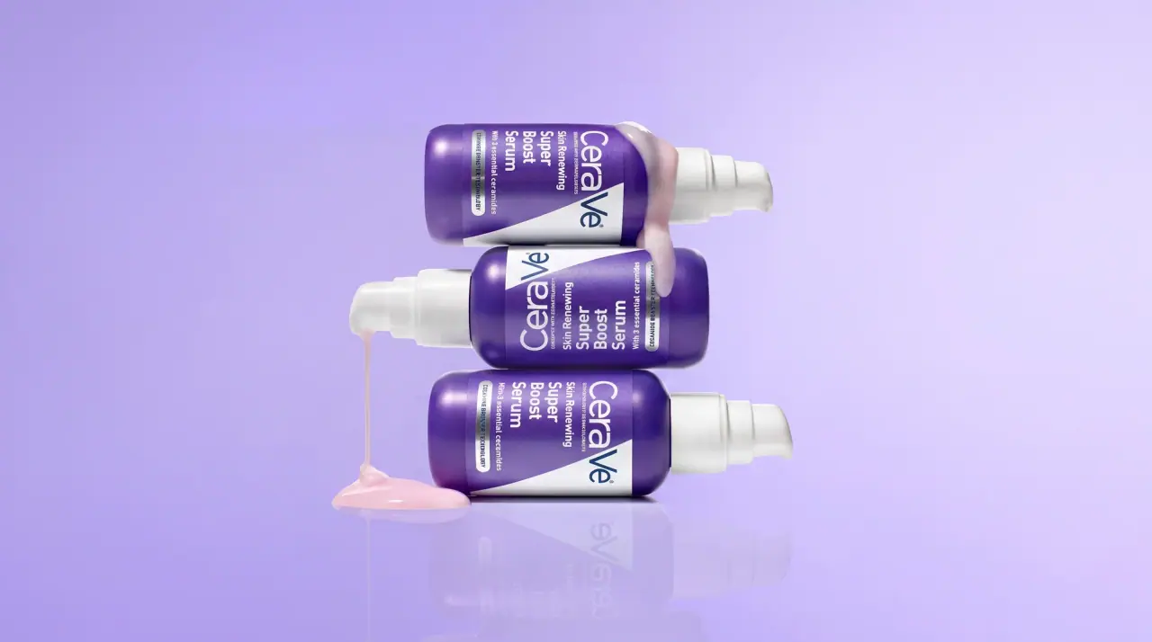
CeraVe packs are plain opaque white bottles, tubes and tubs (#f6f7f7) with one bold device: a coloured band that enters at the top right of the front and tapers diagonally down the right edge to a point about two-thirds of the way down. The wordmark, a slate geometric sans with an oversized capital V, sits top left and overlaps the band, and the product name follows below in a bold condensed sans set in the band colour, stacked over two or three lines. Under it come a grey skin-type line, two short benefit lines in the band colour, an ingredient line and a grey pill-shaped tag naming the concern. The band colour, repeated on the pump or cap, is the only thing that changes between cleansers, moisturisers and treatments.
Approximate colours interpreted from photography. These are screen references, not official brand colours or print specifications.
Pack body
Derm White
#f6f7f7
Opaque white bottle, tube and tub body across the whole range; the ground for all type
Label
Concern Pill Grey
#9fa4a8
Rounded tag near the base reading the concern (oil control, moisture balance), white type reversed out
Ink
Wordmark Slate
#39434d
Wordmark, the small 'developed with dermatologists' line under it and the volume line
Copy Grey
#6d7378
Skin-type line under the product name and the ingredient line
Accent
Value Red
#d6324a
Small flag in the top left corner on value-size and new packs
AM Amber
#f2a33a
Sun icon and AM badge on the daytime lotion with sunscreen
Range coding
Moisturiser Blue
#1f6fd1
Diagonal band, pump, product name and benefit copy on the moisturising cream and daily lotion
Hydrating Green
#57c24a
Band, pump and product name on the hydrating cleansers
Foaming Teal
#36b5a6
Band and product name on the foaming and acne cleansers
SA Sky
#39b5e3
Band, pump and product name on the SA smoothing line
PM Navy
#173a63
Band, tall cap and PM badge on the night facial lotion
Typography
Suggested visual alternatives, not confirmed brand typefaces. Any scale below is an illustrative estimate.
The wordmark reads first, large and top left, overlapping the diagonal band. The product name is next, bold and condensed in the band colour, left-aligned and stacked over two or three lines. Below it a grey skin-type line, two bold benefit lines in the band colour, an ingredient line in grey, then the grey concern pill and the volume at the base.
Type scale
Estimated cap size as a share of the panel · Front of the 236 ml cleanser pump bottle, shoulder to base, about 130 mm tall
wordmark
9% · SemiBold · Display
DermaLab
product-name
6% · Bold · Headline
Hydrating Facial Cleanser
benefit
2.4% · Bold · Headline
Cleanses and hydrates without stripping
skin-type
2.2% · Regular · Body
For Normal to Dry Skin
ingredient-line
2% · Regular · Body
With 3 essential ceramides
concern-pill
1.8% · Bold · Label
MOISTURE BALANCE
Fonts
Display
Nunito Sans
Looks like
Custom geometric sans close to Avenir Medium
Type
Geometric humanist sans with an oversized capital V
Weight
SemiBold
Case
Mixed case, capital C and V
Tracking
Tight, about -2%
Fallback
Avenir Next, Helvetica Neue, Arial
The wordmark only, top left on every front in Wordmark Slate, with its tiny uppercase tagline beneath.
Headline
Barlow Semi Condensed
Looks like
DIN Next Bold, FF DIN Condensed Bold
Type
Bold semi-condensed industrial grotesque
Weight
Bold
Case
Title case
Tracking
Tight, about -1%
Fallback
DIN Condensed, Arial Narrow Bold
Stacked product name in the band colour, and the bold benefit lines under it.
Body
Barlow
Looks like
DIN Next Regular
Type
Industrial grotesque
Weight
Regular, Medium
Case
Sentence case
Tracking
Normal
Fallback
DIN, Arial
Skin-type line, ingredient line, volume and all back-panel copy.
Label
Roboto Condensed
Looks like
DIN Condensed Bold
Type
Bold condensed grotesque
Weight
Bold
Case
Uppercase
Tracking
Wide, about +5%
Fallback
Arial Narrow Bold
Concern pill text reversed in white, AM/PM badges and the value-size flag.
Structure & Proportions
Proportions
Purpose
Value
Preview
Band width at top
About 30% of front width, tapering to a point
Band length
Runs from the top edge to about 65% of front height
Wordmark width
About 70% of front width, overlapping the band
Left margin
About 8% of front width; all type hangs from it
White space
About 45% of the front left empty white
Colours per pack
Three: white body, slate ink, one range colour (plus grey pill)
—
Density
Dense left-aligned text column, open white lower right
—
Shapes
Element
Value
Preview
Range band
Long tapering wedge cutting diagonally down the right edge
Opaque white HDPE, PP tub, Laminate tube, Glass dropper bottle
Closures
Coloured pumps and caps matched to the band, wide white screw lids on tubs, tall coloured overcaps on airless lotions
Decoration
Diagonal colour band, Direct print or wrap label, Rounded concern pill, Association seal roundel
Front Panel
Schematic reading order. The diagram’s zone heights do not represent measured artwork proportions.
Top
Middle
Bottom
White front with a colour band entering from the top right and slanting down to a point; all type left-aligned in the remaining white.
Zone
Content
Top
Wordmark and dermatologist line, overlapping the band; value or new flag above on some packs
Middle
Stacked product name in range colour, skin-type line, benefit copy
Bottom
Ingredient line, grey concern pill, volume; association seal on some packs
Range System
Colour coding with a fixed layout: each product line owns one band colour, matched by its pump or cap and product name, on an identical white pack.
Moisturising cream = blue band on a white tub
Hydrating cleanser = green band + green pump
Foaming cleanser = teal band + white pump
PM lotion = navy band + tall navy cap
SA line = sky-blue band + pump
Back of Pack & Shelf
The back is a dense, left-aligned white panel in slate and grey: a short paragraph on the formula, directions, a long INCI list, then warnings, barcode and company lines, with the band colour used only for small subheads.
Product description paragraph and key ingredients
Directions for use in short sentences
Full INCI ingredient list in small grey type
Warnings for external use
Barcode on white, recycling marks and batch code
Distributor address and website line
On shelf
On shelf the identical white bottles form a clinical white wall, and the diagonal bands line up into a repeating stripe pattern whose colour sorts the range by step.
Imagery
No photography or illustration; only the diagonal band, a seal roundel, small AM/PM icons and the type.
Guidelines
Do
Keep every body opaque white (#f6f7f7) and give each line one band colour.
Run the band diagonally down the right edge, about 30% wide at the top and tapering to a point at 65% height.
Set the wordmark top left at about 70% of front width so it overlaps the band.
Print the product name in a bold condensed sans in the band colour, stacked over 2–3 lines.
Match the pump or cap exactly to the band colour.
Close the front with a grey pill tag in white condensed capitals naming the concern.
Don't
Don't use photography, botanicals or illustration.
Don't tint the bottle body; colour lives only in the band, name and closure.
Don't centre the type; everything hangs from the left margin.
Don't use serif or script faces anywhere.
Don't use more than one range colour on a single pack (small AM/PM or value flags excepted).
Give your AI packaging taste
Give your design or image tool a packaging study: palette, type, structure, front panel and principles for an original brief.