About this packaging
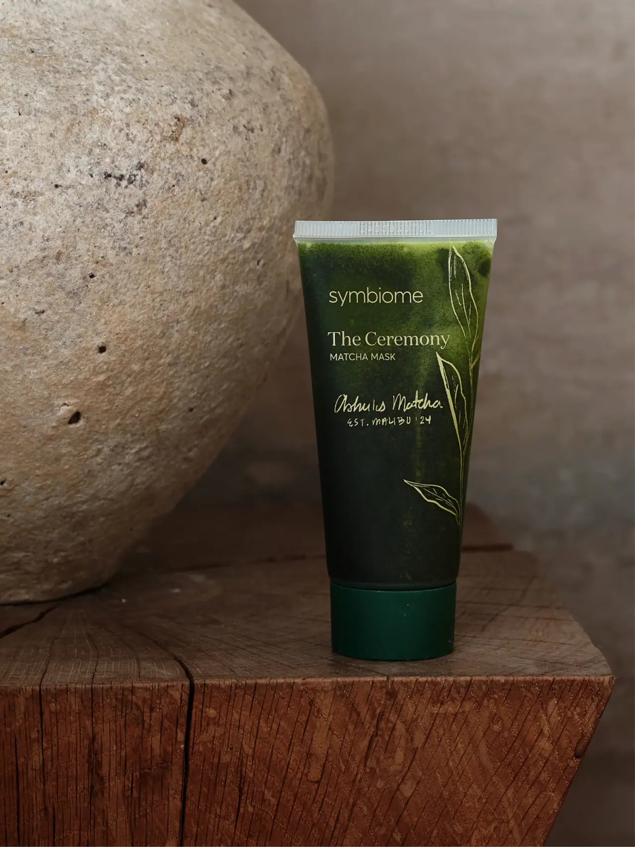
Symbiome The Ceremony Matcha Mask is shown in a dark green tapered tube with pale botanical line art and a deep green bottom cap. Left-aligned maker and product text are balanced by a fine branch at the right, with a handwritten-looking Ashu’s Matcha signature below.
Symbiome identifies The Ceremony as a matcha mask and presents the product in a tube format. The selected cover is the basis for visual observations.[1]
Pack construction & use
- Tube format
- The cover shows a tapered flexible-looking tube with a pale ribbed top seal and dark green bottom cap. The cap opening and tube laminate are not visible.Observed in the reference photograph
- Front graphics
- Pale type and fine leaf drawings sit on a dark green ground, with the Symbiome mark above the product name.Observed in the reference photograph
What makes the design work
Editorial analysis of this packaging reference.
Ingredient-coded palette
Dark green and pale botanical line art reinforce the matcha cue directly on the tube, making the product variant legible before small details are read.
Distinct voices organise the front
A light lowercase maker sits above the left-aligned serif The Ceremony and uppercase Matcha Mask descriptor. The handwritten-looking Ashu’s Matcha signature adds a separate ingredient-related voice below, balanced by botanical linework at the right.
Illustration restraint
A few fine leaf outlines frame the copy rather than filling the panel. This gives the ingredient illustration a supporting role and keeps the product name readable.
Ideas for your next brief
- Use ingredient-linked color and line art to distinguish a variant while preserving a shared label structure.
- Keep decorative illustration light around the name block so narrow tubes remain readable.
Sources & further reading
Researched 19 October 2026