About this packaging
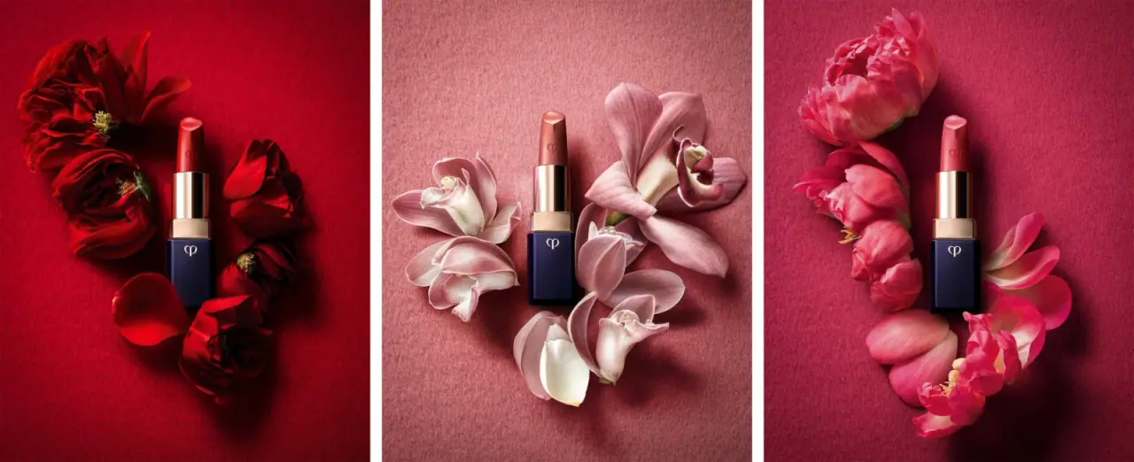
This earlier Clé de Peau Beauté Lipstick Cashmere reference pairs a dark faceted base with a reflective gold-colored barrel and exposed lipstick bullet. HIRO’s triptych presents three differently colored bullets against floral settings; no cap or readable shade identifier is visible.
Clé de Peau Beauté’s current lipstick range distinguishes Lipstick Cashmere as a matte-finish formula. The product-family page supports the product-line context only; HIRO’s photograph is the source for the earlier presentation, and no current page is used to claim that the case design remains unchanged.[1][2]
Edition note. Earlier Lipstick Cashmere campaign presentation identified by HIRO’s caption. The source filename is not treated as a verified shade identifier, and the photograph does not show a cap.
Pack construction & use
- Case geometry
- The selected image shows a dark navy rectangular base with beveled edges, a cylindrical gold-colored barrel and an exposed lipstick bullet. No cap is shown; exact construction materials are unverified.Observed in the reference photograph
- Edition identification
- HIRO captions the work as Clé de Peau Beauté — Lipstick Cashmere. Flower Beige appears in the source image filename, but the triptych shows differently colored bullets and does not establish shade names from legible package text.[2]
What makes the design work
Editorial analysis of this packaging reference.
Faceted base contrasts with the smooth barrel
The sharply beveled lower case creates a dark geometric block, while the long cylindrical gold-colored section reads as a clean vertical axis. That shift in form gives the small lipstick a distinctive two-part silhouette.
Monograms connect case and formula
A pale emblem sits near the top of the dark base, while a recessed-looking version appears on the exposed lipstick bullet. The repeated symbol connects the rigid case with the colored product without a large front label.
Flower styling frames rather than replaces the case
The lipstick sits among pink petals across three narrow panels. Their soft organic edges contrast with the angular base, leaving the package’s dark-and-gold structure easy to distinguish.
Ideas for your next brief
- Use contrast between case colors and shapes to give a small lipstick a recognizable profile.
- Repeat a compact emblem on multiple visible parts when the pack has no broad flat label panel.
Sources & further reading
Researched 19 October 2026