About this packaging
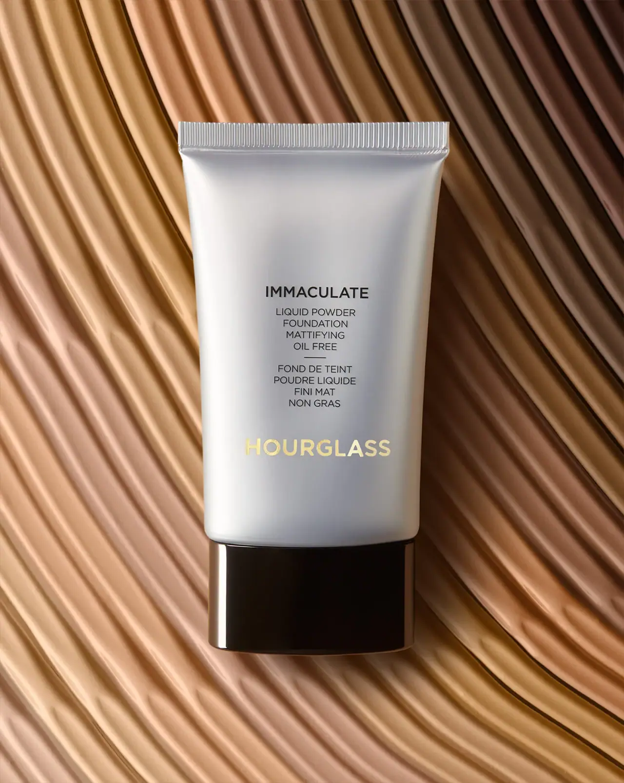
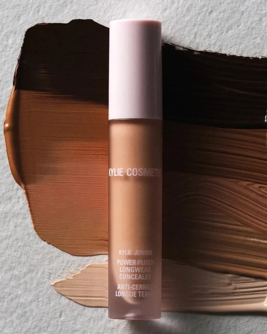
This HAKU brightening foundation reference uses a narrow white tube with a clear, substantial cap and a vertical black wordmark. The isolated image includes Japanese product naming and SPF information, with a flowing beige swatch that frames the pale package without obscuring its front.
Shiseido's July 2024 release describes HAKU Brightening Foundation in two shades with SPF30 / PA+++. This is release-specific context: the selected earlier photograph does not independently establish its date, net quantity or shade.[1]
Pack construction & use
- Container
- The selected photograph shows a narrow pearly white tube. No quantity is legible on the front, so the photographed unit's size is not established here.Observed in the reference photograph
- Closure
- A large transparent cap forms the lower end of the tube and is visible in the image; the photograph does not show its internal opening.Observed in the reference photograph
- Protection information
- The selected tube states SPF 30 / PA+++; Shiseido’s product material gives the same ratings for HAKU Brightening Foundation.[1]
What makes the design work
Editorial analysis of this packaging reference.
Stacked upright identity
The four HAKU letters remain upright and stack one below another near the sealed end; the whole word is not rotated. Japanese product wording and the protection rating form a smaller lower block, separated by a broad pale interval.
Transparent base as accent
The clear cap introduces a reflective, slightly iridescent visual base to an otherwise white tube. It gives the package a distinct lower profile without adding another printed color block.
Makeup texture as frame
A curved foundation swatch loops around the pack. The tube remains fully visible, providing texture and shade context without hiding its front.
Ideas for your next brief
- Stack short maker names letter by letter to use a narrow front while keeping each character upright.
- Use transparent closure elements as a subtle accent when a mostly white package needs visual separation.
Sources & further reading
Researched 19 October 2026