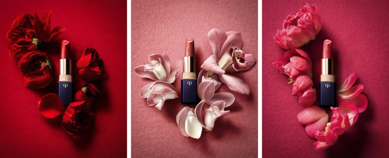
Photography: HIRO — still-life photography. Images belong to their respective owners.
Clé de Peau Beauté

Faceted navy base, reflective gold barrel, discreet repeated emblem
The earlier Lipstick Cashmere presentation photographed by HIRO relies on a compact material-like contrast: a dark beveled base below a bright cylindrical barrel, then the exposed color of the lipstick itself. A small pale emblem marks the base and repeats as a recessed-looking detail on the bullet. Three floral panels demonstrate the same visible case language with different lipstick colors. No cap is shown; the pink and red upper elements are the product, not colored closures.
- Make-up
- Dark pack
- Luxe monochrome
About this study
Earlier Lipstick Cashmere presentation in HIRO’s three-panel campaign photograph. Exposed bullets and visible cases are analyzed; current packaging, shade names and unseen caps are excluded.
Sources & evidence · Reviewed 2026-10-19Color Palette
Approximate colours interpreted from photography. These are screen references, not official brand colours or print specifications.
Pack body
Deep navy
#171A36
Approximate color of the faceted base. Its nearly black edges and brighter face depend on the directional light.
Champagne gold
#D2B98E
Warm reflective barrel and collar. This is an appearance reference rather than a verified metal or plating specification.
Ink
Pale emblem
#E9E1CC
Small high-contrast monogram on the dark base; the application method and exact color are unknown.
Typography
Suggested visual alternatives, not confirmed brand typefaces. Any scale below is an illustrative estimate.
The visible front has an emblem rather than a conventional text hierarchy. There is no legible product headline, shade name or quantity line to reconstruct. Recognition rests on the small symbol, dark faceted body and reflective upper cylinder. Repeating the emblem on the lipstick bullet connects the consumable product with the case, while its limited size preserves large uninterrupted surfaces. Font recommendations below concern supporting artwork for a new concept, not typography proven to be on this photographed face.
Fonts
Original supporting identity
Bodoni Moda
- Looks like
- Refined high-contrast serif
- Type
- Modern display serif
- Weight
- Medium, Semibold
- Case
- Title case or carefully spaced capitals
- Tracking
- Optical, with protected thin strokes
- Fallback
- Didot, Georgia, serif
A proposal for a new written maker name on supporting packaging. It should complement an independently designed emblem rather than attempt to spell out or reconstruct the source monogram.
Shade and technical information
Inter
- Looks like
- Quiet readable sans-serif
- Type
- Neo-grotesque sans-serif
- Weight
- Regular, Medium
- Case
- Mixed case
- Tracking
- Natural spacing
- Fallback
- Arial, sans-serif
A practical alternative for a new shade name, net contents and underside information. This role is a design recommendation, since none of those text blocks is visible in the selected photograph.
Structure & Proportions
Visual proportions and finish previews are illustrative. Confirmed construction details and uncertainties are distinguished in the study notes.
Proportions
| Purpose | Value | Preview |
|---|---|---|
| Vertical sequence | Dark base, short warm collar, reflective barrel and colored bullet create four readable stages. Their photographed proportions are not production measurements. | — |
| Square-to-round transition | The beveled rectangular base appears broader than the cylindrical barrel above, creating a compact shoulder before the smooth vertical upper section. | — |
| Emblem placement | The pale mark sits high on the dark face, leaving most of that face undecorated and visually solid. | — |
| Open presentation | The extended bullet adds considerable visible height. Closed-pack height and cap proportions cannot be derived from this view. | — |
Shapes
| Element | Value | Preview |
|---|---|---|
| Faceted base | Dark rectangular footprint with beveled edges and a broad flat front. | |
| Upper barrel | Straight cylindrical sleeve with continuous vertical reflections. | |
| Collar | Short warm-toned transition above the navy body, visually wider than the barrel. | |
| Product tip | Angled rounded top of the exposed lipstick; formula geometry rather than a closure. |
Finishes
Reflective warm sleeve
Barrel and collar; gold-colored appearance does not identify a solid metal or electroplating process. · metallic
Smooth dark case
Navy base and bevels, where narrow highlights emphasize the edge geometry. · gloss
Recessed-looking product emblem
Lipstick bullet surface; a visual impression, not proof of a particular manufacturing operation. · emboss
Formats and materials
| Formats | Earlier open Lipstick Cashmere case with a dark faceted rectangular base and exposed cylindrical barrel |
| Materials | Dark opaque-looking base and warm reflective barrel are observed appearances; exact resin, metal, coatings and internal mechanism materials are not specified by the consulted sources., The colored upper form is the lipstick bullet. It must not be counted as a pink or red packaging component. |
| Closures | No cap is present in any of the three panels. The image reveals the extended bullet and upper barrel but not the closing interface, magnetic or friction retention, internal twist mechanism, or whether the assembly accepts a refill. |
| Decoration | Restrained emblem near the upper front of the navy base, Repeated symbol on the colored bullet, No separate paper label or large front-facing text block established |
Front Panel
Schematic reading order. The diagram’s zone heights do not represent measured artwork proportions.
There is no broad graphic label to map. The front-facing base carries a single small symbol and otherwise lets the dark surface and bevels speak. The upper product repeats that symbol. A complete retail information system certainly cannot be reconstructed from these minimal open views, so unseen names and legal copy are left undocumented.
| Zone | Content |
|---|---|
| Upper base identity | A small pale emblem contrasts strongly with the navy face without expanding into a large wordmark. |
| Uninterrupted dark field | The lower area remains visually clear, giving the small base a more solid and sculptural reading. |
| Reflective transition | Collar and barrel contain no clearly legible text in this image; light gradients emphasize their geometry. |
| Product signature | A subtle version of the emblem appears on the lipstick bullet, linking formula and casing while remaining distinct from package printing. |
Range System
The approved triptych itself shows three differently colored lipstick bullets with closely related dark-and-gold cases. It supports consistency within this photographed presentation, not a full account of every Cashmere edition. Red, muted beige-pink and brighter rose tones appear in the product and surrounding flowers. No official shade names are assigned from those screen colors, and the Flower Beige filename is not treated as a shade record.
- For an original range, a stable case can let the actual exposed formula supply the strongest color difference in campaign images.
- A closed-case retail system still needs a reliable shade identifier; this open triptych does not reveal how the source solves that need.
- Keep photographic backgrounds separate from package specifications even when each setting closely follows its lipstick color.
Back of Pack & Shelf
The reverse, underside, cap and retail carton are absent. No barcode, shade sticker, ingredient list or manufacturing marks can be read from the selected source.
- Inspect the underside before documenting shade-coding placement.
- Obtain a closed reference before making claims about cap geometry or retention.
- Verify refill compatibility independently; an exposed barrel alone establishes no refill system.
On shelf
Interpretively, the dark base and bright barrel give an open tester a readily recognizable outline even without much text. The small emblem is suited to close viewing, while surface contrast works from farther away. The campaign does not show a closed lipstick or carton, so shelf visibility cannot be judged as though this exposed-bullet arrangement were the shipping format. An independent design should test both open and closed recognition.
Imagery
Three narrow panels place upright lipsticks among red, pale pink and vivid pink flowers. The framing is repetitive, but petal shapes and color intensity change across the panels. Soft organic contours make the rigid bevels and straight barrel more noticeable. The flowers are a campaign setting, not illustrations printed on the pack or evidence of botanical ingredients. White gutters separate the panels and should likewise stay outside any packaging palette.
Guidelines
Editorial principles for an original design brief, not official brand guidelines.
Do
- Distinguish formula color from casing color.
- Use changes in geometry to make compact components legible.
- Let a small emblem work with silhouette and finish.
- Document open and closed states separately.
- Treat photographer filenames as metadata unless corroborated.
Don't
- Do not describe the exposed bullet as a pink cap.
- Do not infer gold plating or case material from highlights.
- Do not assign shade names from floral colors.
- Do not copy the existing monogram.
- Do not claim a current case or refill system matches this earlier presentation.
Sources & evidence
How this study was built
edition · Sourced fact
HIRO explicitly captions the work as Clé de Peau Beauté Lipstick Cashmere.HIRO — Lipstick campaign portfolioedition · Sourced fact
Brand category text identifies Cashmere as a matte lipstick family; it does not establish continuity of the photographed case.Clé de Peau Beauté — Lipstick and Lip Linersstructure · Visual observation
Dark beveled bases, reflective barrels and exposed bullets appear in all three panels; no cap is shown.HIRO — Lipstick campaign portfoliolabel · Visual observation
A pale base emblem repeats as a recessed-looking mark on the bullet, without a readable text hierarchy.HIRO — Lipstick campaign portfoliopalette · Visual observation
Navy and gold-colored case components remain distinct from formula shades and floral backgrounds.HIRO — Lipstick campaign portfoliorange · Visual observation
The triptych supports repeated visible geometry across three differently colored bullets, but not official shade naming.HIRO — Lipstick campaign portfoliotypography · Editorial interpretation
Serif and sans-serif suggestions are independent supporting typography roles, not source font attributions.
What remains unverified
- Exact case materials, coating process and dimensions unknown.
- No cap, underside, reverse or carton visible.
- Font alternatives are for hypothetical supporting art; no alphabet identified on the visible face.
- Flower Beige asset filename does not establish a shade name.
- Brand category page available through indexed text after direct timeout; used only for Cashmere line context.
Give your AI
packaging taste
Give your design or image tool a packaging study: palette, type, structure, front panel and principles for an original brief.
Export this styleFree with an email. PACK.md works in Claude, ChatGPT, Cursor and image tools.
More like this

African Botanics
Technical black label with a low serif signature

al.ive body
warm architectural calm, built as a paired vanity object

bareMinerals
a restrained black compact framing the powder itself

BeautyPWR
Clear square shell, white cream cup, black serif identity

Christian Louboutin
Faceted turquoise base beneath an extreme silver taper

Color Wow
Tall condensed naming on a broad reflective silver jar

Corpus
sage gloss with whispered gold lettering

Costa Brazil
Pale matching vessels with small, deliberate bilingual labels