About this packaging
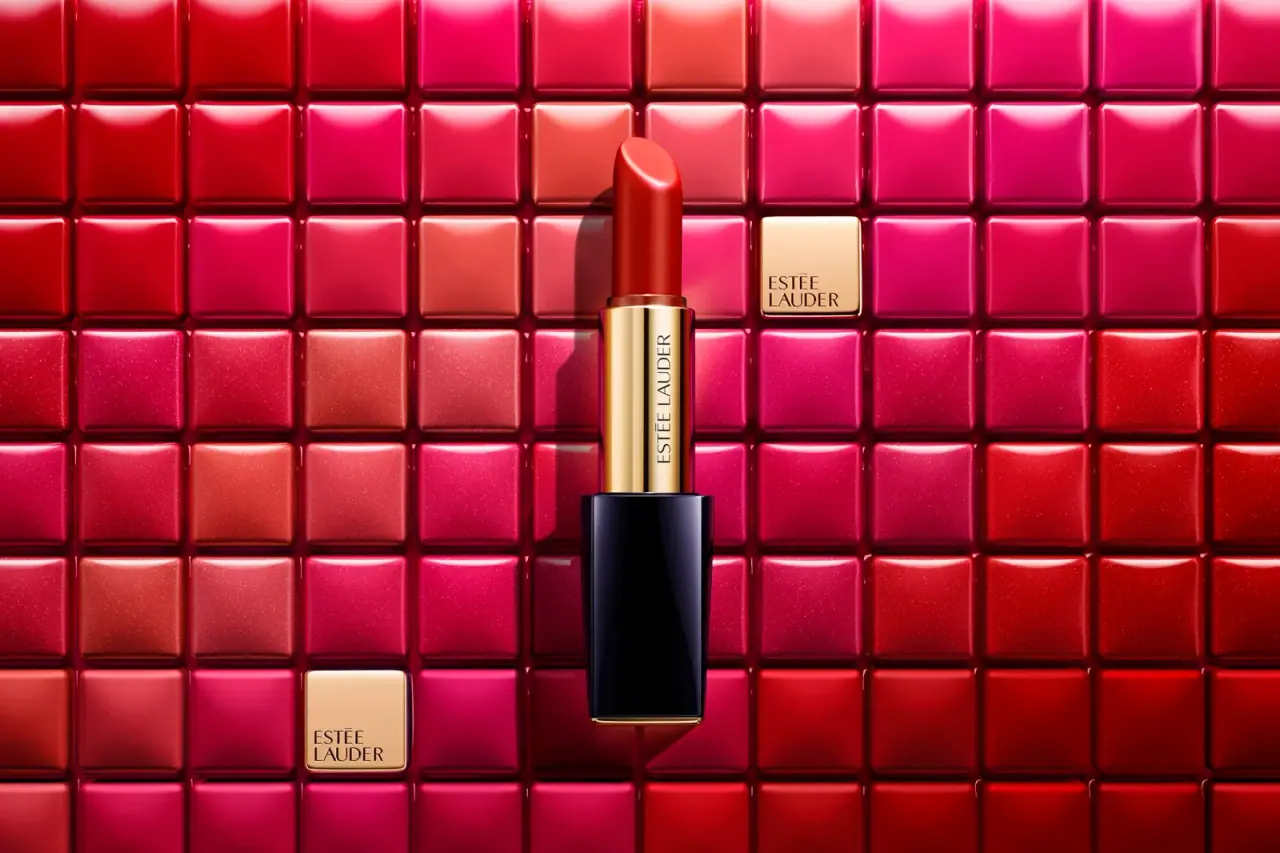
Pure Color Envy is a useful example of Estée Lauder’s case-led lipstick identity in the earlier package shown.
The Estée Lauder Companies’ 2015 annual report features Pure Color Envy under its lipstick category and presents the line as a recognizable, luxurious case design. That contemporary company source grounds the pictured package in the Pure Color Envy family without assigning a shade or a more specific model date.[1]
Edition note. The report supports the Pure Color Envy family and its case design, but does not identify an exact shade or date for this photographed case.
Pack construction & use
- Case and barrel
- The selected photograph shows a dark navy rectangular outer case around a slender gold-colored barrel and an exposed red lipstick. These are visual observations; the report does not specify component materials.Observed in the reference photograph
- Product family
- The company’s 2015 annual report identifies Pure Color Envy and describes its case as an important part of the lipstick’s identity.[1]
What makes the design work
Editorial analysis of this packaging reference.
Distinct component contrast
The navy case and gold-colored barrel separate the outer form from the lipstick mechanism visually. The red bullet provides a third focal color without adding graphics to the case.
Vertical brand placement
Estée Lauder lettering runs down the narrow barrel, using its length for brand identification while keeping the rectangular case face uncluttered.
Controlled silhouette
The hard-edged case contrasts with the rounded lipstick bullet. This pairing keeps the package recognizable both closed and when displayed open.
Ideas for your next brief
- Use contrasting component colors to make a compact multi-part package readable at a glance.
- Place branding on the narrower structural element when the main case face should remain visually quiet.
Sources & further reading
Researched 19 October 2026