Black Magenta

Photography: dsanddurga.com. All imagery belongs to its respective owner.
What makes the design work
D.S. & Durga brand studyVisual observations across the brand’s packaging. Individual formats and editions may vary.
Scent-name block
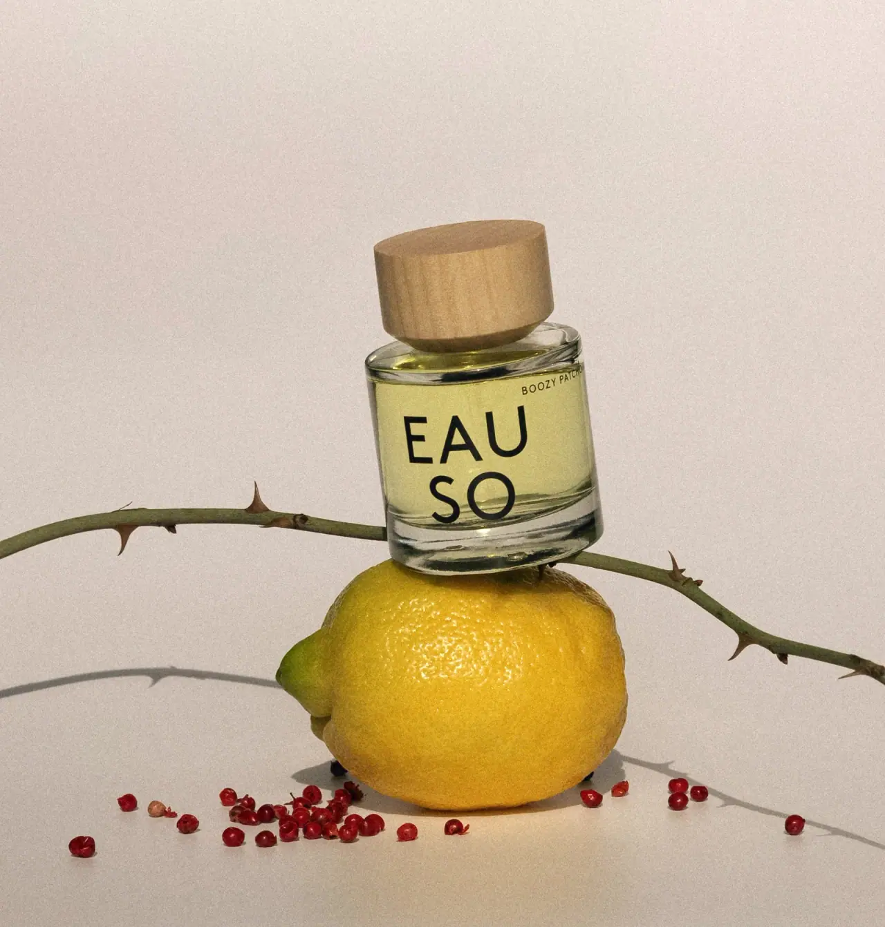
Heavy grotesk capitals at about 85% of label width, one or two centred lines, black #151413 on parchment.
Parchment label
Landscape matte beige rectangle, about 70% of bottle width and 33% of its height, square corners, centred.
House footer
House name in small medium caps and 'eau de parfum 50 mL' in lowercase beneath, both centred, about a quarter of the scent-name size.
Reading the label
One landscape rectangle centred on the front of the round bottle, roughly a third of its height, with all text centred.
- Upper two thirds
- Scent name in large heavy grotesk capitals, one or two lines
- Lower third
- House name in small capitals, format and 50 mL volume
Typography & hierarchy
The scent name dominates the label, set in heavy capitals across one or two centred lines and allowed to be long, odd or conversational. Everything else is a small centred footer: house name in capitals, then format and volume in lowercase.
Display
Helvetica Bold, Neue Haas Grotesk Display Bold
Heavy neo-grotesque sans
Uppercase · Bold, ExtraBold
Label
Helvetica, Arial
Neo-grotesque sans
Uppercase for house name, lowercase for volume · Medium, Regular
Typeface suggestions based on visual similarity. These are not verified font identifications.
How the range holds together
Everything is fixed (bottle, cap, label size, typeface); scents differ only by name and by the colour of the juice, with an inverted black and gold label reserved for a dark, rich scent.
Shelf presence
Lined up, the bottles read as a row of identical black caps and beige labels, and the shopper scans the names like book spines; the one black label breaks the row on purpose.
Related packaging
More curated references in perfume, matched by format and visual style.