About this packaging
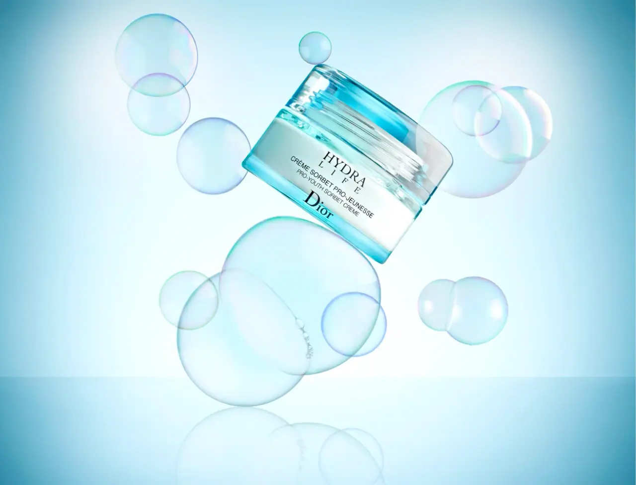
This archived Dior Hydra Life Pro-Youth Sorbet Crème image shows an aqua transparent-looking outer jar around a pale inner vessel, with a broad lid and compact central lettering. Translucent bubbles extend the optical lightness into the campaign scene.
Nordstrom lists Dior Hydra Life Pro-Youth Sorbet Crème as a 1.7 oz moisturizer.[1]
Edition note. The selected image documents an earlier Hydra Life Pro-Youth Sorbet Crème package.
Pack construction & use
- Archive jar
- The cover shows a low jar with comparatively straight outer edges and softened rectangular-looking corners, a pale inner vessel and a broad transparent-looking aqua lid. Exact plan geometry and materials remain unverified.Observed in the reference photograph
- Front type
- HYDRA LIFE appears above the smaller Pro-Youth Sorbet Crème name, with Dior below.Observed in the reference photograph
What makes the design work
Editorial analysis of this packaging reference.
Color carries the texture cue
The cool aqua jar and floating bubbles suggest freshness and a light, chilled cream texture. The campaign prop language connects directly to the word “Sorbet” without adding decorative graphics to the container.
Two serif anchors
The Hydra Life family title and substantial Dior signature frame smaller bilingual sans-serif descriptors. This creates a compact central hierarchy without making every line equally prominent.
Jar framed as a floating object
The tilted jar sits in a pale-blue field among translucent spheres. Their round outlines contrast with the straighter outer jar edges while sharing its optical lightness; the front remains readable.
Ideas for your next brief
- Use a low jar and restrained front typography, then extend the product texture cue through campaign props rather than extra label graphics.
- Tilt a compact jar within a light field to show its lid and label while giving the campaign image motion.
Sources & further reading
Researched 19 October 2026