About this packaging
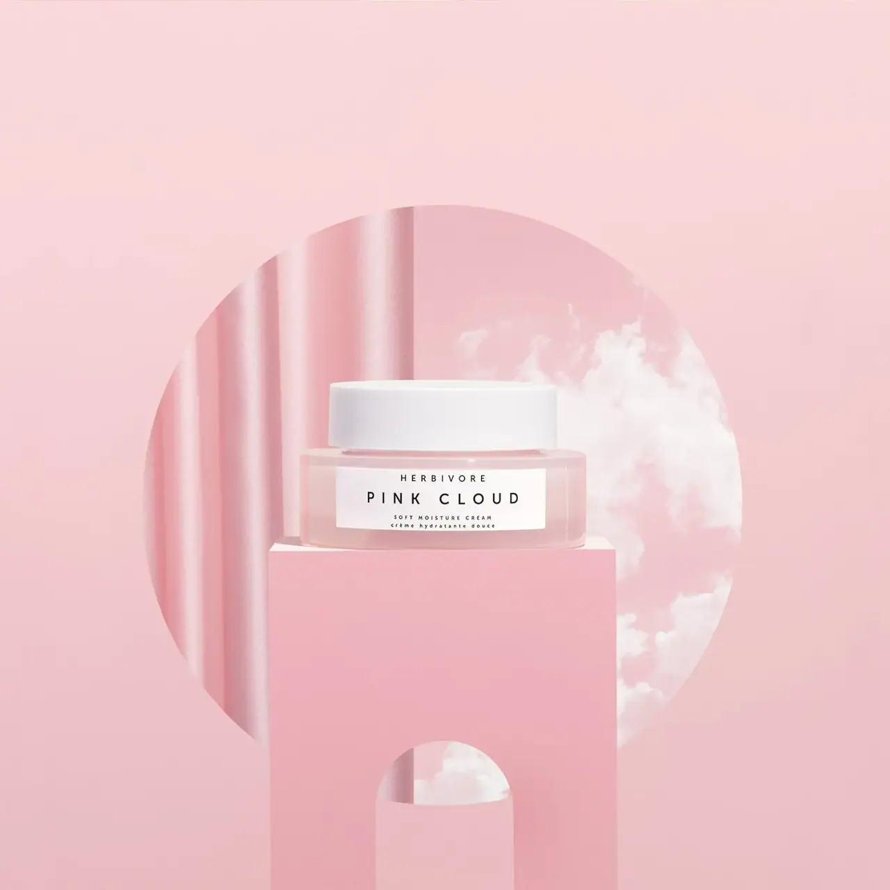
Herbivore’s Pink Cloud Soft Moisture Cream appears in a low, clear jar with a broad white lid and a compact monochrome label. In the selected launch image, a pastel pink set and cloud-like forms frame the jar, extending the product name into the campaign art direction.
Jurada credits its work on Herbivore’s Pink Cloud launch to concept development, art direction, photography and production. Those are campaign credits; the studio page does not identify it as the packaging designer.[1]
Edition note. This reference follows the Soft Moisture Cream packaging in Jurada’s Pink Cloud launch campaign; current retail editions may differ.
Pack construction & use
- Container / closure
- The low transparent-looking jar has a broad white lid and a rectangular white front label. The label identifies Pink Cloud as a Soft Moisture Cream in English and French.Observed in the reference photograph
- Label placement
- The front label sits between clear-looking borders above and below, rather than covering the whole body. Its long horizontal proportions echo the jar’s width.Observed in the reference photograph
What makes the design work
Editorial analysis of this packaging reference.
Name becomes scene
The floating cloud imagery and soft pink monochrome setting echo “Pink Cloud” without relying on literal illustrations printed on the jar. The environment gives a simple package a broader campaign identity.
Quiet label hierarchy
The centered white label uses spaced brand lettering above the larger PINK CLOUD name; product type appears in small lettering below. This hierarchy stays legible while preserving the jar’s minimal front.
Contrast through transparency
The transparent jar gives the pale cream a visible presence, while the opaque white lid and label create stable bright accents. The low, wide proportions suit the calm, horizontal composition of the campaign image.
Ideas for your next brief
- Carry a product name into campaign styling through color, lighting and shape instead of adding more front-panel copy.
- Use a compact centered label to protect legibility on a low, wide jar.
Sources & further reading
Researched 19 October 2026