Photography: Leo Acker — Dior advertorial photography. Images belong to their respective owners.
Dior

An aqua archive jar suspended in light
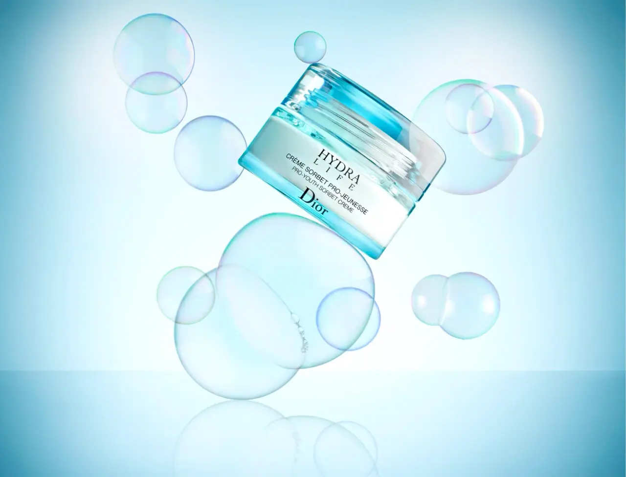
The archived Hydra Life Pro-Youth Sorbet Crème package uses optical depth as its main decorative device. A pale inner vessel sits inside a transparent-looking aqua outer form with a broad lid and comparatively straight outer edges. Fine dark lettering concentrates at the centre of the front while clear margins reveal reflections, highlights and the nested construction. Leo Acker’s floating-bubble photograph amplifies that lightness, but the pack itself remains typographically restrained. This study follows the words and structure visible in the selected archive image; it does not assign the specifications of a current Hydra Life product to this earlier object.
- Skincare
- Light pack
- Luxe monochrome
About this study
Archive Hydra Life Pro-Youth Sorbet Crème front photographed by Leo Acker. Current Hydra Life specifications are deliberately outside scope.
Sources & evidence · Reviewed 2026-10-19Color Palette
Approximate colours interpreted from photography. These are screen references, not official brand colours or print specifications.
Pack body
Transparent aqua appearance
#6ACAD9
Approximate midtone from the outer jar edges. The colour varies sharply with thickness, reflections and the bright setting, so this is a viewing reference rather than a manufacturing colour match.
Pale inner vessel
#E3F0EB
The opaque-looking inner area gives the dark lettering a calmer background than the surrounding clear edges. Its pale aqua cast may partly come from the outer shell and scene lighting.
Ink
Fine dark type
#132B2B
Approximate dark front lettering. It supplies the only strong graphic contrast on the visible package; black versus a specific dark ink formulation is unverified.
Typography
Suggested visual alternatives, not confirmed brand typefaces. Any scale below is an illustrative estimate.
The front has two serif anchors: the stacked Hydra Life family title above and the Dior signature below. Between them, compact sans-serif French and English product descriptions provide functional detail. Hydra appears relatively broad, while Life is spaced out below it, creating a small two-line masthead. The house signature is substantial and should not be dismissed as minor footer text. This balanced top-and-bottom arrangement gives the bilingual description a defined middle territory.
Fonts
Fine serif family title
Bodoni Moda
- Looks like
- Bodoni Moda
- Type
- High-contrast serif
- Weight
- Regular 400 / Medium 500
- Case
- Uppercase for the family title
- Tracking
- Moderate for the short secondary title line
- Fallback
- serif
An alternative for the contrast between fine hairlines and strong vertical strokes. Use a sufficiently robust weight for the final print size; an elegant large screen specimen does not prove that very fine strokes will survive on a reflective curved surface.
Bilingual product descriptor
Roboto
- Looks like
- Roboto
- Type
- Sans serif
- Weight
- Regular 400
- Case
- Uppercase
- Tracking
- Neutral to slightly open
- Fallback
- sans-serif
A readable alternative for the two closely stacked descriptive lines. Keep French and English recognisably separate, using a consistent alignment instead of creating a new ornamental treatment for each language.
Fictional house signature
Cormorant Garamond
- Looks like
- Cormorant Garamond
- Type
- High-contrast serif
- Weight
- Medium 500
- Case
- Title case for an original house name
- Tracking
- Natural optical spacing
- Fallback
- serif
A proposed contrast to the uppercase family title. Use an entirely new name and letter arrangement; the original Dior signature is a proprietary mark, not a type sample to reproduce.
Structure & Proportions
Visual proportions and finish previews are illustrative. Confirmed construction details and uncertainties are distinguished in the study notes.
Proportions
| Purpose | Value | Preview |
|---|---|---|
| Jar body | Broad relative to its height, with a visible clear perimeter around a smaller pale inner volume. No millimetre dimensions are inferred from the campaign perspective. | — |
| Lid | A substantial horizontal cap band contributes strongly to the silhouette instead of acting as a thin finishing line. | — |
| Text block | A compact centred stack occupies the quiet inner area, leaving the outer edges visually open for optical depth and reflections. | — |
Shapes
| Element | Value | Preview |
|---|---|---|
| Outer jar silhouette | Low rectangular-looking front with softened corners and straight side segments. It should not be reduced to a simple circle based on the surrounding bubbles. | |
| Broad lid | A wide transparent-looking block follows the upper jar outline, with rounded transitions at the corners. | |
| Inner visual field | A pale central volume sits inside the clearer perimeter, forming a natural backdrop for the type. |
Finishes
Optical clear appearance
Outer jar and broad lid; material and surface-treatment specification unknown. · transparent
Glossy highlights
Edges and horizontal transitions, especially where the cool lighting catches them. · gloss
Formats and materials
| Formats | A low closed skincare jar with a broad transparent-looking lid, pale inner vessel and aqua outer edges. Its front silhouette has straighter sides and more rectangular corners than a simple round pot. The exact plan geometry cannot be measured from one tilted view. |
| Materials | The selected photograph establishes transparency, colour and nested-looking construction, not glass versus polymer. No component specification for this archive edition was verified., The pale inner area appears visually distinct from the outer form, but the image alone cannot establish separable parts, a refill insert or the complete wall construction. |
| Closures | A broad lid sits above a pronounced horizontal join. It appears to cover the full outer form. The image does not expose threads, sealing surfaces or the inside of the lid, so the fastening mechanism and gasket arrangement remain unknown. |
| Decoration | Dark front typography sits over the pale inner area. No paper-label boundary is apparent in this view, but direct printing, transfer marking and other processes cannot be distinguished reliably from the photograph. |
Front Panel
Schematic reading order. The diagram’s zone heights do not represent measured artwork proportions.
A central axis gathers the typography into a small front-facing stack. The package has no bold coloured label panel; instead, the pale inner vessel performs the visual work of a label ground. Clear edges surround this area and keep the object from reading as an opaque block.
| Zone | Content |
|---|---|
| Upper family title | A two-line serif title starts the hierarchy. The spaced second word forms a lighter supporting line, giving a short name enough presence without increasing its width across the whole jar. |
| Bilingual middle | Two small sans-serif lines distinguish the French and English product descriptors. They are functional and compact, with neither receiving a decorative accent that would break the central rhythm. |
| Lower house signature | A sizeable serif signature anchors the bottom of the readable field. The front balances this signature against the upper family name, rather than making every piece of information the same size. |
| Clear perimeter | No major text occupies the strongest aqua edges. This protects the fine lettering from the most variable reflections and leaves the physical construction visible. |
Range System
This is a single archive specimen. Its Pro-Youth wording and broad clear aqua lid define the edition studied here. No current family-wide colour rule, component specification or refill system is inferred. The transferable principle is to combine a quiet inner reading field with an optically active outer form.
- For an original family, preserve the legibility of the inner field while varying a clearly named product function. Any tint changes should be checked under several backgrounds because transparent colour is highly scene-dependent.
- A second language can share the same centred grid without doubling the apparent number of headline levels. The selected front demonstrates this arrangement; it does not establish how other Dior products handle bilingual information.
Back of Pack & Shelf
The selected photograph shows the front, lid and part of the side. The rear, base, open neck and any carton are absent.
- Verify the actual archive artwork before transcribing quantities, ingredients or responsible-party details.
- Do not import a current formula, refill claim or environmental statement into this earlier package record.
- For an original design, reserve a separate readable information area and check distortion through the outer wall. No exact rear-panel grid is claimed here.
On shelf
Without the bubbles, the most distinctive visible features would be the broad clear lid, aqua perimeter and dual serif anchors. The campaign supplies motion, but the package supplies layered depth. This is an interpretation of the visible design rather than consumer-testing evidence. A practical review would also need a level, closed front photograph to judge the balance without the dramatic tilt and bright setting.
Imagery
The jar is tilted diagonally above a reflective pale surface, surrounded by translucent soap-bubble forms of different sizes. Their round outlines contrast with the jar’s straighter outer edges while sharing its optical lightness. The dark type remains sufficiently visible because the pale inner vessel faces the viewer. Bright aqua edge light and a near-white central field make the jar appear buoyant. Leo Acker’s own portfolio identifies this Dior skincare still life within advertorial work. The image does not prove that the jar floats, contains bubbles or uses a particular production material.
Guidelines
Editorial principles for an original design brief, not official brand guidelines.
Do
- Keep fine typography over the calmer inner visual field rather than the brightest transparent edges.
- Preserve the distinction between the substantial house signature and the upper family title.
- Evaluate clear or tinted surfaces against multiple backgrounds before choosing a production colour reference.
- Document this as an archive edition and keep current-product claims separate.
Don't
- Do not describe the jar as a simple round pot because the photographic props are spherical.
- Do not identify glass, acrylic, frosting or a refill insert without a component source.
- Do not treat floating bubbles as a packaging feature or a demonstrated skincare benefit.
- Do not reconstruct unseen reverse information from a current product with a similar family name.
Sources & evidence
- Leo Acker — Dior skincare advertorial still lifephotographer
How this study was built
imagery · Sourced fact
The photographer’s portfolio includes the matching Dior skincare jar and soap-bubble still life in its advertorial section.Leo Acker — Dior skincare advertorial still lifeedition · Visual observation
The visible front reads Hydra Life and Pro-Youth Sorbet Creme; analysis remains tied to this archived specimen.structure · Visual observation
A pale inner area is surrounded by aqua transparent-looking edges and a broad lid, with comparatively straight outer segments.typography · Visual observation
Serif family title and substantial house signature frame smaller sans-serif bilingual descriptors.label · Visual observation
The pale inner field provides a calmer type ground than the clear perimeter; no paper-label edge is evident.palette · Visual observation
Aqua optical colour, pale inner area and dark type are approximate pack colours, not production references.range · Editorial interpretation
Suggested extensions concern optical layering and legibility, not a documented universal Dior range rule.
What remains unverified
- The archived retailer page could not be opened; no product specification is treated as freshly verified from it.
- Outer and inner materials, closure mechanism, manufacturing date and print process are unknown.
- The source image file date does not establish the package launch year.
- Reverse, base, open jar and outer carton were not inspected; font and colour values are alternatives or approximations.
Give your AI
packaging taste
Give your design or image tool a packaging study: palette, type, structure, front panel and principles for an original brief.
Export this styleFree with an email. PACK.md works in Claude, ChatGPT, Cursor and image tools.
More like this

African Botanics
Technical black label with a low serif signature

al.ive body
warm architectural calm, built as a paired vanity object

bareMinerals
a restrained black compact framing the powder itself

BeautyPWR
Clear square shell, white cream cup, black serif identity

Christian Louboutin
Faceted turquoise base beneath an extreme silver taper
Clé de Peau Beauté
Faceted navy base, reflective gold barrel, discreet repeated emblem

Color Wow
Tall condensed naming on a broad reflective silver jar

Corpus
sage gloss with whispered gold lettering