Photography: Halves Studio — product photography. Images belong to their respective owners.
Fresh

Teal dropper bottle with white serif naming and silver collar
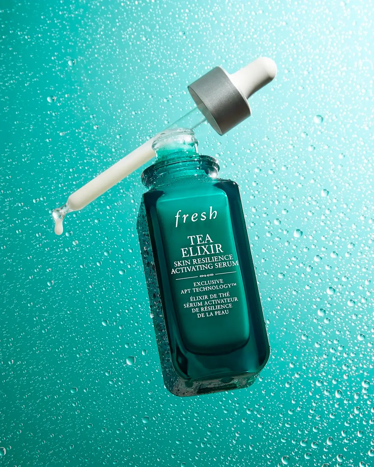
Tea Elixir combines a teal rectangular-looking bottle with white serif information and a detached dropper assembly. The softly rounded shoulders and deep transparent-looking edges give the body volume without obscuring its front reading area. An italic lowercase fresh signature sits above stacked uppercase product naming, followed by a small ornamental divider and bilingual detail. The silver-colored collar and white bulb provide a contrasting closure. Halves Studio's open composition reveals pale emulsion in the pipette and keeps the functional components visible.
- Skincare
- Dark pack
- Apothecary
- Heritage label
About this study
Selected open Tea Elixir bottle and dropper in Halves Studio's teal image, supported by Fresh's July 2022 product article. Capacity and current-edition continuity are not assumed.
Sources & evidence · Reviewed 2026-10-19Color Palette
Approximate colours interpreted from photography. These are screen references, not official brand colours or print specifications.
Pack body
Deep teal bottle
#006F68
Approximate central body color; darker edges and bright reflections describe depth rather than additional specified inks.
Silver-colored collar
#9CA8A4
Neutral reflective-looking band on the detached dropper, separating the white bulb from the transparent-looking stem.
Bulb white
#EDEEE5
Pale opaque-looking upper grip; its exact material is not inferred from color or form.
Ink
White front lettering
#ECEEE2
High-contrast italic signature, serif naming and fine ornament against the teal field.
Typography
Suggested visual alternatives, not confirmed brand typefaces. Any scale below is an illustrative estimate.
The lowercase italic fresh signature is widely spaced and visually light. TEA ELIXIR follows in larger uppercase serif lines, then the longer English descriptor in smaller capitals. A fine rule with a tiny central flourish creates a boundary before the technology wording and French description. Most of the front uses a consistent serif voice, so size, line breaks, italic movement and the divider establish hierarchy instead of a strong serif-versus-sans contrast. The dense lower block remains centered within the same front field.
Fonts
Original italic identity
Cormorant Garamond
- Looks like
- Light classical italic serif
- Type
- Display serif
- Weight
- Regular, Medium
- Case
- Lowercase in italic
- Tracking
- Moderately open with optical correction
- Fallback
- Georgia, serif
Proposed for a newly named maker whose italic voice contrasts with upright product naming. Avoid copying the exact fresh letterforms, spacing and short-word silhouette.
Product and bilingual information
Libre Baskerville
- Looks like
- Compact upright traditional serif
- Type
- Transitional serif
- Weight
- Regular, Bold
- Case
- Uppercase for short names and descriptors
- Tracking
- Natural to slightly open
- Fallback
- Georgia, serif
An alternative for a structured product hierarchy with clear serifs. Proof small capitals at actual bottle size, especially where longer French wording requires extra lines.
Structure & Proportions
Visual proportions and finish previews are illustrative. Confirmed construction details and uncertainties are distinguished in the study notes.
Proportions
| Purpose | Value | Preview |
|---|---|---|
| Front reading face | A broad central rectangle provides a stable area for centered copy while the curved edges catch darker teal and brighter reflections. | — |
| Shoulder transition | Soft rounded shoulders lead from the broad body to a narrow threaded neck, balancing rectangular geometry with the circular closure. | — |
| Dropper length | The detached pipette is a long slender component in the composition. The angle and staging do not establish a measured insertion depth or capacity. | — |
| Information grouping | The divider separates the large upper naming group from denser lower copy, rather than enclosing every section within its own box. | — |
Shapes
| Element | Value | Preview |
|---|---|---|
| Bottle body | Upright rectangular-looking form with rounded corners, shoulders and a deep clear-looking lower edge. | |
| Threaded mouth | Circular opening with visible raised threads around the neck. | |
| Dropper assembly | White bulb over a broad collar and long slender pipette, shown detached. | |
| Divider | Fine horizontal lines meet a small central flourish between the main name and lower information. |
Finishes
Teal transparent-looking depth
Bottle edges, shoulders and base; exact substrate and color application unknown. · transparent
Glossy body highlights
Curved edges and neck catch bright reflections under the studio lighting. · gloss
Silver-colored collar
Detached dropper collar, with a comparatively soft metal-like reflection rather than a verified composition. · metallic
Formats and materials
| Formats | Open rectangular-looking serum bottle with rounded shoulders and a detached bulb-and-pipette dropper |
| Materials | The body and pipette appear transparent or translucent in places, but the consulted sources do not establish exact glass or polymer specifications., The silver-colored collar and white bulb are visibly distinct components. Appearance does not establish a metal collar, silicone bulb or particular seal material., Fresh's historical article describes a green bottle and milky emulsion, supporting the observed color/texture relationship without supplying construction details. |
| Closures | The open neck visibly carries screw threads. A detached assembly includes a broad silver-colored collar, white bulb and long transparent-looking pipette. This supports a screw-interface dropper format, but not thread dimensions, dosing accuracy, liner construction or refill compatibility. |
| Decoration | Spaced italic maker signature, Centered stacked serif English product name, Fine horizontal divider with small central flourish, Compact technology and French information below the divider |
Front Panel
Schematic reading order. The diagram’s zone heights do not represent measured artwork proportions.
All visible wording occupies a centered vertical column on the teal front, with no obvious separate paper-label edge. The brand is airy and italic, the product name upright and more substantial, and the lower copy compact. The thin ornamental divider adds a heritage-like detail without creating a broad decorative frame. The image cannot resolve the exact print carrier, coating or whether the central field has a separate surface treatment.
| Zone | Content |
|---|---|
| Maker signature | A white lowercase italic wordmark sits high on the face, with generous spacing between letters and clear space below. |
| Product family | TEA ELIXIR occupies two prominent uppercase serif lines, creating the main product recognition point. |
| English descriptor | Smaller uppercase lines describe the serum beneath the family name, remaining centered and closely grouped. |
| Ornamental separation | A short horizontal rule and tiny central flourish distinguish upper naming from the lower information block. |
| Supporting and bilingual copy | Technology wording and a multi-line French descriptor fill the lower area. Their presence is recorded without independently validating product performance. |
Range System
The 2022 brand article establishes this named serum and its green-bottle context. It does not provide a full packaging system, exact capacity for the selected image or proof that every current version is identical. The study therefore treats teal color, serif hierarchy and the dropper assembly as observations of this reference. Any application to related products below is an independent design interpretation.
- For an original serum family, keep a clear hierarchy between maker, family name and longer functional descriptor before adding ingredient badges.
- A different dispensing format can retain the same serif information voice without copying a dropper where it is unsuitable.
- If bilingual descriptions vary in length, let the lower block expand while preserving space around the primary product name.
Back of Pack & Shelf
The reverse, underside and any carton are not visible. The image reveals the open neck and pipette but does not show full ingredient text, usage directions, quantity or batch information.
- Obtain a reverse view before mapping the complete information hierarchy.
- Confirm capacity from the selected edition rather than estimating it from the dropper length.
- Inspect the closure's interior separately before specifying seals or refill behavior.
On shelf
Interpretively, white serif text on deep teal combines a traditional label voice with a saturated contemporary color. The silver collar and white bulb would create a lighter top when assembled, while the broad face offers more room for stacked text than a narrow cylinder. The dramatic open composition does not show closed-pack height or retail carton visibility, so those should be checked separately for an original design.
Imagery
The bottle and detached dropper run diagonally across a teal droplet-covered backdrop. Pale emulsion fills much of the pipette and a small drop hangs at its tip, making formula and dispensing format visible together. The saturated setting repeats the bottle's color family but is brighter and more varied. Its many droplets are not printed texture on the front, and the staged suspension does not represent storage or application instructions.
Guidelines
Editorial principles for an original design brief, not official brand guidelines.
Do
- Distinguish identity, product family and bilingual detail through scale.
- Use an ornamental divider only where it clarifies grouping.
- Separate visible closure components from assumed materials.
- Let an open view explain the dropper without inventing dosing specifications.
- Keep edition date and source scope clear.
Don't
- Do not infer a glass bottle or silicone bulb from appearance alone.
- Do not convert droplets into a permanent packaging pattern.
- Do not invent capacity from the photographed proportions.
- Do not copy the fresh wordmark or exact flourish.
- Do not treat a historical product article as proof of every current pack.
Sources & evidence
- Fresh — A Face Serum for Resilient Skinbrand
- Halves Studio — Product photography portfoliophotographer
How this study was built
edition · Sourced fact
Fresh's July 2022 article names the serum and describes a green bottle with milky emulsion.Fresh — A Face Serum for Resilient Skinstructure · Visual observation
Rounded rectangular-looking body, threaded neck and detached bulb/collar/pipette assembly are visible.Halves Studio — Product photography portfoliotypography · Visual observation
Italic lowercase maker lettering leads upright uppercase serif naming and compact lower bilingual detail.Halves Studio — Product photography portfoliolabel · Visual observation
A thin ornamental divider separates the main naming group from technology and French wording.Halves Studio — Product photography portfoliopalette · Visual observation
Deep teal body, white type/bulb and silver-colored collar are distinguished from the brighter surrounding set.Halves Studio — Product photography portfolioimagery · Visual observation
The open pipette carries pale emulsion over a droplet-covered backdrop; the droplets are staging.Halves Studio — Product photography portfoliorange · Editorial interpretation
A stable serif information hierarchy could guide an independent family, but this reference does not establish a complete Fresh packaging system.
What remains unverified
- Vessel, pipette, collar and bulb substrates unspecified.
- Capacity, dimensions, thread specification and dosing not established.
- Reverse, underside and carton unseen.
- Exact fonts, print carrier and color application unknown.
- Historical brand article confirms product context, not every current presentation.
Give your AI
packaging taste
Give your design or image tool a packaging study: palette, type, structure, front panel and principles for an original brief.
Export this styleFree with an email. PACK.md works in Claude, ChatGPT, Cursor and image tools.
More like this

Aesop
a botanical still life around a disciplined apothecary label
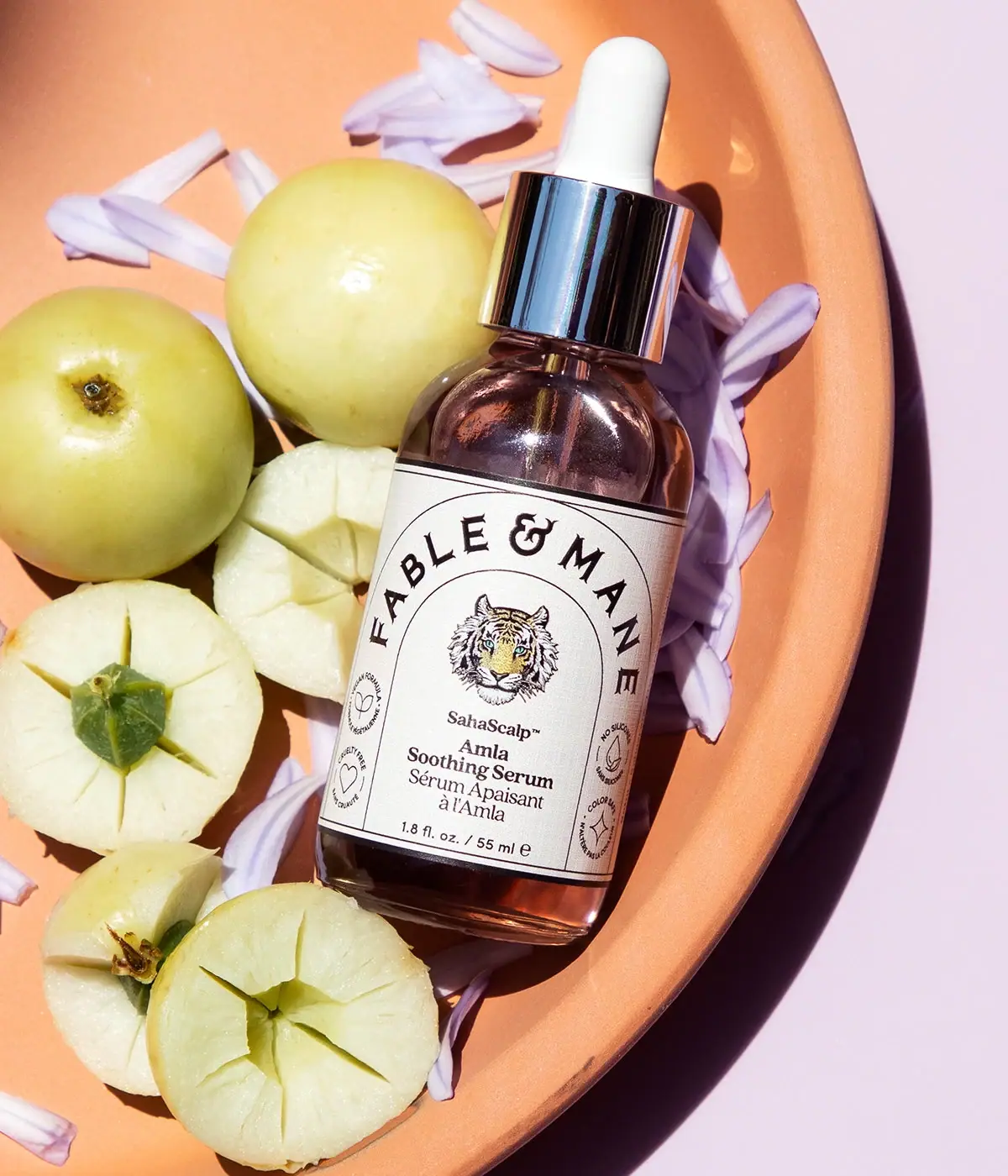
Fable & Mane
Arched serif maker, tiger portrait and amber dropper bottle
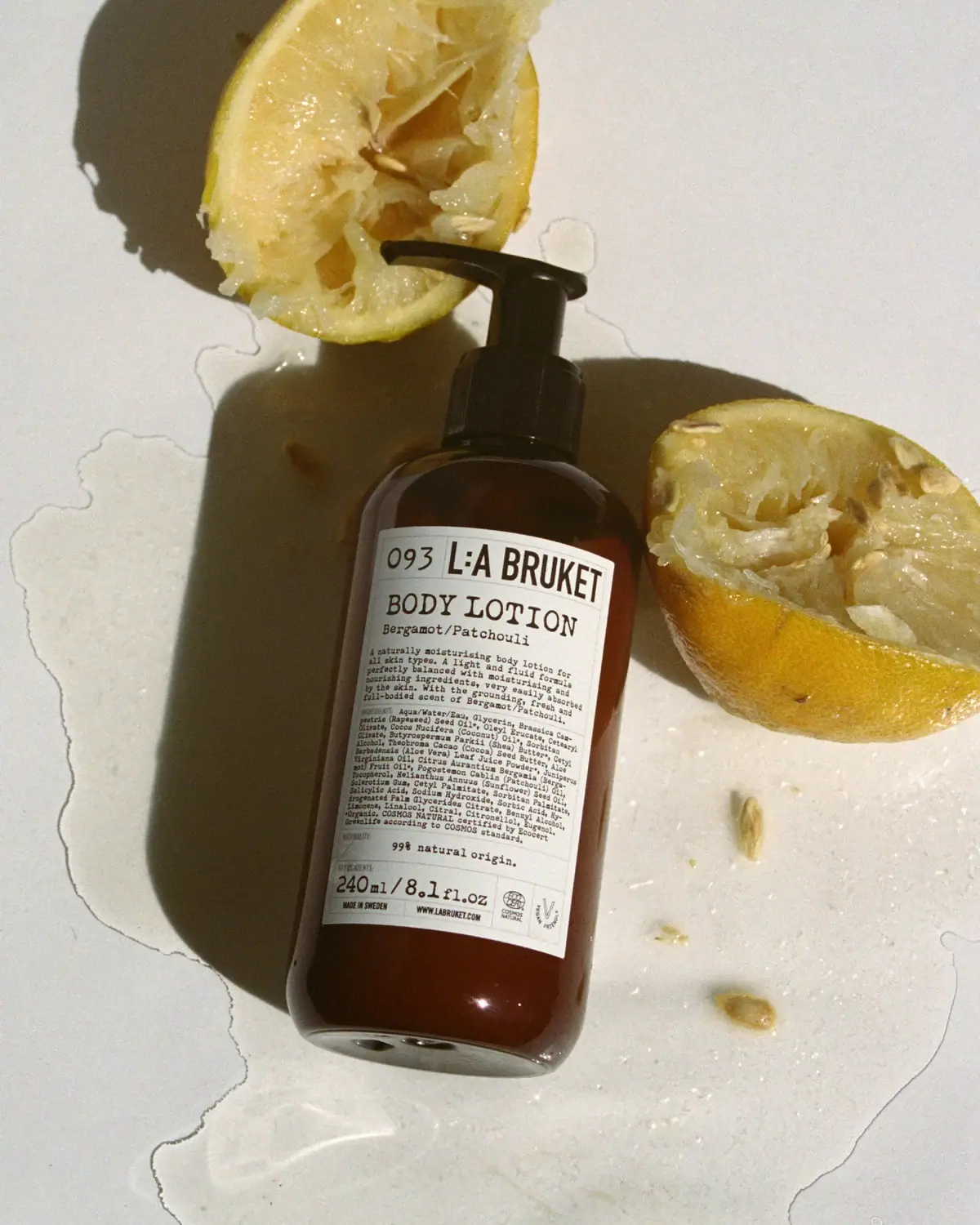
L:A Bruket
Amber pump bottle with a ruled typographic information label
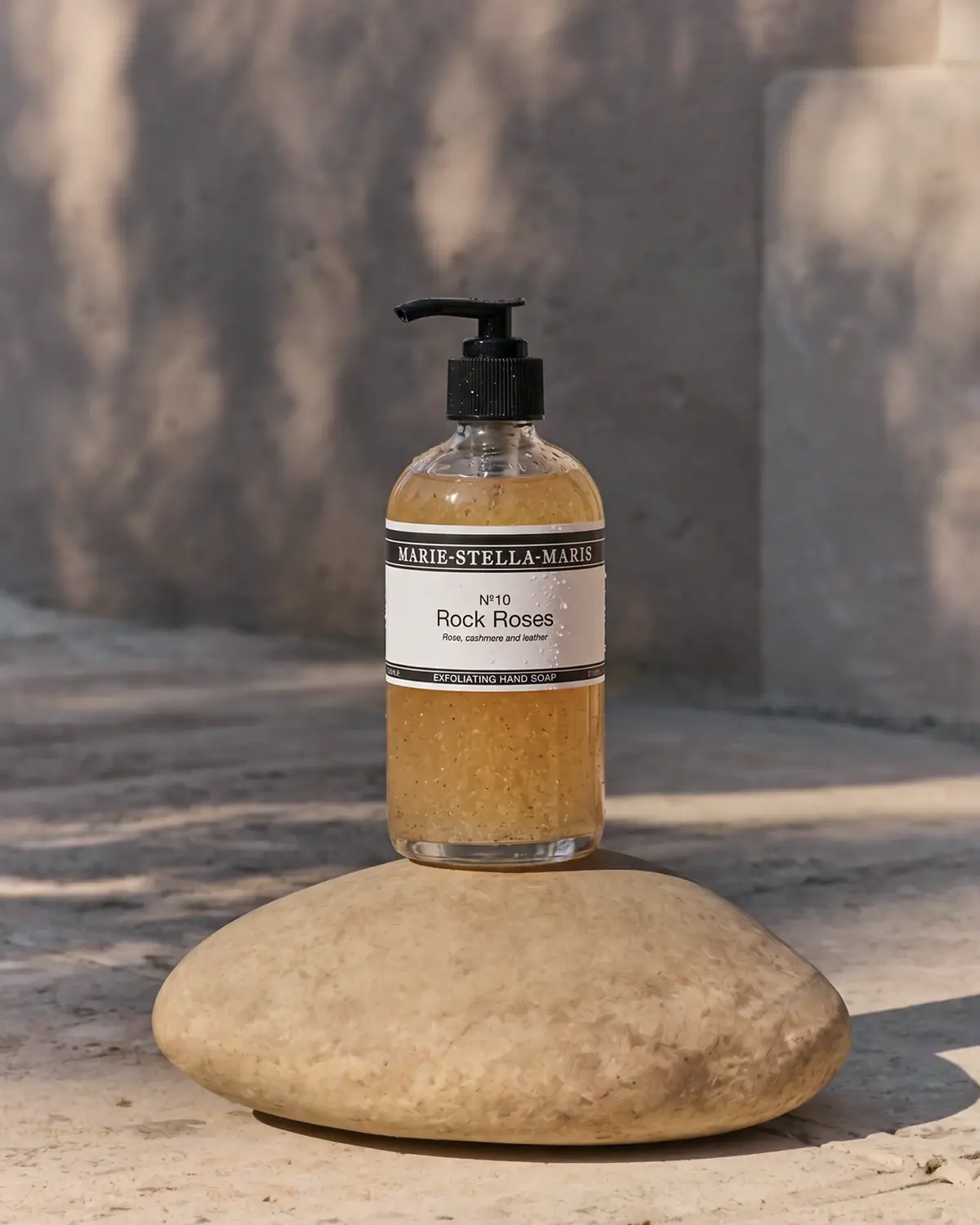
Marie-Stella-Maris
Black label bands frame numbered scent and amber texture
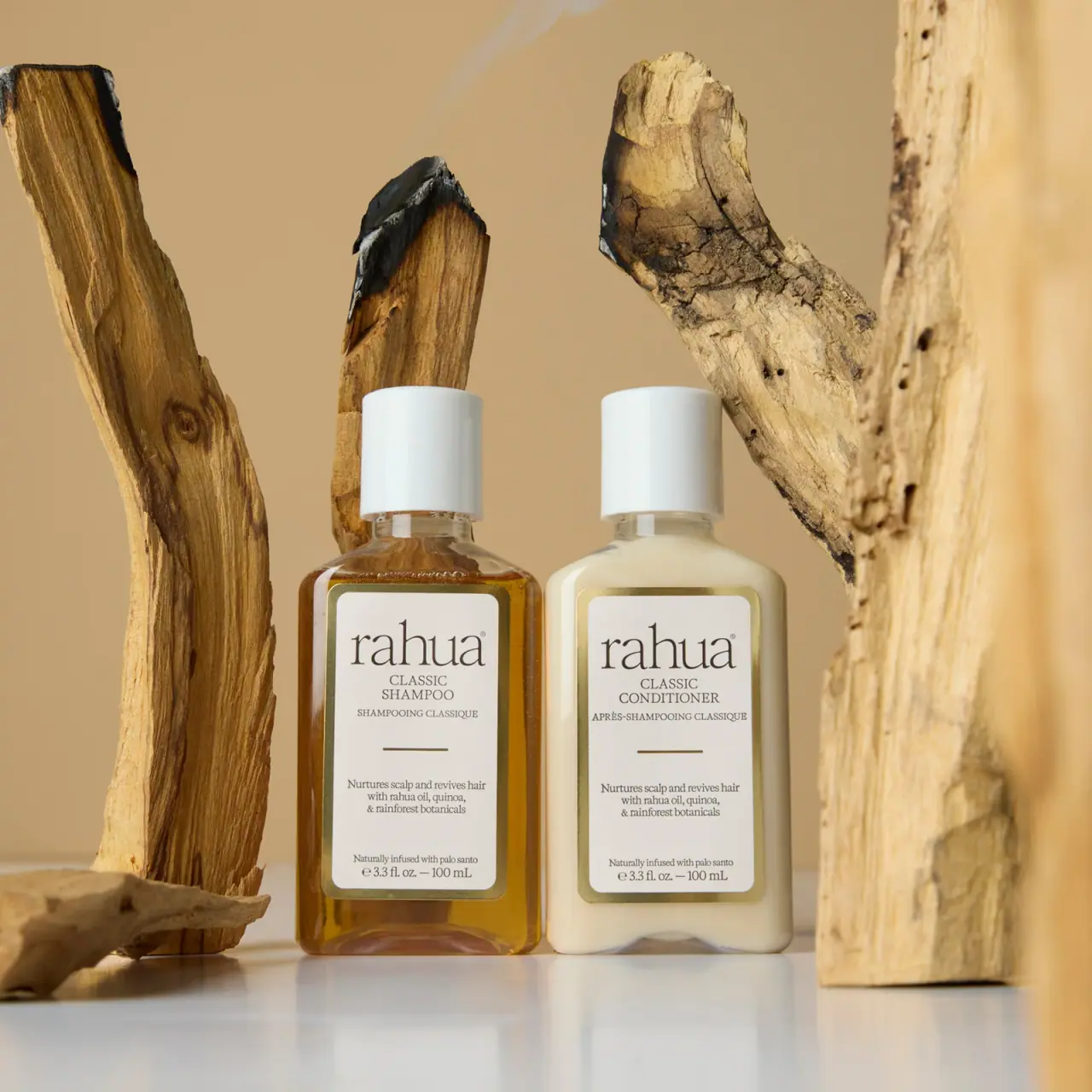
Rahua
paired cream serif labels with gold borders and white caps
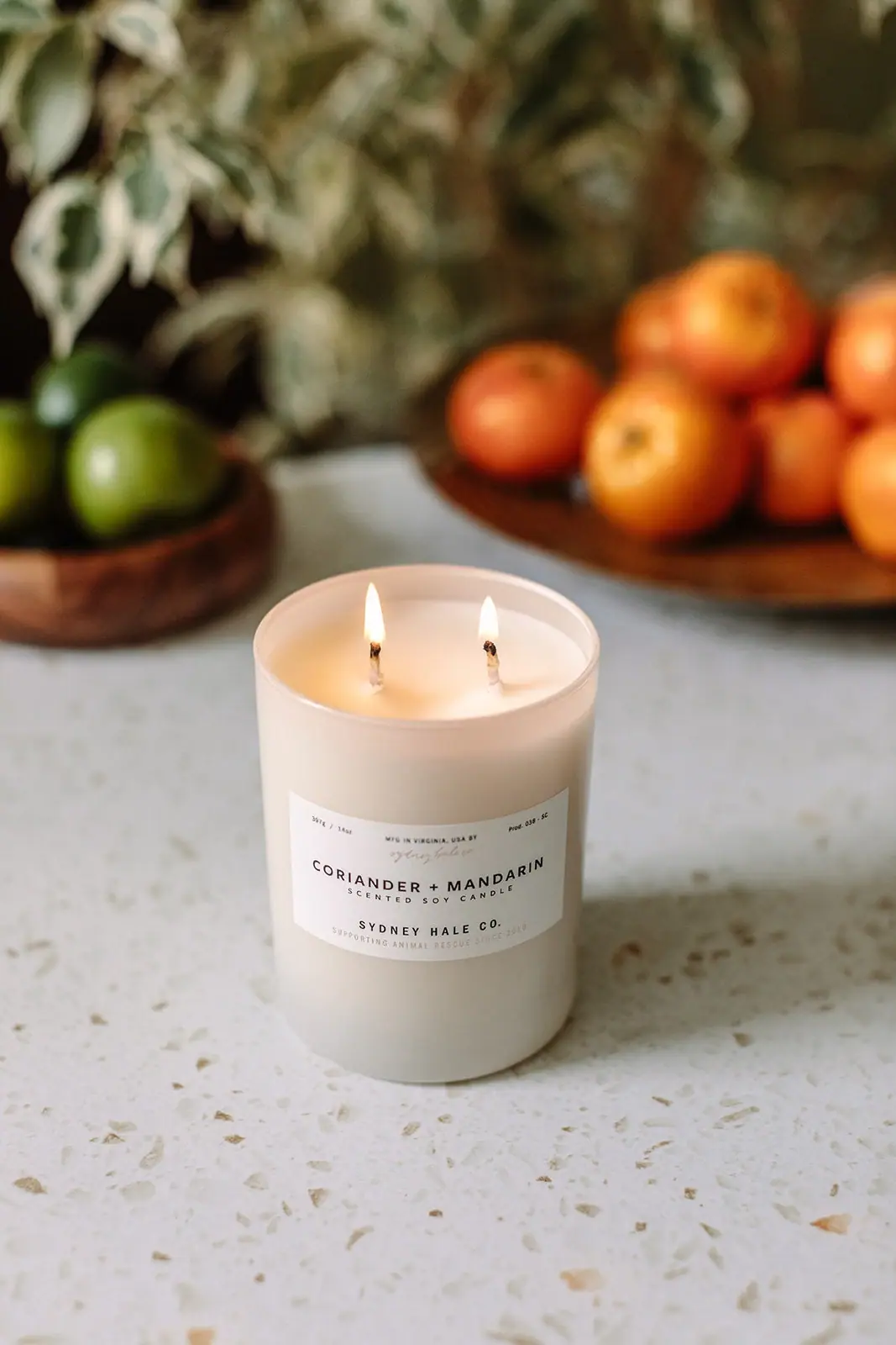
Sydney Hale Co.
Pale double-wick tumbler with a scent-first maker label
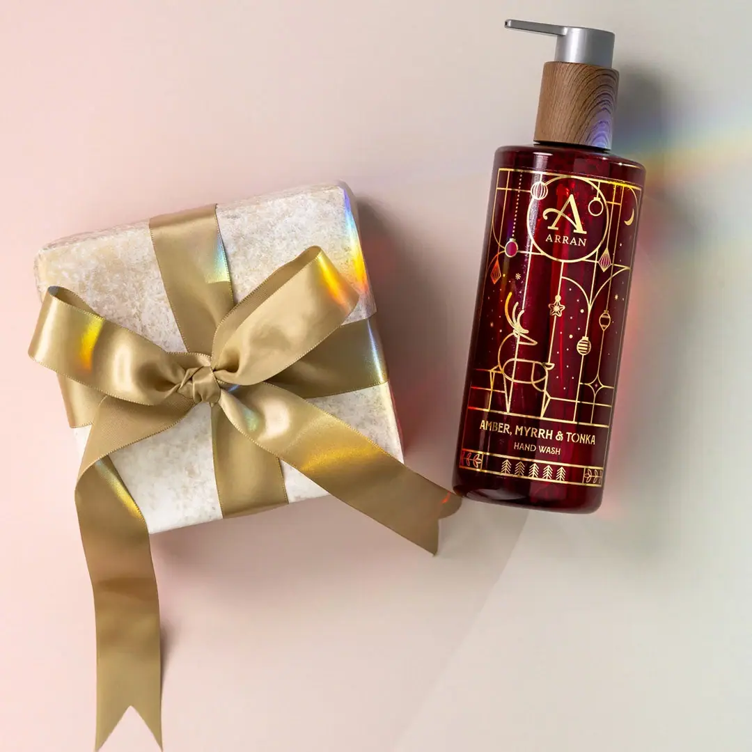
ARRAN
Festive golden linework on garnet with a grain-textured collar

Benamôr
Ornamental lilac medallion suspended above golden botanical oil