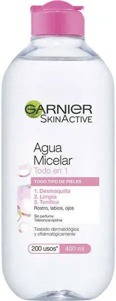
Agua micelar
Photography: Open Beauty Facts · CC BY-SA. All imagery belongs to its respective owner.
What makes the design work
Garnier brand studyVisual observations across the brand’s packaging. Individual formats and editions may vary.
House mark
Charcoal rounded capitals at about 40% of front width with a green leaf arc around the first letter, centred near the top.
Sub-brand masthead
Sub-brand name in its own face directly under the house mark, as large as or larger than it.
Two-colour product name
Product name over two lines with the second line in the variant colour, e.g. pink 'All-in-1'.
Reading the label
Centred stack on the front with the house mark at top, sub-brand masthead, ingredient image mid-pack and claims at the base.
- Top
- Charcoal wordmark with green leaf, recycled-plastic strip on some packs
- Middle
- Sub-brand, product name in two colours, ingredient picture or sun arc
- Bottom
- Big claim number, skin or hair type band, numbered benefits, volume
Typography & hierarchy
The GARNIER mark is first, small and centred near the top. The sub-brand (SkinActive, Fructis, Ambre Solaire) follows at the same size or larger in its own face, then the product name, often set in two lines and two colours. Claim figures (50+, 98%, 400 ml) are set very large in the lower half, and small badges sit at the very top or bottom.
Display
Custom Garnier logotype; close to Nunito ExtraBold
Rounded geometric sans with a leaf arc
Uppercase · ExtraBold
Headline
Helvetica Neue Condensed Black, Futura Condensed ExtraBold
Bold condensed sans
Uppercase or title case · Bold, ExtraBold
Numeral
Futura Condensed ExtraBold numerals
Heavy condensed figures
Figures with a symbol · Black
Typeface suggestions based on visual similarity. These are not verified font identifications.
How the range holds together
Each sub-brand owns a pack shape and colour world; within it, variants are coded by cap or body colour and the ingredient picture, while the house mark stays at the top.
Shelf presence
Each sub-brand blocks as its own colour (clear pink micellar, lime Fructis, orange-white sun care) so the shelf reads as several bright runs held together by the same small charcoal mark.
Related packaging
More curated references in skincare, matched by format and visual style.