About this packaging
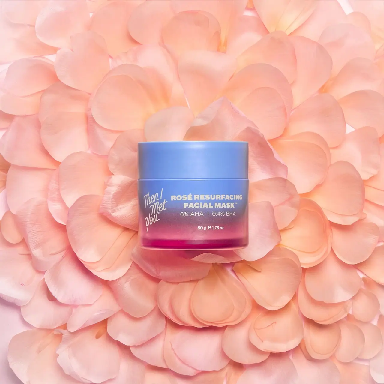
Then I Met You’s Rosé Resurfacing Facial Mask is pictured in a wide jar with a blue-to-pink color transition. The script brand mark and bold product title share the front, while concentration and size sit in smaller lines below.
The official page identifies Rosé Resurfacing Facial Mask and lists its 50 g / 1.76 oz size.[1]
Pack construction & use
- Jar and lid
- The cover shows a low, straight-sided jar and wide lid with a blue-to-pink visual transition.Observed in the reference photograph
- Front label
- The image shows a script brand mark beside the uppercase product title, followed by acid concentration and net weight.Observed in the reference photograph
What makes the design work
Editorial analysis of this packaging reference.
Color flows through the pack
The blue upper area shifts into rose pink below, connecting the title and product category to a clear color signature.
Different type voices
The handwritten logo contrasts with the compact uppercase title. That contrast separates brand personality from functional identification.
Small print stays subordinate
Concentration and size sit below the main title in a smaller line, preserving a clear read order on the curved front.
Ideas for your next brief
- Pair an expressive brand signature with a more legible product title to balance personality and identification.
- Use a continuous color transition to give a simple jar a recognizable face without adding a separate graphic panel.
Sources & further reading
Researched 19 October 2026