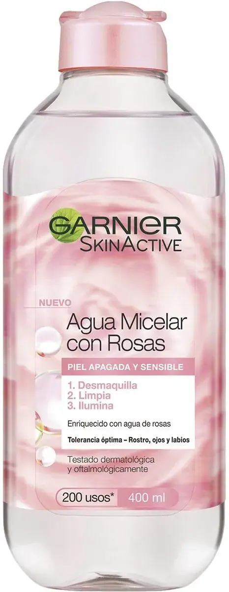
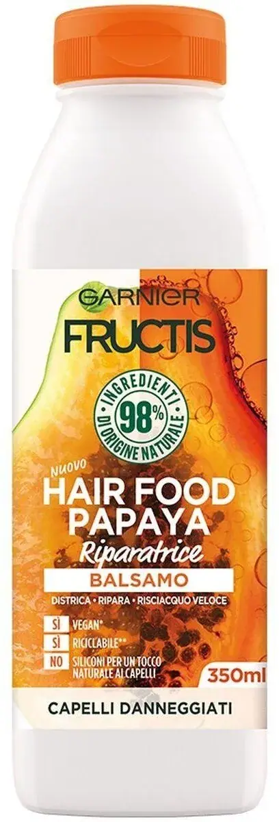
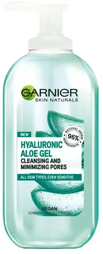
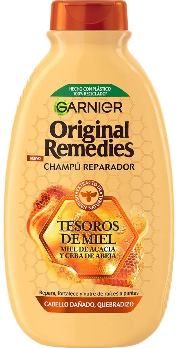
green-leaf mark over fruit-bright sub-brand bottles
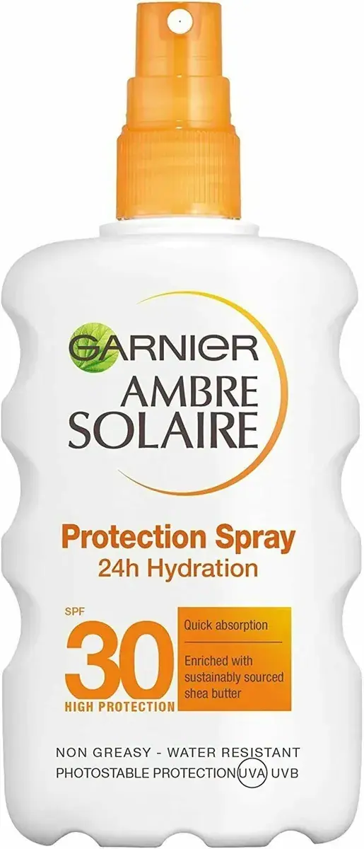
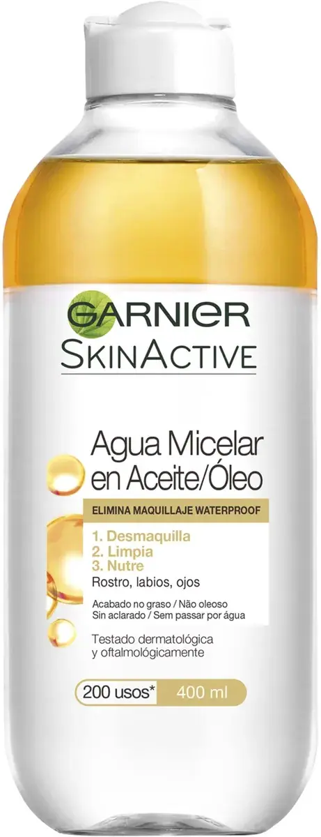
Garnier is a house of sub-brands held together by one mark: GARNIER in dark charcoal (#2b2b2b) capitals with a green (#4c9a2a) leaf arc curling round the G, centred near the top of every pack. Under it each line has its own colour world: SkinActive micellar water in clear PET bottles with a pink (#e86fa8) or blue disc cap and a white text panel, Fructis in saturated green or papaya-orange bottles with a cut fruit photo, Original Remedies in honey-amber with a honeycomb, and Ambre Solaire in white with an orange (#f28a1e) sun arc, orange closures and huge orange SPF numerals. The common thread is the charcoal-and-green mark, bright saturated colour, a picture of the key ingredient and big claim figures.
Approximate colours interpreted from photography. These are screen references, not official brand colours or print specifications.
Pack body
Clear Micellar
#eef2f4
Transparent PET bottle on micellar water so the liquid shows
Sun White
#f6f6f2
White bottle body for sun sprays, tubes and the papaya conditioner
Ink
Garnier Charcoal
#2b2b2b
GARNIER letters at the top of every front and most small back-of-pack text
Accent
Leaf Green
#4c9a2a
Leaf arc around the G of the wordmark, recycled-plastic strip and vegan badges
Sensitive Blue
#2a8fd0
'sensitive expert+' lettering and water-resistance band on sun care
Range coding
Micellar Pink
#e86fa8
Disc cap, product-name second line and claim band on the sensitive micellar water
Bi-phase Gold
#e3b33a
Yellow oil layer seen through the clear bottle and the waterproof band on oil-infused micellar
Fructis Green
#a6c81e
Full bottle colour of the Fructis strength-and-shine shampoo
Papaya Orange
#f08a2a
Lid, label panel and fruit photo on the Hair Food papaya mask and conditioner
Honey Amber
#e9b04a
Full bottle colour of the Original Remedies honey shampoo
Sun Orange
#f28a1e
Sun arc around the sub-brand, SPF numerals, trigger and spray caps on Ambre Solaire
Typography
Suggested visual alternatives, not confirmed brand typefaces. Any scale below is an illustrative estimate.
The GARNIER mark is first, small and centred near the top. The sub-brand (SkinActive, Fructis, Ambre Solaire) follows at the same size or larger in its own face, then the product name, often set in two lines and two colours. Claim figures (50+, 98%, 400 ml) are set very large in the lower half, and small badges sit at the very top or bottom.
Type scale
Estimated cap size as a share of the panel · Front of the 400 ml micellar water bottle, about 190 mm tall
claim-figure
9% · Black · Numeral
50+
sub-brand
6% · ExtraBold · Headline
SOLAR CARE
product-name
4% · Bold · Headline
Micellar Cleansing Water
house-mark
3.5% · ExtraBold · Display
MAISON
variant-line
3% · Bold · Headline
All-in-1
type-band
1.8% · Bold · Body
SENSITIVE SKIN
Fonts
Display
Nunito
Looks like
Custom Garnier logotype; close to Nunito ExtraBold
Type
Rounded geometric sans with a leaf arc
Weight
ExtraBold
Case
Uppercase
Tracking
Slightly wide, about +2%
Fallback
Arial Rounded MT Bold, sans-serif
The house mark only, charcoal letters with the green leaf curling round the first letter.
Headline
Barlow Condensed
Looks like
Helvetica Neue Condensed Black, Futura Condensed ExtraBold
Coloured flip caps, wide disc-top caps on micellar, orange trigger and mist actuators on sun care, coloured screw lids on tubs, pump on gels
Decoration
Direct print, Shrink sleeve, Ingredient photography, Large claim numerals, Recycling and vegan badges
Front Panel
Schematic reading order. The diagram’s zone heights do not represent measured artwork proportions.
Top
Middle
Bottom
Centred stack on the front with the house mark at top, sub-brand masthead, ingredient image mid-pack and claims at the base.
Zone
Content
Top
Charcoal wordmark with green leaf, recycled-plastic strip on some packs
Middle
Sub-brand, product name in two colours, ingredient picture or sun arc
Bottom
Big claim number, skin or hair type band, numbered benefits, volume
Range System
Each sub-brand owns a pack shape and colour world; within it, variants are coded by cap or body colour and the ingredient picture, while the house mark stays at the top.
Micellar sensitive = clear bottle + pink cap and pink second line
Micellar oil-infused = clear bottle with gold oil layer + white cap
Hair Food papaya = white or orange pack + papaya photo
Original Remedies honey = amber bottle + honeycomb image
Ambre Solaire = white bottle, orange arc and cap, big 50+
Back of Pack & Shelf
Backs run dense multilingual copy blocks: directions and benefits per language, an INCI ingredient list, natural-origin percentage, then recycling and sorting marks, barcode and the manufacturer address.
Directions and benefits in two to six languages, including Arabic in some markets
INCI ingredient list in small capitals
Natural-origin percentage and vegan formula note
Sorting and recycling marks, PAO icon
Barcode, batch code and manufacturer address
On shelf
Each sub-brand blocks as its own colour (clear pink micellar, lime Fructis, orange-white sun care) so the shelf reads as several bright runs held together by the same small charcoal mark.
Imagery
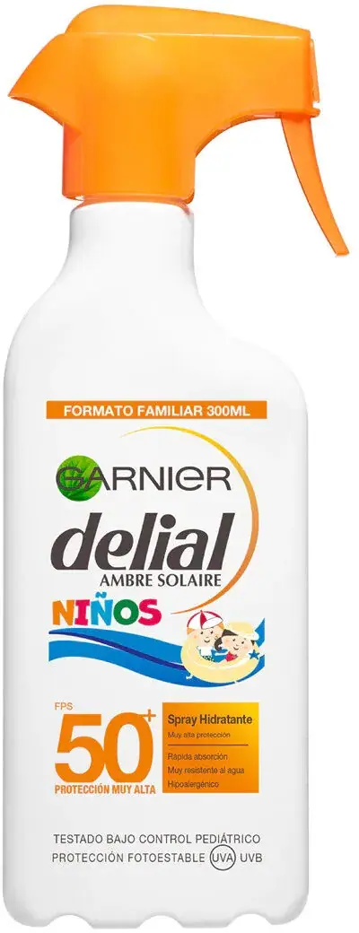
Bright ingredient photos and renders (cut citrus, papaya halves, honeycomb, rose petals, aloe) and simple sun graphics; kids sun care adds small cartoons.
Guidelines
Do
Put the charcoal (#2b2b2b) rounded wordmark with a green (#4c9a2a) leaf at the top of every pack.
Give each sub-brand its own saturated body or cap colour and a masthead as big as the house mark.
Show the key ingredient as a photo or render in the middle of the front.
Set SPF or percentage figures in heavy condensed numerals at about 9% of pack height.
Use clear bottles where the liquid colour helps tell variants apart.
Split the product name over two lines with the second line in the variant colour.
Add a small recycled-plastic badge at the shoulder or base.
Don't
Don't use muted or luxury palettes; colours are bright and fruity.
Don't drop the ingredient picture on hair and body care.
Don't recolour the house mark per variant.
Don't use foil or embossing.
Don't leave the front sparse; packs carry several claims and badges.
Don't make the house mark bigger than the sub-brand masthead.
Give your AI packaging taste
Give your design or image tool a packaging study: palette, type, structure, front panel and principles for an original brief.