About this packaging
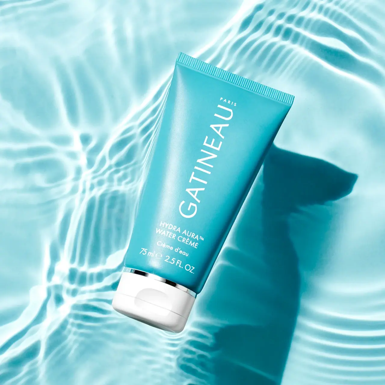
Gatineau Hydra Aura Water Crème is shown in a vivid turquoise tube with white text and a broad white flip-top cap. Its water-ripple setting reinforces the product name visually, while the long vertical brand wordmark makes the tube identifiable in a tight crop.
Gatineau’s official collection lists Water Cream in 75 mL and 15 mL options. The selected cover visibly carries 75 ml / 2.5 fl oz and the wording WATER CRÈME followed by Crème d’eau.[1]
Pack construction & use
- Container
- The cover shows a turquoise tube with a crimped end and the 75 ml size printed on front.[1]
- Closure
- A broad white flip-top cap is visible at the base of the inverted tube.Observed in the reference photograph
- Edition
- The collection lists 75 mL and 15 mL sizes. The photographed 75 mL front uses WATER CRÈME with the French wording Crème d’eau below; current web titles use Water Cream.[1]
What makes the design work
Editorial analysis of this packaging reference.
Turquoise field with a white closure
Saturated turquoise covers most of the tube, contrasting with white type and a broad white cap. A narrow silver-looking band marks the cap boundary. This one image does not establish a universal colour rule for the full range.
Vertical brand movement
The long vertical wordmark uses the tube’s height, while product naming and size sit in smaller lines below.
Photography follows the name
Rippling water patterns echo the Water Crème name and make the tube appear within a fluid visual field. The cap remains visible, clarifying orientation and use rather than leaving the pack as an abstract color shape.
Ideas for your next brief
- Use a saturated body colour and contrasting closure to separate a simple tube from a related-colour photographic setting.
- Keep the closure visible in campaign images of inverted tubes so package orientation stays clear.
Sources & further reading
Researched 19 October 2026