Photography: Ian Oliver Walsh — product photography. Images belong to their respective owners.
Gatineau

Turquoise tube with lengthwise white name and silver accent
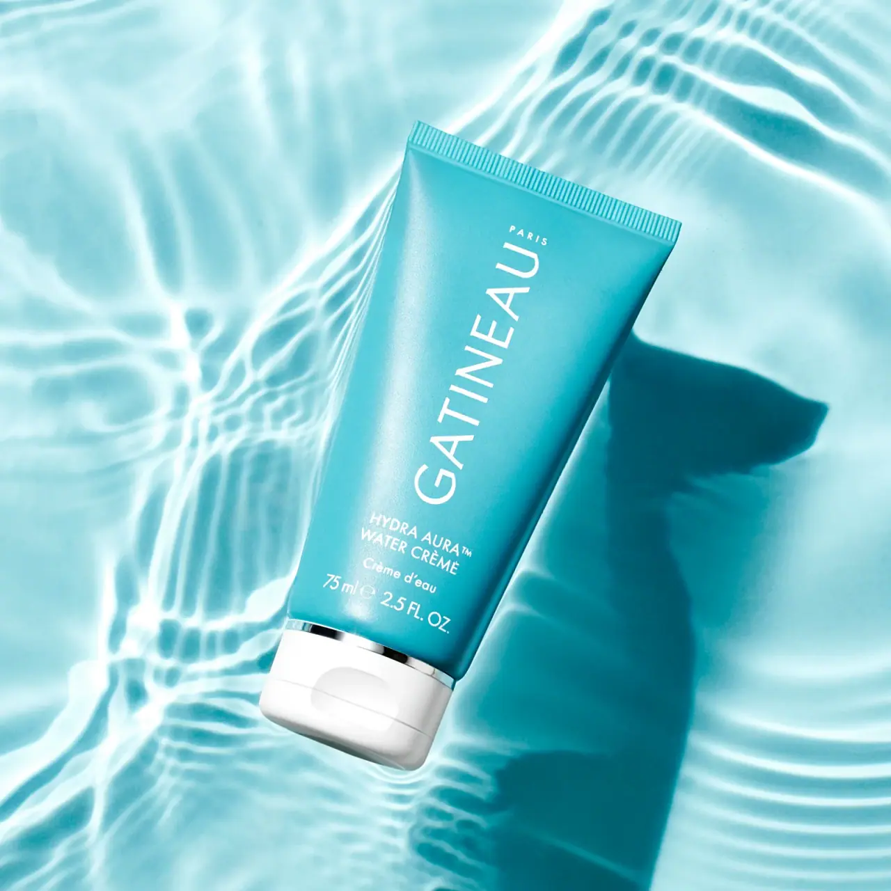
Hydra Aura Water Crème uses most of its turquoise tube length for a large rotated GATINEAU name. Smaller horizontal product and capacity lines gather near the white flip cap, creating a deliberate change in reading direction. A thin reflective silver-looking band separates cap and body. The selected water-ripple photograph repeats the tube's cool colour family while a deep shadow gives the object definition. This study follows the visible 75 mL package and its exact front wording, keeping current online size options and photographic water effects separate from the package's construction.
- Skincare
- Light pack
- Bold typographic
- Clinical minimal
About this study
The selected 75 mL Water Crème tube with bilingual front wording. Official current size listings provide context but do not establish identical construction for the 15 mL version.
Sources & evidence · Reviewed 2026-10-19Color Palette
Approximate colours interpreted from photography. These are screen references, not official brand colours or print specifications.
Pack body
Saturated turquoise tube
#159FB1
Approximate main body colour, darker than much of the surrounding pale aqua scene. Its left highlight and shaded right edge are lighting variations rather than additional range colours.
White flip cap
#F3F4F1
Approximate opaque closure colour. Its broad light mass visibly marks the dispensing end of the saturated tube.
Ink
White front type
#F3FCF8
Approximate maker, product and capacity lettering. White connects the large rotated name with the small horizontal information block.
Accent
Silver-looking separator
#BFCFD0
Approximate reflective band between tube and cap. Bright and dark reflections change its apparent colour; the value is not a material specification.
Typography
Suggested visual alternatives, not confirmed brand typefaces. Any scale below is an illustrative estimate.
GATINEAU is the largest element, set in light uppercase letters and rotated along the tube's long axis. A tiny spaced PARIS sits near the far end of that identity area. Near the closure, HYDRA AURA and WATER CRÈME return to a horizontal reading direction, followed by the smaller French wording Crème d'eau and the capacity line. The contrast is primarily scale and orientation rather than multiple type styles. This lets the maker occupy a long narrow field while the practical details use the tube's width.
Fonts
Original long maker-name alternative
Montserrat
- Looks like
- Light geometric uppercase sans
- Type
- Geometric sans serif
- Weight
- Light, Regular
- Case
- Uppercase
- Tracking
- Slightly open
- Fallback
- Arial, sans-serif
Explore a long rotated brand line while preserving generous internal letter spaces. Check the name in both upright storage and the intended photographic orientation before fixing its reading direction.
Product and quantity alternative
Source Sans 3
- Looks like
- Compact plain sans serif
- Type
- Sans serif
- Weight
- Regular, SemiBold
- Case
- Uppercase product family with mixed-case translation
- Tracking
- Normal
- Fallback
- Arial, sans-serif
Build a concise lower information block that remains legible beside the dominant maker name. Use line spacing to separate language and quantity rather than giving every line equal headline emphasis.
Structure & Proportions
Visual proportions and finish previews are illustrative. Confirmed construction details and uncertainties are distinguished in the study notes.
Proportions
| Purpose | Value | Preview |
|---|---|---|
| Length used for identity | The maker name occupies most of the available long body area, allowing a large word without spreading it horizontally across the tapered width. | — |
| Compressed lower details | Product family, product name, translation and capacity gather immediately above the reflective band, leaving the upper field less fragmented. | — |
| Closure contrast | The white cap is a broad terminal block, while the reflective separator is a fine line. Their different scales distinguish functional form from decorative accent. | — |
Shapes
| Element | Value | Preview |
|---|---|---|
| Tube outline | Straight broad crimp tapering into a curved body above the narrower cap. | |
| Long maker field | A rotated line of large letters aligned to the tube's principal axis. | |
| Closure recess | Rounded thumb indentation on the white flip-top face. |
Finishes
Softly reflective body appearance
Turquoise tube wall · matte
Reflective separator appearance
Narrow cap-to-body band · metallic
Smooth white closure
Cap's rounded exterior · gloss
Formats and materials
| Formats | Turquoise squeeze tube with a straight ribbed crimp, Broad white closed flip cap at the dispensing end, Selected front visibly marked 75 ml / 2.5 fl oz |
| Materials | The tube's exact resin, laminate construction and barrier layers are unverified in the inspected official text., The white closure appears opaque, but its polymer and hinge construction are not specified., The narrow reflective separator has a silver-like appearance; the image cannot identify metal, metallised film, coating or a decorative insert. |
| Closures | The cap has a rounded rectangular-looking front, a visible horizontal lid seam and a thumb recess. Its white colour makes the opening end clear even with the tube tilted diagonally. It remains closed in the selected photograph, so nozzle diameter, outlet shape and sealing details are not available. Water imagery is not evidence of a waterproof or submersible package claim. |
| Decoration | Oversized rotated maker name, Compact horizontal bilingual product block, Consistent white lettering across identity and practical details |
Front Panel
Schematic reading order. The diagram’s zone heights do not represent measured artwork proportions.
The main front uses two orientations within one colour system. The rotated maker line is isolated above the smaller horizontal product block, so the eye encounters a clear change in scale before changing reading direction. No framed sticker or large image panel is visible. The decoration method is unknown, and the fine surface texture in the photograph should not be converted into a claim of a particular varnish or pigment.
| Zone | Content |
|---|---|
| Near the sealed end | Small PARIS word associated with the large maker identity. |
| Long central identity field | Large white GATINEAU lettering running lengthwise along the tube. |
| Lower product block | HYDRA AURA and WATER CRÈME above Crème d'eau, arranged horizontally relative to the tube width. |
| Capacity line | 75 ml and 2.5 FL. OZ. directly above the reflective separator; the photographed size is clear without relying on an online default variant. |
Range System
The official Hydra Aura collection lists Water Cream in 75 mL and 15 mL options, while the separately opened product page currently defaults to a 15 mL listing. The selected image is explicitly 75 mL. These sources establish size context, not identical construction or a universal turquoise rule across every item. The observed design can inspire a consistent maker orientation and a flexible lower product block, provided each format is checked independently.
- The larger tube gives the rotated name ample length while keeping bilingual wording near the closure.
- A smaller format would require a fresh hierarchy check rather than mechanically shrinking all text.
- Turquoise connects this package with its water-themed scene; a broader range-colour strategy remains an interpretation until multiple packs are compared.
Back of Pack & Shelf
The reverse, underside, opened cap and any carton are not shown. Online ingredient and usage text does not reveal how the back is divided or printed.
- Do not invent a reverse-language order from the short bilingual front.
- Keep pictured 75 mL information separate from the current product page's default 15 mL variant.
- For original work, allow sufficient space for practical information on the actual tube geometry rather than borrowing the front's oversized scale.
On shelf
As an interpretation, the long white name and saturated body colour provide strong recognition cues even when only part of the tube is visible. The smaller product wording remains a close-reading task. Rotating the maker line uses space efficiently but creates a different reading direction from the lower information; that trade-off should be tested with the tube standing cap-down as well as lying in a campaign composition. The photograph's size and bright caustics cannot establish actual shelf legibility or user preference.
Imagery
Ian Oliver Walsh's beauty portfolio is the recorded primary photography source and includes Gatineau aquatic imagery. The approved image places the tube diagonally within a pale aqua field crossed by bright water-like caustics. A strong cast shadow extends away from the right side, separating the saturated body from the similarly coloured setting. The reflective separator catches sharp bright and dark strips, while the broad body highlight is softer. These effects make a simple tube feel dimensional. The ripples are not a printed pattern, and the apparent watery setting does not establish a tested resistance property of either formula or package.
Guidelines
Editorial principles for an original design brief, not official brand guidelines.
Do
- Use orientation deliberately to fit a long maker name.
- Keep product and capacity details in a clearly separate block.
- Verify the photographed size before applying current online specifications.
- Distinguish reflective appearance from component material.
- Test the tube in storage and handling orientations as well as campaign imagery.
Don't
- Do not treat water caustics as printed graphics.
- Do not infer waterproof performance from the scene.
- Do not assign a universal range colour from one package.
- Do not reproduce the exact rotated wordmark or bilingual lock-up.
Sources & evidence
- Hydra Aura Skincare Collection — Gatineaubrand
- Hydra Aura Water Cream — Gatineau product pageproduct
- Beauty still-life photography — Ian Oliver Walshphotographer
How this study was built
edition · Sourced fact
The collection lists 75 mL and 15 mL options; the selected image visibly identifies the larger size.Hydra Aura Skincare Collection — Gatineauedition · Sourced fact
The opened product page presents a 15 mL default and is not treated as the exact photographed size.Hydra Aura Water Cream — Gatineau product pagetypography · Visual observation
The maker line runs lengthwise while product, translation and quantity lines remain horizontal relative to the tube.Beauty still-life photography — Ian Oliver Walshstructure · Visual observation
A white closed flip cap and narrow reflective separator terminate the turquoise body.Beauty still-life photography — Ian Oliver Walshimagery · Visual observation
Water-like caustics and a strong shadow belong to the surrounding photographic field.Beauty still-life photography — Ian Oliver Walshrange · Editorial interpretation
A consistent name orientation could support a family, but this single selected tube cannot verify a universal colour system.
What remains unverified
- Exact tube, cap and reflective-band materials and processes are unverified.
- The reverse, open cap and carton are absent.
- The current opened product page defaults to 15 mL, unlike the photographed 75 mL.
- Original fonts, numeric proportions and package colour standards are not established.
Give your AI
packaging taste
Give your design or image tool a packaging study: palette, type, structure, front panel and principles for an original brief.
Export this styleFree with an email. PACK.md works in Claude, ChatGPT, Cursor and image tools.
More like this

AussieZinc
Sun-yellow numerals on a tall, information-rich white cylinder

BioSeivas
Vertical serif identity on a mauve treatment band
ELEVEN Australia
Deep blue open jar with emphatic hold-first typography

Malin+Goetz
pharmacy label set in bracketed helvetica
Murad
Purple inner field framed by clear walls and silver

Native
white drugstore bottles, scent-tinted vertical caps
Odele
Cream tube with tiny utility copy and oversized lower serif
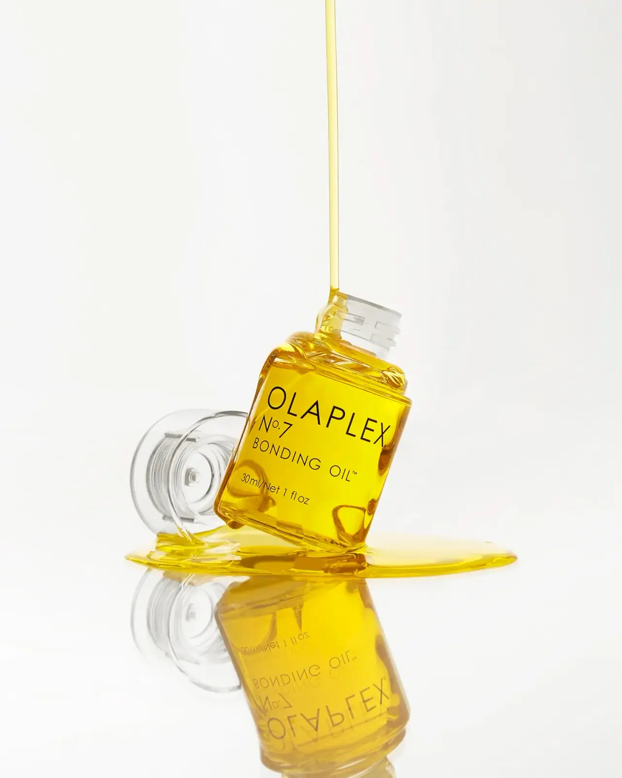
Olaplex
Clear compact bottle with golden oil and precise black type