About this packaging
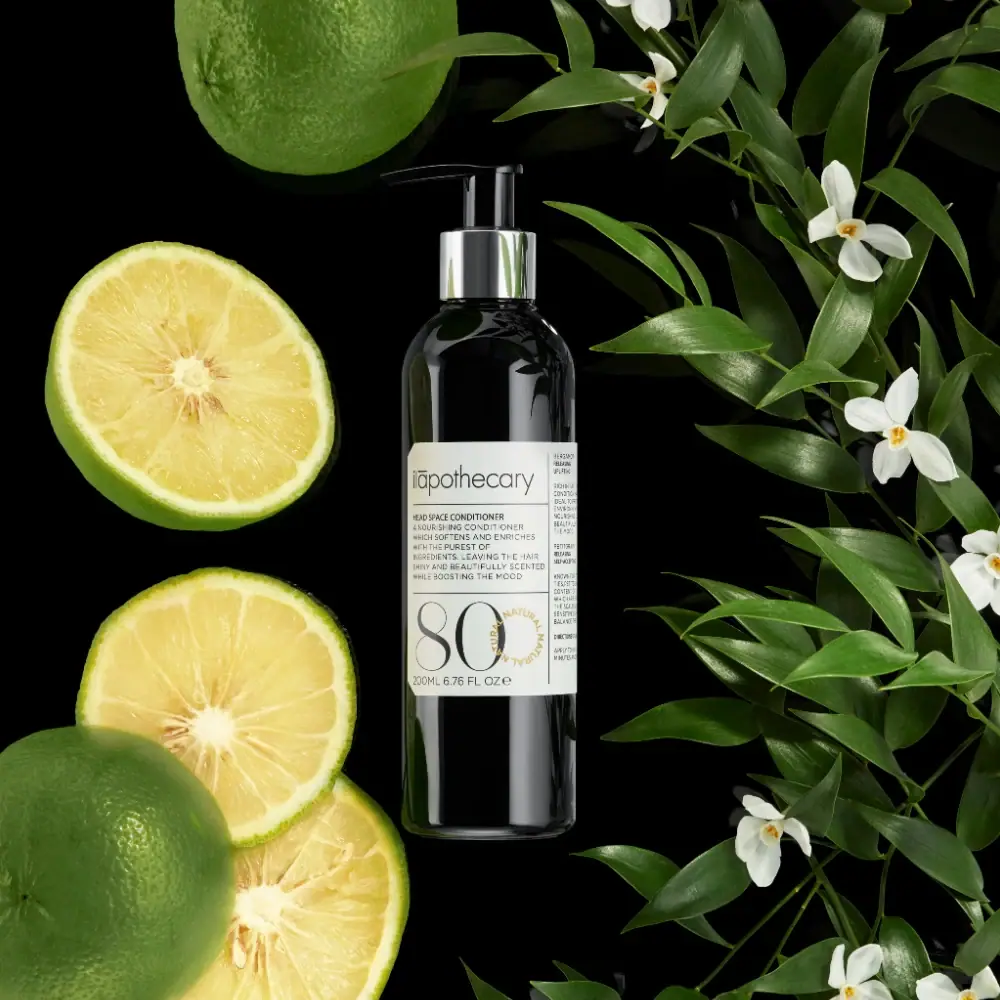
ilapothecary Head Space Conditioner appears in a dark, straight-sided pump bottle with a reflective collar and a dense white front label. Citrus and white flowers flank the pack, connecting the ingredient story to the product while the narrow label retains several readable information tiers.
The official product page identifies Head Space Conditioner as a 200 ml conditioner and describes its essential-oil blend, including patchouli, bitter orange / petitgrain, bergamot and lavender.[1]
Pack construction & use
- Container
- The official listing gives Head Space Conditioner as 200 ml. The cover shows a tall dark cylindrical bottle.[1]
- Closure / dispenser
- A black pump head with a reflective collar is visible.Observed in the reference photograph
- Ruled wrap label
- The off-white label divides a broad main field from a narrow right-side column. Fine rules separate producer, conditioner copy and an oversized 80, with the 200 ml quantity below and an ochre circular text motif near the numeral.Observed in the reference photograph
What makes the design work
Editorial analysis of this packaging reference.
A ruled label with a large identifier
The pale wrap label contrasts with the glossy dark bottle. Its main panel combines fine uppercase description with a very large thin-stroked 80; a vertical rule separates a narrow secondary column. The number’s meaning is not established as a percentage or quantity.
Pump presentation
The visible pump communicates the dispensing format; its reflective collar creates a small bright break at the shoulder.
Botanical scent story
Citrus fruit and white blossoms frame the label, echoing several aromatic ingredients on the official page. The black ground provides contrast and keeps the props from blending into the bottle silhouette.
Ideas for your next brief
- Use a light, narrow label to preserve readability on a dark bottle.
- Show the pump directly when dispensing format is central to everyday use.
Sources & further reading
Researched 19 October 2026