Photography: ilapothecary — official product photography. Images belong to their respective owners.
ilapothecary

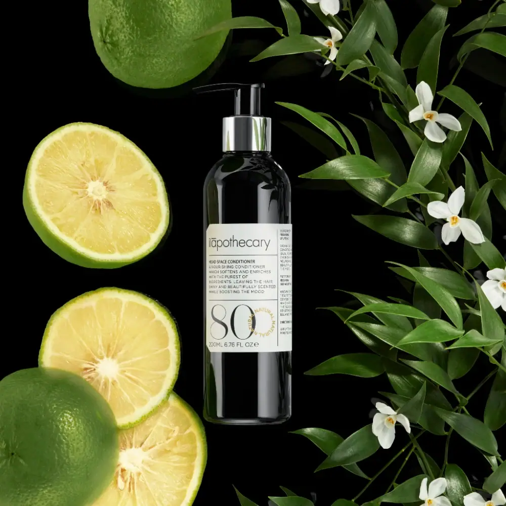
Dark pump bottle with a ruled label and oversized 80
The selected Head Space Conditioner bottle pairs a glossy dark cylinder with a black pump and bright silver-coloured collar. Its off-white wrap label is divided into a main reading area and a narrow side column by fine rules. A light producer wordmark heads the main panel, followed by small conditioner copy and a very large thin-stroked 80. A small ochre circular text motif overlaps the numeral region. The official product page and visible quantity line identify 200 ml.
- Hair
- Light pack
- Apothecary
- Bold typographic
About this study
Selected 200 ml Head Space Conditioner pump bottle with ruled label and large 80; numbering semantics and component materials unverified.
Sources & evidence · Reviewed 2026-10-19Color Palette
Approximate colours interpreted from photography. These are screen references, not official brand colours or print specifications.
Pack body
Glossy near-black body
#111510
Approximate dark bottle and black pump. Green reflections from nearby leaves do not prove a green substrate.
Label
Warm off-white panel
#E5E5DA
Continuous pale wrap label behind fine text, rules and the large number.
Ink
Charcoal information
#41443E
Light wordmark, dense small copy, dividing rules and oversized numeral. Stroke weight changes hierarchy more than ink colour.
Accent
Ochre circular lettering
#B7A45C
Small repeated circular text near the zero, adding a limited warm accent without a filled badge.
Silver collar appearance
#C4C7C3
Reflective pump collar with scene-dependent highlights. Metal construction or plating is not verified.
Typography
Suggested visual alternatives, not confirmed brand typefaces. Any scale below is an illustrative estimate.
The ilapothecary wordmark sits at the top of the broad main label section above a thin horizontal rule. HEAD SPACE CONDITIONER begins a compact uppercase text block, followed by several short lines of description. Another rule separates that copy from the oversized 80 below. The quantity sits along the bottom, while a vertical divider isolates a very narrow column of small additional text on the right. The large number is the strongest graphic element, but its meaning is not established as a percentage, quantity or performance rating.
Fonts
Producer alternative
Roboto Condensed
- Looks like
- Roboto Condensed
- Type
- Condensed sans serif
- Weight
- Light 300 / Regular 400
- Case
- Lowercase
- Tracking
- Close to neutral
- Fallback
- sans-serif
A proposed light narrow identity for an original producer. Maintain enough stroke contrast against the pale label without copying the existing custom lettering or accent details.
Numeral alternative
Bodoni Moda
- Looks like
- Bodoni Moda
- Type
- High-contrast serif
- Weight
- Regular 400
- Case
- Large numerals
- Tracking
- Optically adjusted
- Fallback
- serif
Use an oversized original identifier with delicate hairlines and strong curves. Clearly explain its role elsewhere; do not allow a large number to be mistaken for fill volume or a formula percentage.
Dense information alternative
Barlow Condensed
- Looks like
- Barlow Condensed
- Type
- Condensed sans serif
- Weight
- Regular 400 / Medium 500
- Case
- Uppercase with short mixed-case exceptions
- Tracking
- Slightly open
- Fallback
- sans-serif
A compact option for product description and secondary columns. Keep realistic line lengths and test the narrow side text around the bottle curvature at print size.
Structure & Proportions
Visual proportions and finish previews are illustrative. Confirmed construction details and uncertainties are distinguished in the study notes.
Proportions
| Purpose | Value | Preview |
|---|---|---|
| Bottle silhouette | A tall narrow cylinder leaves substantial dark surface visible above and below the middle wrap label. | — |
| Label columns | The main front field is much wider than the narrow visible right column, divided by a single vertical rule. | — |
| Oversized identifier | The 80 occupies most of the lower main panel, substantially larger than either producer or product name. | — |
Shapes
| Element | Value | Preview |
|---|---|---|
| Bottle body | Straight cylinder with rounded shoulders and softly curved base edge. | |
| Exposed dispenser | Black pump with horizontal spout above a reflective collar. | |
| Ruled label grid | Rectangular wrap field split into a main area and narrow side column. | |
| Ochre text ring | Small circular lettering overlapping the large-number region. |
Finishes
Glossy dark body
Bottle shoulder and lower cylinder; substrate unverified. · gloss
Reflective silver collar
Pump neck surround; material and finish process unknown. · metallic
Quiet pale label
Ruled information panel; exact stock and coating unknown. · matte
Formats and materials
| Formats | A tall straight-sided dark conditioner bottle with rounded shoulders and an exposed pump. The official page lists 200 ml, matching the visible 200 ml / 6.76 fl oz front line. |
| Materials | The accessed official product page does not establish bottle substrate, pump polymer, collar metal or label stock. A glossy dark container cannot be confidently classified as glass from this photograph., The reflective collar is silver-coloured in appearance, but could involve a finish over another material. No complete component specification or refill claim is available for the selected specimen. |
| Closures | A black pump stem rises above the reflective cylindrical collar, with a short horizontal spout projecting to the left in the image. The pump is visibly exposed rather than hidden by an overcap. Locking mechanism, output per stroke and removability are not demonstrated. |
| Decoration | Fine horizontal and vertical rules divide the label into an identity header, a descriptive block, a large-number region and a narrow side column., An ochre circular text motif overlaps the area near the zero. Its ring-like lettering is not evidence of a separately applied seal or certification. |
Front Panel
Schematic reading order. The diagram’s zone heights do not represent measured artwork proportions.
The label resembles a compact editorial grid. Fine rules keep the producer, paragraph-like product copy and large identifier separate, while a narrow right column accommodates additional small text. The pale field is broad enough to support this density without filling the whole bottle. The 80 gives the system a striking visual anchor, but the product name remains the explicit format identifier above it.
| Zone | Content |
|---|---|
| Producer header | A light lowercase wordmark spans the main panel width above a thin rule. It is larger than the descriptive copy but much smaller than the number. |
| Conditioner description | The product name starts a short uppercase block. Several closely set lines describe the product; the study does not independently endorse the wording as a performance finding. |
| Number and circular accent | A large thin-stroked 80 sits below another rule, partly overlapped by a small ochre text ring. Its visual role is clear even though its complete semantic system is not sourced here. |
| Quantity and side column | The 200 ml / 6.76 fl oz line runs beneath the large numeral. A vertical rule separates narrow secondary text to the right, some of which is too small to transcribe reliably. |
Range System
This study covers the selected Head Space Conditioner label and pump presentation. The official page confirms its 200 ml identity and includes petitgrain, bergamot and patchouli in the ingredient story. It does not establish the meaning of every visible number across the brand, so 80 is treated as a prominent identifier rather than a proven universal numbering rule.
- An original numbered range can use a large identifier as a recognition device, but should explain what it means through clear product naming or a documented index. Avoid confusing it with a concentration or quantity.
- A stable ruled label can accommodate short and long product names if its main and side columns are tested separately. The narrow column should not become a place to hide essential information at unreadable sizes.
Back of Pack & Shelf
A small part of the wrap’s right side is visible, but the full reverse and base are not. The narrow side text cannot support a complete reconstruction of ingredients, instructions or batch placement.
- Inspect a flattened label or full rotation before documenting all column contents.
- Keep pump dose and locking details unassigned until functional evidence is available.
- Verify any large-number meaning through brand documentation rather than reading it as a percentage.
On shelf
The pale label and large 80 should be recognised before the small product-description lines at reduced size. The silver collar adds a functional highlight above the dark body, while the exposed pump explains the dispensing format. This is visual interpretation rather than tested shelf performance. A neutral bottle rotation would complement the botanical hero by making the side column, label edges and closure details easier to inspect.
Imagery
Green citrus fruits and cut yellow-green halves occupy the left side, while leafy branches with small white flowers frame the right. The bottle remains upright against a black ground. This creates a botanical context consistent with parts of the ingredient story, but the photograph alone does not identify the exact fruit or flower species. Bright vertical reflections separate the dark body from the black background, and the off-white label provides the central reading surface.
Guidelines
Editorial principles for an original design brief, not official brand guidelines.
Do
- Keep the oversized number distinct from the 200 ml quantity.
- Describe the main and narrow side columns separately.
- Use reflections to reveal the dark bottle on a dark background.
- Verify pump function and number meaning before assigning specifications.
Don't
- Do not infer glass from the glossy dark cylinder.
- Do not describe the silver collar as solid metal without evidence.
- Do not identify every botanical prop from ingredient names.
- Do not call the ochre text ring a certification seal.
Sources & evidence
How this study was built
edition · Sourced fact
Official product confirms Head Space Conditioner and 200 ml.Head Space Conditioner — ilapothecaryimagery · Sourced fact
Official page includes petitgrain, bergamot and patchouli context; prop species remain unassigned.Head Space Conditioner — ilapothecarystructure · Visual observation
Glossy dark cylinder carries exposed black pump and reflective silver-coloured collar.typography · Visual observation
Light producer, small uppercase text and oversized high-contrast 80 create three scales.label · Visual observation
Fine rules divide a main panel from a narrow right-side column; ochre text ring overlaps numeral area.palette · Visual observation
Off-white, charcoal and ochre label contrasts with dark body and silver collar; foliage colours excluded.range · Editorial interpretation
One visible identifier does not establish the complete brand numbering scheme.
What remains unverified
- Non-www product URL failed; official www page and indexed primary result accessible.
- Body/pump/collar/label materials and pump dose unknown.
- Meaning of large 80 and complete side/reverse text not verified.
- Botanical prop species not identified solely from ingredient context.
- Fonts proposed and colours approximate.
Give your AI
packaging taste
Give your design or image tool a packaging study: palette, type, structure, front panel and principles for an original brief.
Export this styleFree with an email. PACK.md works in Claude, ChatGPT, Cursor and image tools.
More like this
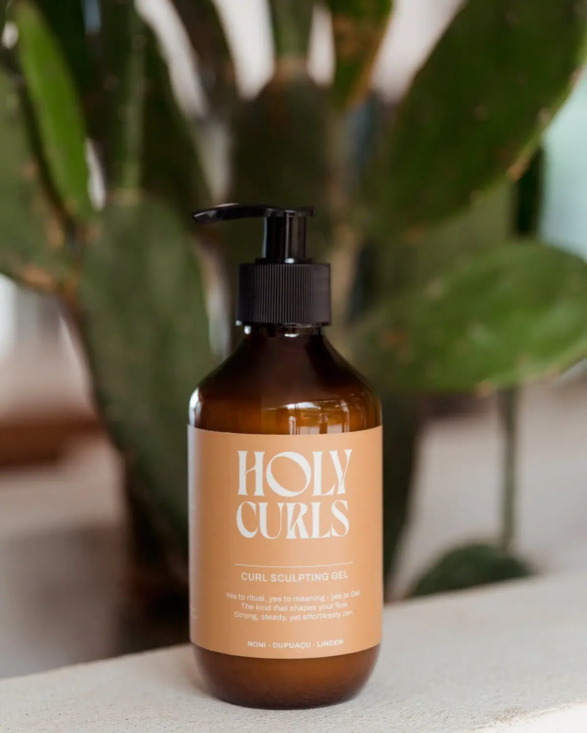
Holy Curls
Expressive white serifs on warm ochre with amber shoulders
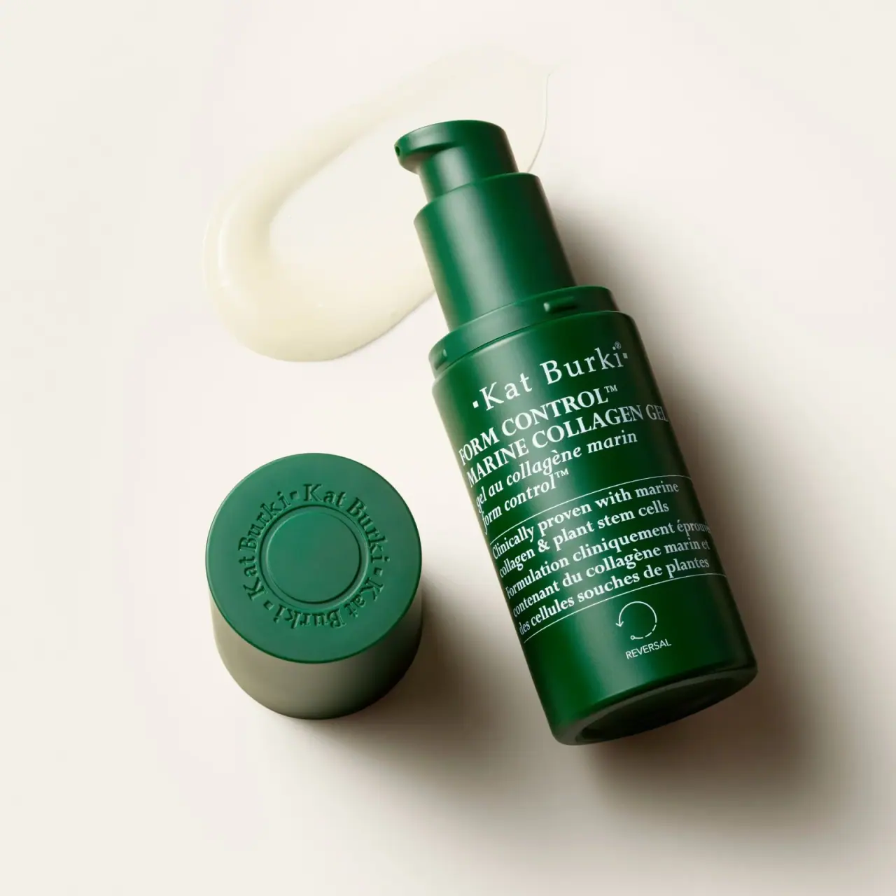
Kat Burki
Forest green, dense white serif text and sculpted cap
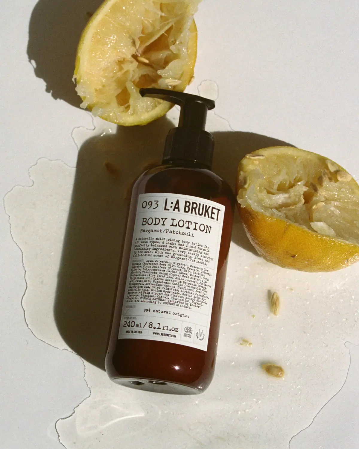
L:A Bruket
Amber pump bottle with a ruled typographic information label
Oway
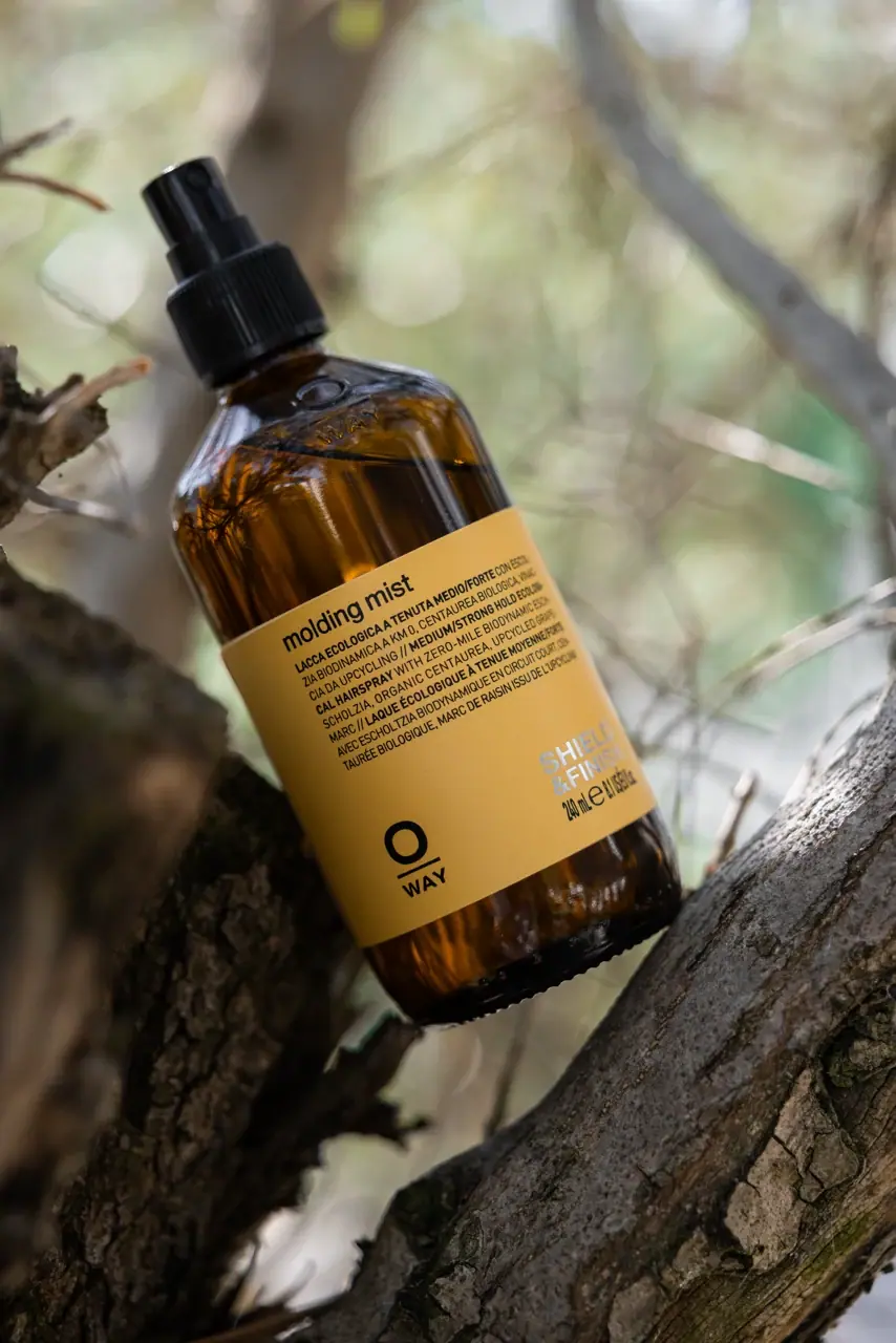
mustard wrap with split lower anchors on amber spray bottle

D.S. & Durga
deadpan grotesk names on parchment labels

ACURE
Iridescent spectacle with practical, tightly ordered type

Aesop
a botanical still life around a disciplined apothecary label

AKT
Lilac stage directions with a quiet metallic detail