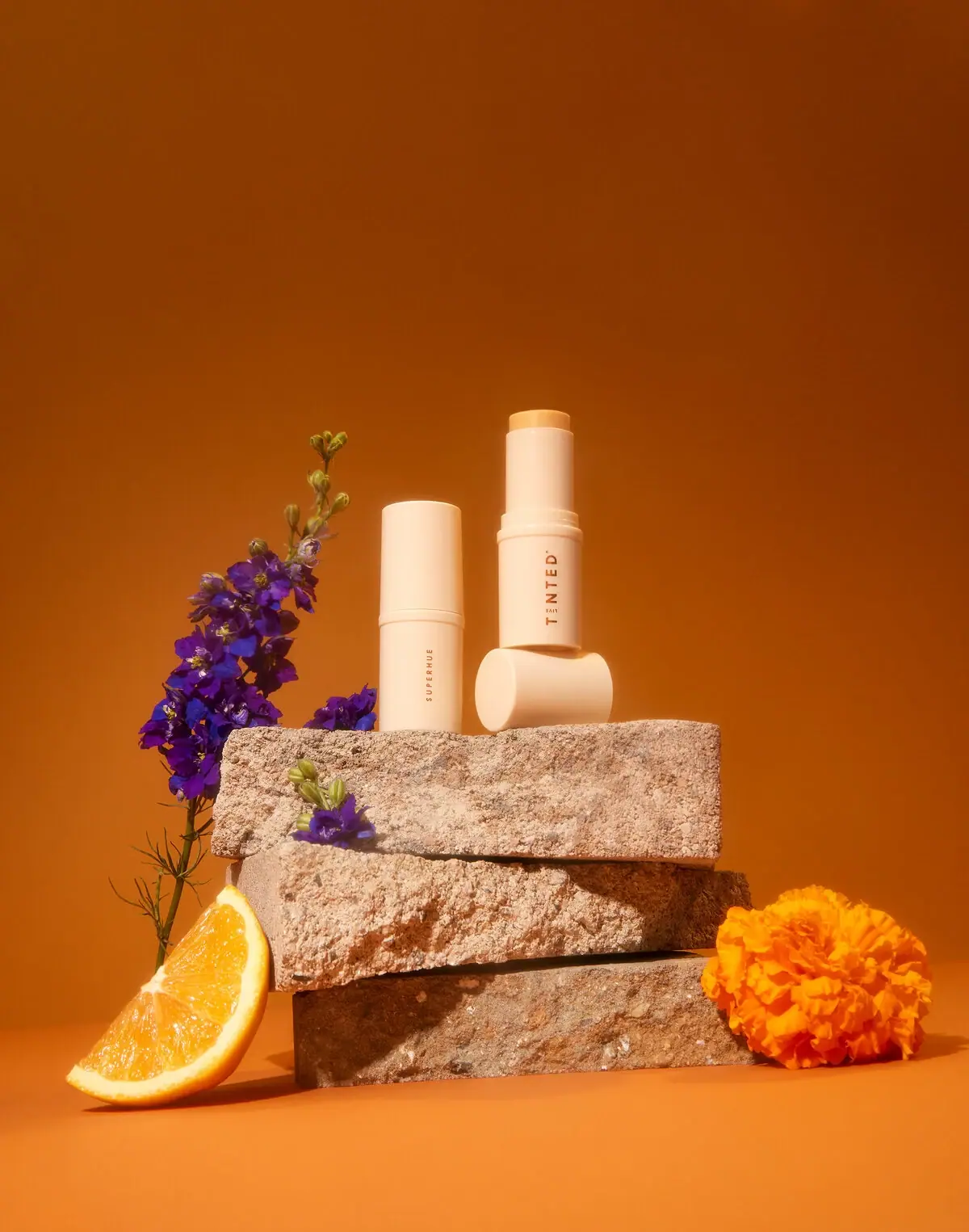
Multi-Stick

Photography: iliabeauty.com. All imagery belongs to its respective owner.
What makes the design work
ILIA brand studyVisual observations across the brand’s packaging. Individual formats and editions may vary.
Vertical wordmark
Thin geometric capitals tracked about +40%, rotated to read bottom to top along about 45% of body height.
Paired cap mark
Same wordmark printed on the cap so that cap and base read as a pair when separated.
Flush cylinder cap
Straight push-on cap the same diameter as the body, in the body colour or a related nude.
Reading the label
No label: the wordmark is printed once along the lower body and once on the cap, both vertical and centred.
- Body
- Vertical spaced wordmark reading bottom to top
- Cap
- Same wordmark repeated, aligned with the body
- Base or back
- Shade, product name and size in tiny type
Typography & hierarchy
There is one typographic element on the front: the brand name, spaced out in thin capitals and rotated to read up the component. It appears again on the cap, so cap and base line up as a pair. Product names, shades and claims are held to tiny lines on the base, the back or the carton.
Display
Futura Light, Neutraface Light
Thin geometric sans, wide tracking
Uppercase · Light
Label
Gotham Book, Brandon Grotesque
Small geometric sans
Uppercase · Regular, Medium
Body
Gotham Light
Light geometric sans
Sentence case · Light
Typeface suggestions based on visual similarity. These are not verified font identifications.
How the range holds together
Body colour stays within warm white, cream and nude, while product type is signalled by component shape and shade by what shows through clear walls, the bullet or a single coloured cap.
Shelf presence
On a counter the range reads as a tidy family of pale, matte cylinders in stepped skin tones, with the shade glimpsed through frosted walls; the thin vertical wordmark is quiet enough to read only up close.
Related packaging
More curated references in skincare, matched by format and visual style.