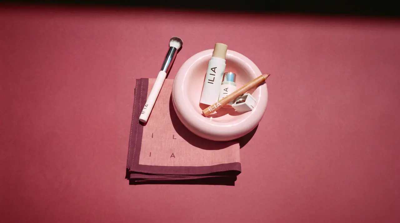
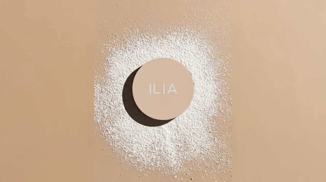
Campaign images © ILIA, from iliabeauty.com
ILIA
whispered capitals on skin-tone sleeves
ILIA keeps every component in a narrow band of skin and stone tones (warm white #ede9e4, cream, sand, nude) so the range looks like one set of objects photographed against white. The four-letter wordmark is the only branding on the front: thin, widely tracked uppercase sans printed vertically along the body and repeated on the cap, so a lipstick or stick reads the name twice when it stands open. Caps are straight cylinders the same diameter as the body. Product colour enters through clear and frosted walls, the bullet itself, or a single lacquered cap on a natural-wood crayon.
- Make-up
- Light pack
- Clinical minimal
- Pastel soft-touch
Color Palette
Approximate colours interpreted from photography. These are screen references, not official brand colours or print specifications.
Pack body
Warm Porcelain
#ede9e4
Matte white sleeves, caps and stick bodies across lip and complexion products
Sand Sleeve
#d6bea8
Lipstick sleeve and cap in a matte nude-beige
Frosted Milk
#e7e0d8
Frosted glass and plastic walls that let serum and concealer tones show through
Peach Cap
#e7c8b4
Pale peach caps on the shadow stick and gloss, matched loosely to the shade family
Raw Cedar
#c99a6e
Unlacquered wood barrel of the lip crayon
Ink
Stone Grey
#6f6866
Thin vertical wordmark on light components
Bone White
#f6f3ee
Wordmark reversed out on nude, wood and tinted gloss components
Accent
Mirror Silver
#b9b9bb
Polished inner collar on the multi-stick
Range coding
Crayon Red
#a4241c
Lacquered cap on the red lip crayon, matched to the lead
Rose Nude
#c98f88
Blush stick, gloss and shade colours seen through clear walls
Typography
Suggested visual alternatives, not confirmed brand typefaces. Any scale below is an illustrative estimate.
There is one typographic element on the front: the brand name, spaced out in thin capitals and rotated to read up the component. It appears again on the cap, so cap and base line up as a pair. Product names, shades and claims are held to tiny lines on the base, the back or the carton.
Type scale
Estimated cap size as a share of the panel · Body of the lipstick base with the cap off, about 55 mm tall
body-wordmark
7% · Light · Display
NOVA
cap-wordmark
7% · Light · Display
NOVA
carton-product
3% · Medium · Label
HYDRATING LIP TINT
shade-name
2% · Regular · Label
SHADE · WARM CLAY
base-size
1.4% · Light · Body
4 g · 0.14 oz
carton-copy
1.2% · Light · Body
Glide on and build to taste.
Fonts
Display
Josefin Sans
- Looks like
- Futura Light, Neutraface Light
- Type
- Thin geometric sans, wide tracking
- Weight
- Light
- Case
- Uppercase
- Tracking
- Very wide, about +40%
- Fallback
- Futura, Century Gothic, sans-serif
The wordmark, rotated vertically on every stick, tube and pencil body and repeated on the cap; grey on light bodies, white on darker ones.
Label
Jost
- Looks like
- Gotham Book, Brandon Grotesque
- Type
- Small geometric sans
- Weight
- Regular, Medium
- Case
- Uppercase
- Tracking
- Wide, about +10%
- Fallback
- Avenir, Helvetica, sans-serif
Product and shade names on base stickers and cartons.
Body
Jost
- Looks like
- Gotham Light
- Type
- Light geometric sans
- Weight
- Light
- Case
- Sentence case
- Tracking
- Normal
- Fallback
- Avenir Light, Helvetica, sans-serif
Size, ingredients and legal on cartons and the backs of components.
Structure & Proportions
Proportions
| Purpose | Value | Preview |
|---|---|---|
| Print coverage | Under 5% of the component surface | |
| Wordmark length | About 45% of body height, reading bottom to top | |
| Wordmark position | Centred on the lower body, starting about 15% up from the base | |
| Cap to body ratio | Cap about 45% of total closed height on lipsticks and sticks | |
| Colours per component | One body colour plus one ink; shade colour only through the walls or bullet | — |
| Density | Nearly empty; one short line of thin type per part | — |
Shapes
| Element | Value | Preview |
|---|---|---|
| Lipstick and sticks | Straight cylinder with a flush cylindrical cap | |
| Wand tube | Slim cylinder with a round cap and doe-foot | |
| Serum tint | Frosted bottle with dropper | |
| Lip crayon | Raw wood pencil with a lacquered cap | |
| Wordmark | Vertical line of type, no frame |
Finishes
Soft matte plastic
Sleeves, caps and stick bodies · soft-touch
Frosted glass and plastic
Serum, concealer and gloss tubes · frosted
Raw wood
Lip crayon barrel · uncoated
Polished collar
Inner collar on the multi-stick · metallic
Formats and materials
| Formats | Lipstick bullet, Twist stick, Balm stick, Wand tube with doe-foot, Dropper bottle, Lip crayon pencil, Powder compact, Gift carton |
| Materials | Matte plastic, Frosted glass, Clear plastic, Natural wood |
| Closures | Straight-walled push-on caps the same width as the body, wand caps in cream or white, lacquered pencil cap |
| Decoration | Single-colour vertical print, Wordmark repeated on cap |
Front Panel
Schematic reading order. The diagram’s zone heights do not represent measured artwork proportions.
No label: the wordmark is printed once along the lower body and once on the cap, both vertical and centred.
| Zone | Content |
|---|---|
| Body | Vertical spaced wordmark reading bottom to top |
| Cap | Same wordmark repeated, aligned with the body |
| Base or back | Shade, product name and size in tiny type |
Range System
Body colour stays within warm white, cream and nude, while product type is signalled by component shape and shade by what shows through clear walls, the bullet or a single coloured cap.
- Lip balm and complexion sticks = warm white sleeves
- Lipstick = sand sleeve and cap
- Concealer and serum tint = frosted bottles showing the shade
- Gloss = clear tube showing the shade + peach cap
- Lip crayon = raw wood + cap in the lead colour
Back of Pack & Shelf
Components carry only a small base sticker; full information lives on a slim cream carton with tiny light sans: product name and shade, a short how-to, the full ingredient list, then legal, recycling and barcode.
- Product name and shade on the base sticker and carton end
- Short how-to-use line
- Full INCI ingredient list
- PAO symbol, batch code and net weight
- Recycling note and barcode on the carton
On shelf
On a counter the range reads as a tidy family of pale, matte cylinders in stepped skin tones, with the shade glimpsed through frosted walls; the thin vertical wordmark is quiet enough to read only up close.
Imagery
None on the components; gift and collaboration cartons may carry a product photograph on a flat coloured ground.
Guidelines
Do
- Keep component colours in warm white (#ede9e4), cream and nude (#d6bea8) families.
- Print the wordmark in thin Display capitals tracked about +40%, running vertically along about 45% of the body.
- Repeat the wordmark on the cap so cap and body pair when separated.
- Let shade colour show through clear or frosted walls rather than printing it.
- Use straight cylindrical caps the same diameter as the body.
- Use grey ink (#6f6866) on light bodies and white (#f6f3ee) on darker ones.
- Keep print coverage under 5% of each part.
Don't
- Don't use black or saturated plastic bodies.
- Don't set the wordmark horizontally or in a bold weight.
- Don't print product names, claims or icons on the front.
- Don't add gloss lacquer, gold or decorative patterns to the bodies.
- Don't vary the type size between products.
- Don't use domed or tapered caps.
Give your AI
packaging taste
Give your design or image tool a packaging study: palette, type, structure, front panel and principles for an original brief.
Export this styleFree with an email. PACK.md works in Claude, ChatGPT, Cursor and image tools.
More like this

Cocokind
sideways lowercase on spa-water pastels

Herbivore
pastel tinted vessels with a white tag
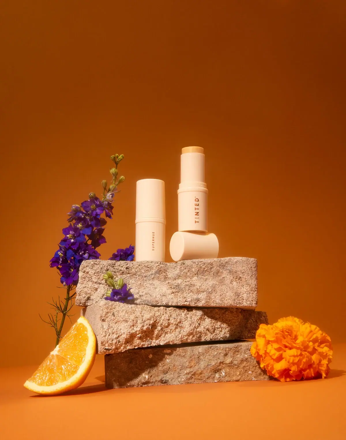
Live Tinted
Pale peach stick, vertical lettering and exposed golden balm
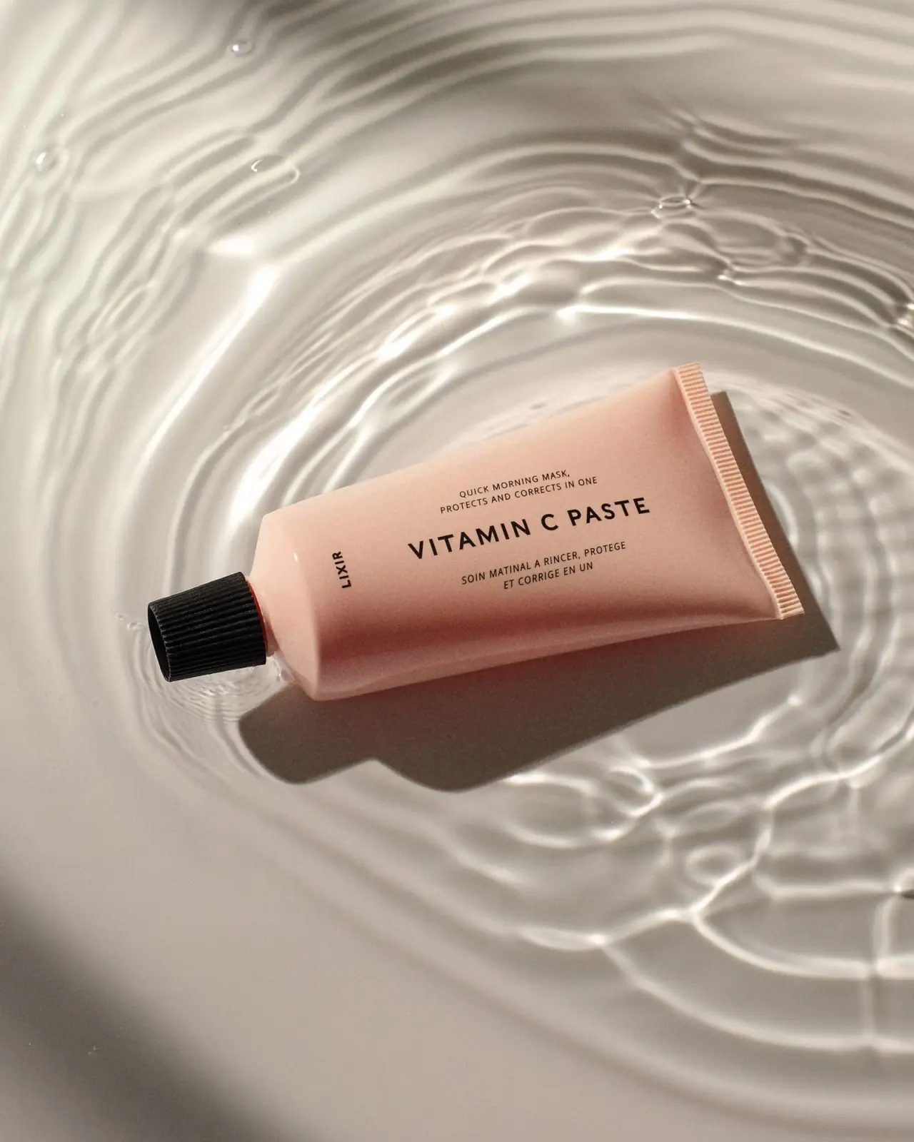
Lixirskin
Peach archival tube with centered title and perpendicular maker

OSEA
sea-glass frosted bottles and a tidal wordmark

OUAI
sheer tinted bottles, small black capitals
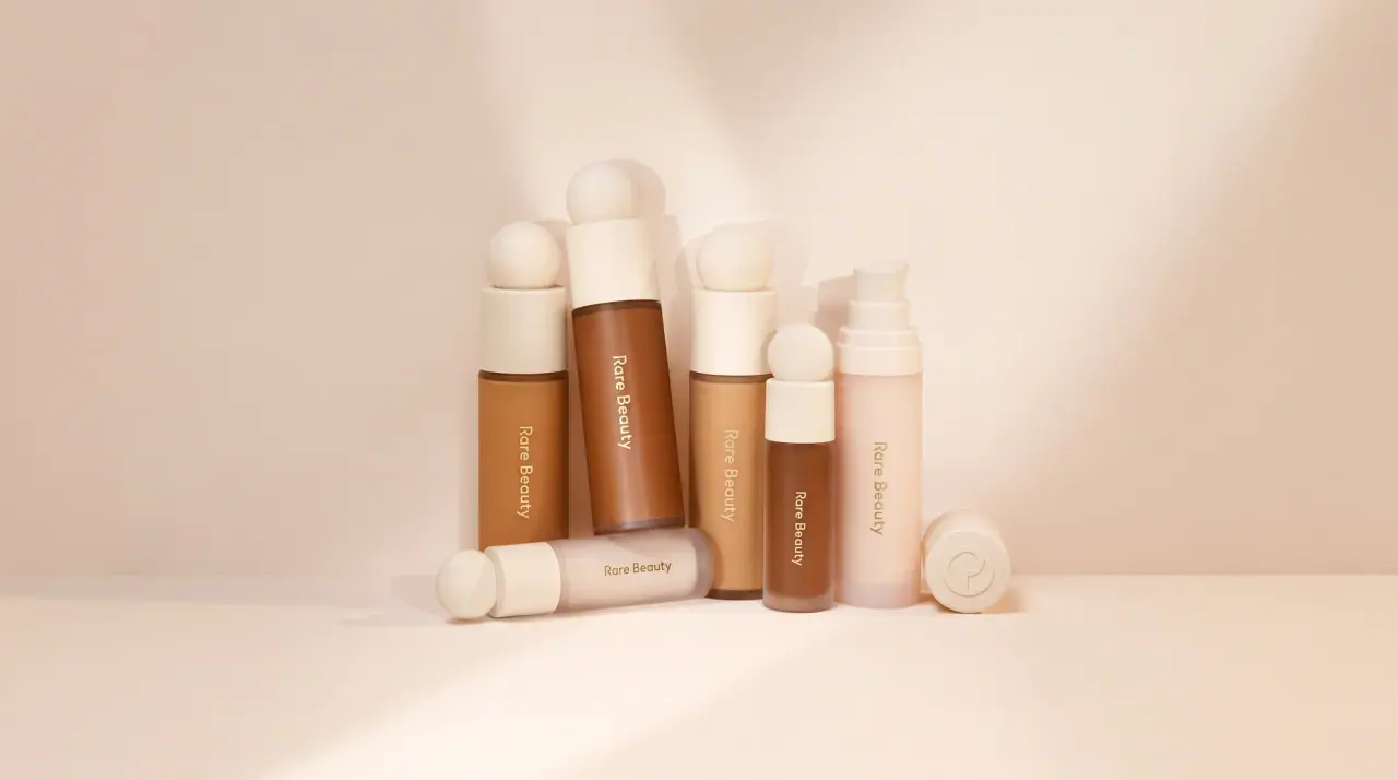
Rare Beauty
sculpted sphere caps in warm skin nudes
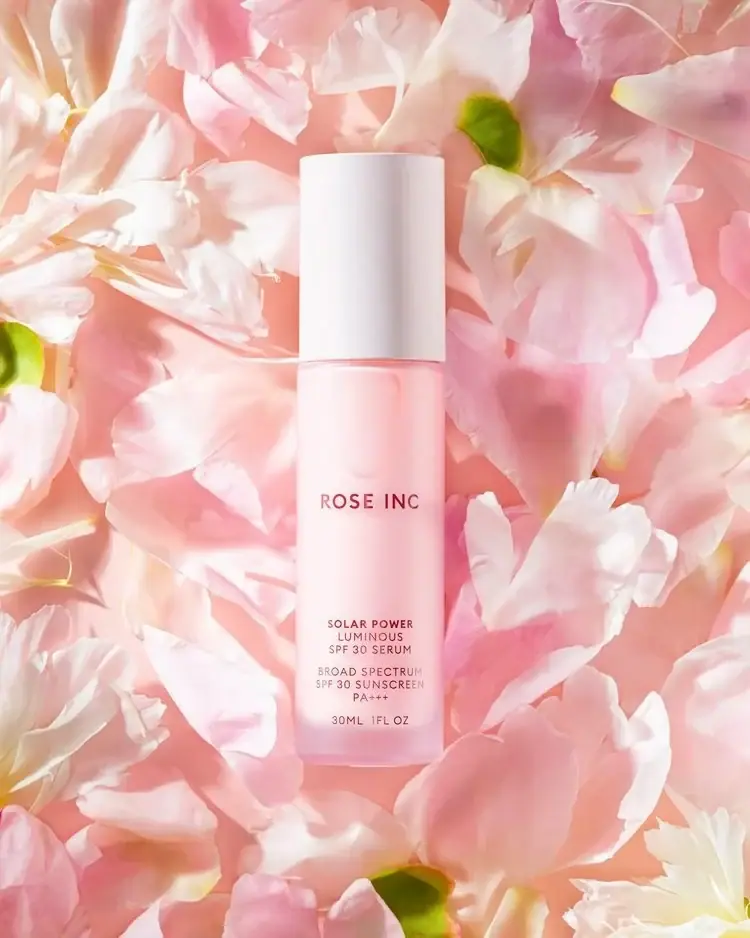
Rose Inc
Translucent blush serum with tall white cap and quiet typography