About this packaging
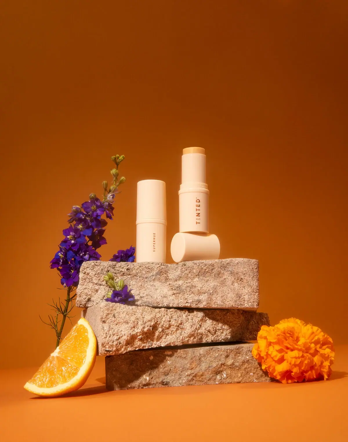
Live Tinted Superhue is shown as a pale cylindrical serum stick with its warm yellow product tip exposed. The muted package stands out against the saturated orange and floral campaign set.
Live Tinted describes Superhue as a balm-to-serum hyperpigmentation serum stick and offers Original and Mini sizes. The official page instructs users to glide it across clean skin and gently rub it in.[1]
Pack construction & use
- Container / format
- The selected image shows a pale twist-up tube with a pale yellow balm core and matching cap.Observed in the reference photograph
- Front lettering
- SUPERHUE runs vertically along the case.Observed in the reference photograph
What makes the design work
Editorial analysis of this packaging reference.
Sparse vertical naming on a compact format
Small spaced SUPERHUE lettering runs vertically on the closed case, while the opened example presents a larger TINTED identity on another face. Broad unprinted areas keep the pale cylindrical form dominant.
Color contrast in campaign
The ivory case and yellow balm sit against a deep orange background, giving the compact strong visibility. Purple flowers and stone add secondary color without obscuring either stick.
Format made visible
The two sticks are shown both capped and opened, making the twist-up balm format clear. The exposed core also gives the pale housing a functional contrast point.
Ideas for your next brief
- Show a stick product open when its solid format is a defining feature; the exposed tip communicates use without instructional copy.
- Use a restrained package color against a contrasting campaign field so the container remains the focal silhouette.
Sources & further reading
Researched 19 October 2026