About this packaging
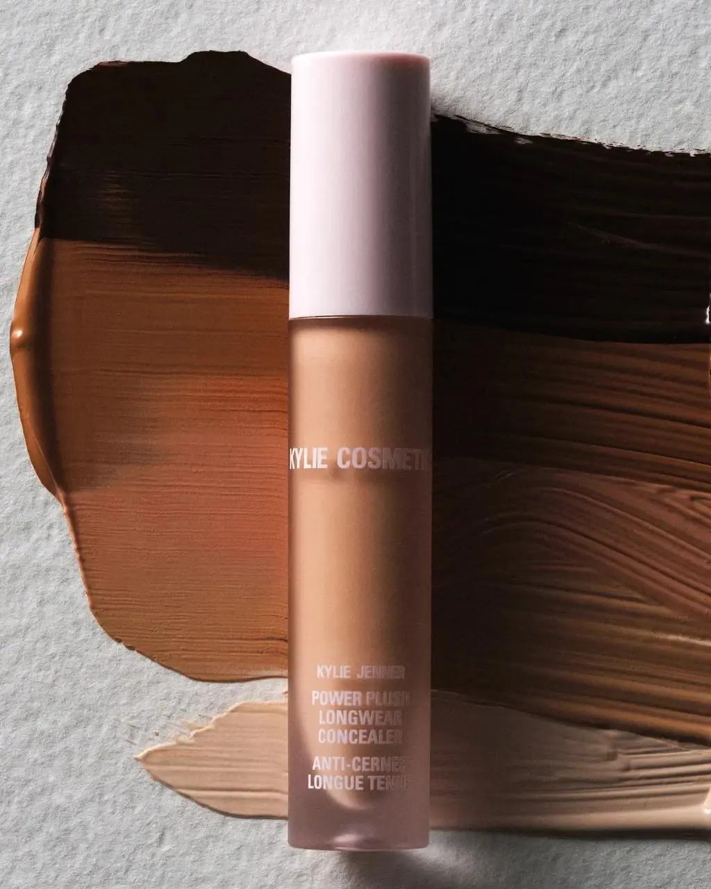
Kylie Cosmetics’ Power Plush Concealer keeps its product identity within a narrow, vertically organized package face.
Kylie Cosmetics positions Power Plush as a medium, buildable-coverage concealer with a satin finish. Its shade-selection guidance distinguishes matching the complexion from choosing lighter or darker shades for highlighting and contouring.[1]
Pack construction & use
- Applicator
- The brand’s instructions identify a doe-foot applicator used to swipe or dab the formula onto skin before blending with a brush. This gives the narrow pack a precise application role beyond storing the liquid.[1]
- Tube and printed hierarchy
- A tall pale-pink cylindrical cap aligns with the straight-sided translucent color chamber. The small white KYLIE COSMETICS wordmark is isolated near the upper part of the body. Compact stacked product text sits close to the rounded base, leaving an open band between the two label groups.Observed in the reference photograph
What makes the design work
Editorial analysis of this packaging reference.
Separated label zones
Branding near the top and product identification low on the body leave a broad open middle. This spacing gives a crowded cosmetic name room to read.
Cap and formula field
The light cap provides a calm top block above the warm-toned color chamber, creating a two-part silhouette without printed color bands.
Compact copy
Small stacked naming follows the narrow tube format, with white lettering selected for contrast against the darker shade shown.
Ideas for your next brief
- Use vertical separation to make small branding and detailed product naming legible on slim formats.
- A neutral cap can balance a strong formula color without adding another graphic element.
Sources & further reading
Researched 19 October 2026