About this packaging
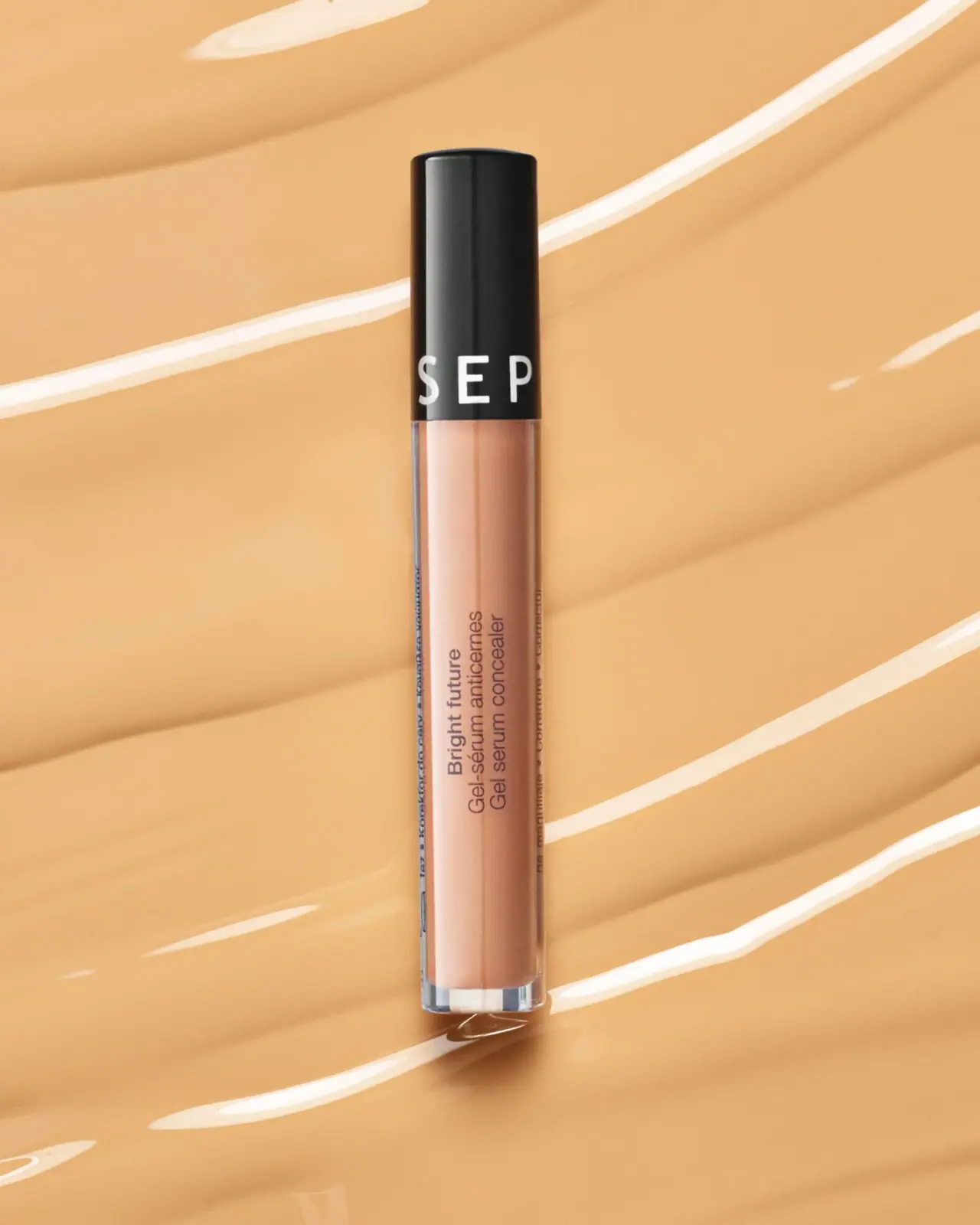
Sephora Collection Bright Future Gel Serum Concealer is shown in a narrow transparent tube with a tall black cap and vertical product lettering. The black-and-clear package is isolated against a warm background.
Sephora Mexico lists Bright Future Gel Serum Concealer as a Sephora Collection product.[1]
Pack construction & use
- Tube / cap
- The cover shows a narrow clear-sided tube with a tall black cap; the applicator is not visible.Observed in the reference photograph
- Front copy
- Bright future and French/English concealer naming form a compact rotated block on the clear body. Large white producer letters wrap around the lower cap; only part of the word is visible from the selected angle.Observed in the reference photograph
- Cap / body contrast
- The tall black cap occupies much of the slim package silhouette, while the clear body reveals the concealer shade.Observed in the reference photograph
What makes the design work
Editorial analysis of this packaging reference.
A strong dark anchor
The black cap creates a high-contrast top that helps the slender tube remain legible against a skin-tone setting. Large spaced letters on the cap identify Sephora Collection from a distance, while the product name sits smaller on the transparent body.
Vertical information flow
The product name runs along the length of the tube, working with the tall format instead of demanding a wider label. A second language appears alongside it, allowing the product to keep a compact front while preserving useful naming information.
Let the shade show
The clear wall makes the peach-toned contents part of the palette. The image uses a similar warm background, so the dark cap and printed lettering do the work of defining the outline; a brighter background or front-facing color chip could improve shelf separation in other contexts.
Ideas for your next brief
- Use the dark cap as an anchor on a transparent shade-specific tube, while keeping product naming on the body.
- Align bilingual product copy to the narrow tube format rather than widening the label into a wrap that hides the shade.
Sources & further reading
Researched 19 October 2026