


Kylie Cosmetics

baby-pink plastic with a dripping cap
Kylie Cosmetics builds almost every component in one baby pink (Ballet Slipper #f6cfd6): glossy pink caps, frosted pink compacts, matte pink tubes and pencils, so the range looks like a single candy-coloured set. The signature device is a pink drip moulded or printed down from the cap of the liquid-lipstick and gloss tubes, over a clear tube that shows the shade, with the name in tall condensed capitals running vertically, chrome silver on the cap or tone-on-tone pink on the tube. A soft rounded lowercase wordmark is used tone-on-tone or embossed into compact lids, while newer tubes and balms set large product names vertically in either a rounded bold serif or a tall condensed sans; liners carry a silver band near the tip.
- Make-up
- Light pack
- Pastel soft-touch
- Playful colour
Color Palette
Approximate colours interpreted from photography. These are screen references, not official brand colours or print specifications.
Pack body
Ballet Slipper
#f6cfd6
Caps, compacts, balm cases, pencil barrels and the drip itself: nearly every component
Frosted Petal
#f3c4cf
Translucent frosted compact lid with the embossed wordmark
Powder Nude
#efd6d0
Matte squeeze tubes for gloss drip and lip butter
Clear Tube
#f4f2f2
Transparent lipstick and gloss tube that shows the shade beneath the drip
Ink
Chrome Silver
#c9c9cb
Mirror-metallic vertical capitals on liquid-lipstick caps and the band on liner pencils
Tonal Rose
#d99ca5
Tone-on-tone product names on matte tubes and the vertical name on gloss tubes
Liner Black
#1c1c1c
Vertical condensed product name on the butter balm case
Range coding
Shade Window
#c97a72
The product's own shade, seen through the clear tube under the drip
Typography
Suggested visual alternatives, not confirmed brand typefaces. Any scale below is an illustrative estimate.
The product or brand name, set vertically along the length of the component, is the largest element. On liquid lipsticks the brand takes over in tall chrome capitals on the cap with the founder's full name in tiny capitals beside it. The rounded lowercase wordmark appears at the base of tubes or pressed into compact lids; legal text is tiny near the base.
Type scale
Estimated cap size as a share of the panel · Matte liquid lipstick component, about 105 mm tall including cap
vertical-brand
30% · Bold · Display
POUT
vertical-product-name
24% · Bold · Headline
Sugar Drip
balm-name
20% · Regular · Label
BUTTER BALM
base-wordmark
5% · Bold · Headline
pout
founder-line
2.4% · Medium · Body
BY JANE MORROW
product-type
1.6% · Regular · Body
MATTE LIQUID LIPSTICK
Fonts
Display
Bebas Neue
- Looks like
- Druk Condensed, Bebas Neue
- Type
- Tall condensed sans capitals
- Weight
- Bold
- Case
- Uppercase
- Tracking
- Normal
- Fallback
- Impact, Arial Narrow Bold
Vertical brand name on lipstick caps (chrome) and gloss tubes (tonal pink), filling the component width.
Headline
Corben
- Looks like
- Cooper Black, Recoleta Bold
- Type
- Rounded soft serif, bubbly
- Weight
- Bold
- Case
- Lowercase wordmark; title case product names
- Tracking
- Normal
- Fallback
- Cooper Black, Georgia Bold
Rounded lowercase wordmark on compacts and tube bases, and vertical product names on gloss and butter tubes.
Label
League Gothic
- Looks like
- League Gothic
- Type
- Extra-condensed grotesque
- Weight
- Regular
- Case
- Uppercase
- Tracking
- Normal
- Fallback
- Arial Narrow
Vertical product names on the balm case printed in Liner Black.
Body
Inter
- Looks like
- Helvetica, Arial
- Type
- Neutral sans, small
- Weight
- Regular, Medium
- Case
- Uppercase
- Tracking
- Open, about +6%
- Fallback
- Helvetica, Arial
Founder name line, product type in English and French, and volume near the base.
Structure & Proportions
Proportions
| Purpose | Value | Preview |
|---|---|---|
| Cap height | About 35% of the liquid-lipstick component height | |
| Drip reach | Drips run down about 15% of the tube below the cap | |
| Vertical name length | About 30% of component height on caps, up to 60% on tubes | |
| Name width | About 90% of component width, edge to edge | |
| Shade window | About 50% of the component shows the product through clear plastic | |
| Colours per component | Two: pink plastic plus one ink (chrome, tonal rose or black), plus the shade | — |
| Density | One vertical word per component, nothing else on the front | — |
Shapes
| Element | Value | Preview |
|---|---|---|
| Drip skirt | Wavy drips hanging from the cap edge | |
| Liquid lipstick | Slim straight cylinder tube with a screw cap | |
| Compact | Round or soft-cornered square flip-top | |
| Squeeze tube | Flat tube with a round flat cap | |
| Liner pencil | Slim pencil with a silver band |
Finishes
High gloss pink plastic
Caps and drips · gloss
Clear plastic tube
Liquid lipstick and gloss bodies · transparent
Frosted translucent lid
Blush and powder compacts · frosted
Chrome print
Cap wordmark and liner band · metallic
Embossed wordmark
Compact lids · emboss
Formats and materials
| Formats | Liquid lipstick tube, Squeeze lip tube, Lip gloss wand, Twist-up balm stick, Round compact, Square soft-cornered compact, Lip pencil |
| Materials | Pink plastic, Clear plastic, Frosted translucent plastic |
| Closures | Pink screw caps with a moulded or printed drip skirt on liquid lipstick and gloss, flat round pink caps on squeeze tubes, flip-top compacts with mirror, pink pencil caps |
| Decoration | Drip motif, Embossed wordmark, Tone-on-tone print, Vertical product name |
Front Panel
Schematic reading order. The diagram’s zone heights do not represent measured artwork proportions.
No applied label: names are printed directly on the component, usually vertically, and the drip device frames the shade window on wand products.
| Zone | Content |
|---|---|
| Cap | Chrome vertical capitals and founder name, with drip running down onto the tube |
| Body | Clear window showing the shade, or a vertical product name on opaque tubes |
| Base | Rounded lowercase wordmark, product type and volume |
Range System
One pink component colour across everything; shades are shown by the clear tube or pan, and product types differ by the font of the vertical name rather than by pack colour.
- Matte Liquid Lipstick = pink drip cap + chrome vertical capitals + clear tube
- High Gloss = pink cap, printed drip, tonal pink vertical capitals on clear tube
- Gloss Drip = matte pink tube, tonal rounded serif name
- Tinted Butter Balm = pink case, black condensed name
- Blush = frosted pink compact with embossed wordmark
- Lip liner = pink pencil with a silver band
Back of Pack & Shelf
Components carry only a small block of print on the reverse; full information sits on a pink outer carton that repeats the drip and wordmark, with the shade name, ingredients and legal text in small black capitals.
- Shade name and number on a sticker at the component base
- Full INCI ingredient list on the carton
- Product type in English and French with net volume
- Barcode and batch code on the carton
- Period-after-opening symbol and distributor address
On shelf
On the counter the range reads as a field of identical baby-pink caps and compacts, with the shade colours lined up through clear tubes like a swatch strip; the drip makes the lipsticks recognisable from the cap alone.
Imagery
No illustration beyond the drip shape; product swatches and the product itself are the image, and campaign shots focus on close-up lips.
Guidelines
Do
- Make every component the same Ballet Slipper (#f6cfd6) pink, gloss or frosted.
- Run a pink drip down about 15% of a clear tube from the cap so the shade shows beneath.
- Set the brand on lipstick caps in tall Display capitals in Chrome Silver (#c9c9cb), running vertically.
- Print large product names vertically along tubes and cases in the Headline rounded serif or Label condensed sans.
- Emboss or tone-print the rounded lowercase wordmark rather than shouting it.
- Keep legal text under 2% of component height, near the base.
Don't
- Don't introduce a second component colour for different product types.
- Don't use paper labels, borders or illustrated scenes.
- Don't set the wordmark in a sharp serif or thin sans.
- Don't hide the shade behind opaque material on wand products.
- Don't use dark or earthy pack colours.
- Don't run names horizontally on slim components.
Give your AI
packaging taste
Give your design or image tool a packaging study: palette, type, structure, front panel and principles for an original brief.
Export this styleFree with an email. PACK.md works in Claude, ChatGPT, Cursor and image tools.
More like this

Bread Beauty Supply
bubblegum pumps and a fat black wordmark
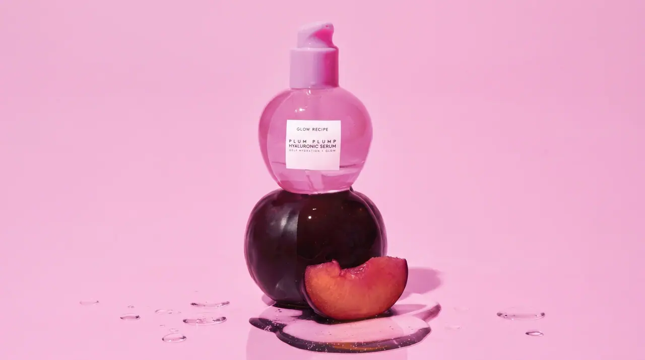
Glow Recipe
juicy fruit candy in tinted glass

Kosas
lavender chrome and candy-pink acrylic
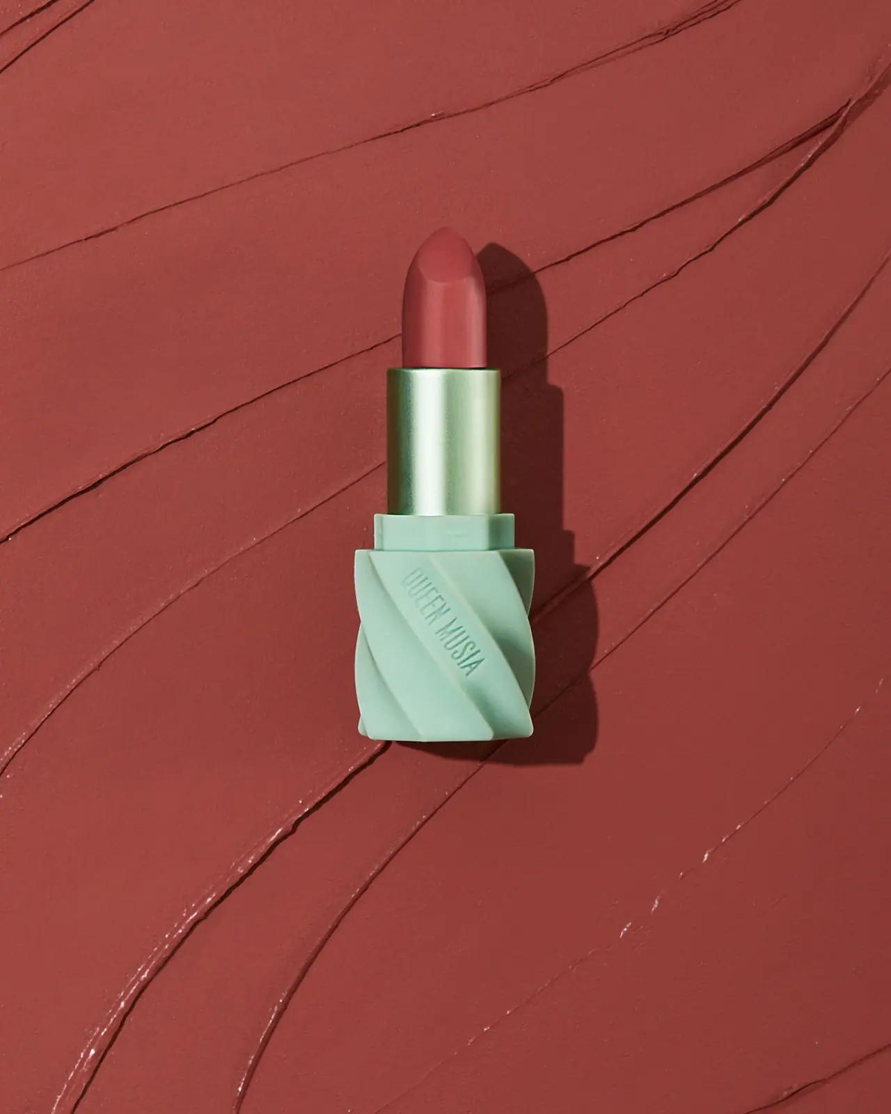
QUEEN MUSIA
Mint diagonal folds with reflective green sleeve and warm lipstick
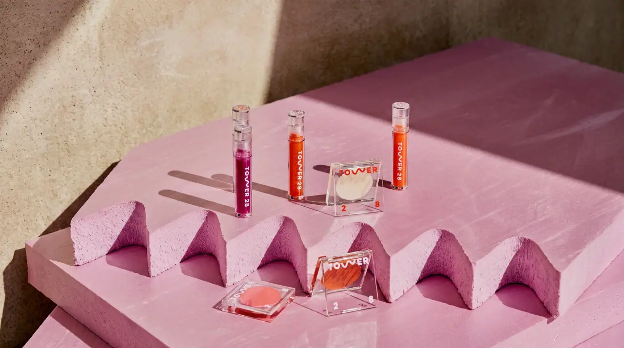
Tower 28
lilac acrylic cubes and wavy w marks

ACURE
Iridescent spectacle with practical, tightly ordered type

Bask
sunny yellow with a playful turquoise signature
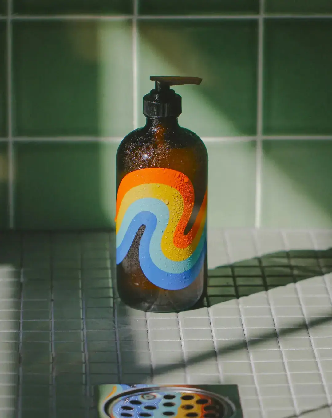
Bathing Culture
Flowing rainbow bands on dark refillable glass