About this packaging
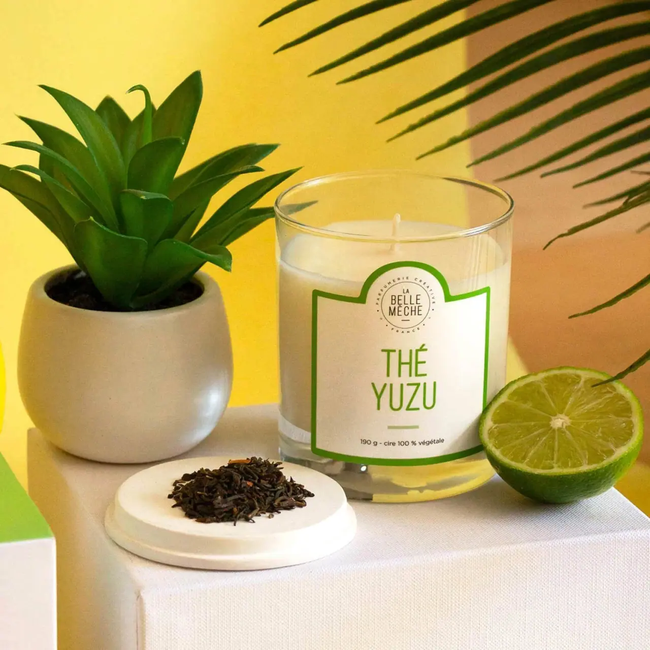
La Belle Mèche Thé Yuzu is shown in a clear straight-sided candle tumbler with white wax and a single wick. Green-bordered labeling and citrus-and-tea props make the fragrance variant recognizable while preserving the vessel as the main focal point.
The official page describes Thé Yuzu with bergamot and yuzu, tea and cardamom, then jasmine and musk. It lists a 50-hour burn time.[1]
Pack construction & use
- Vessel
- The official page lists 190 g and 100% soy wax; the cover shows a clear cylindrical tumbler with white wax.[1]
- Wick
- The page specifies one lead-free cotton wick, also visible in the cover.[1]
- Label
- A large white label with green outline includes brand seal, Thé Yuzu name and 190 g callout.Observed in the reference photograph
What makes the design work
Editorial analysis of this packaging reference.
Scent name as hero
Thé Yuzu takes the largest label space, supported by a small brand medallion above and weight line below. This lets a shopper identify the scent quickly among a candle range.
A simple color code
Green lettering and border stand out against the white wax and clear vessel. The lime slice and tea leaves reinforce the name in photography without being printed into the label artwork.
Transparent display
The clear tumbler exposes the pale candle fill and unlit wick, while the shaped white label defines the front. Citrus and tea props reinforce the scent name without becoming part of the printed artwork.
Ideas for your next brief
- Make scent names the dominant variable on a consistent candle-vessel format.
- Use small, controlled botanical or ingredient props to clarify a fragrance without crowding front-panel graphics.
Sources & further reading
Researched 19 October 2026