About this packaging
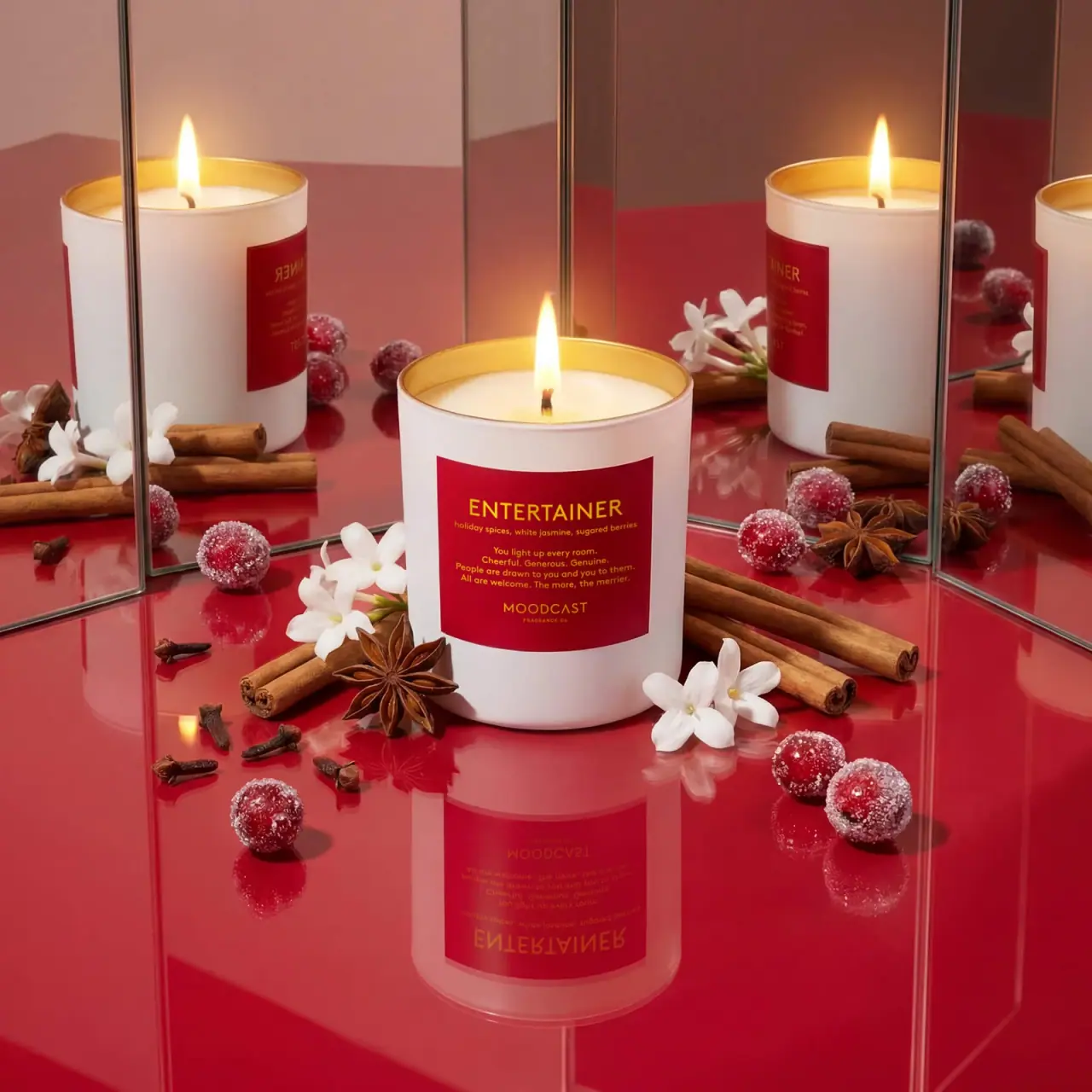
Moodcast Entertainer pairs an opaque white candle vessel with a dark red label and yellow lettering. The mirrored campaign scene repeats the candle around a centered view of its label.
Moodcast describes Entertainer with holiday spices, white jasmine, and sugared berries.[1]
Pack construction & use
- Vessel / label
- The cover shows an opaque white cylindrical jar with a dark red rectangular label and yellow lettering.Observed in the reference photograph
- Wax / wick
- Moodcast lists an 8 oz / 227 g fill, a coconut wax blend, and a natural cotton wick.[1]
What makes the design work
Editorial analysis of this packaging reference.
Label contrast
The red panel stands out clearly on the white vessel, while yellow lettering continues the warm festive palette. The scent name is the largest line, and note information sits immediately beneath it.
Mirrored repetition
Vertical mirrors duplicate the jar and props around a single central candle. This makes the label appear repeatedly without changing the vessel design, using the campaign environment to create abundance.
Notes staged as ingredients
Cinnamon sticks, star anise, berries and white blossoms visually echo the scent list on the product page. The props are arranged around the jar rather than across its label, preserving readability.
Ideas for your next brief
- Place scent name and note details inside a contrasting label block so a white candle vessel remains easy to identify.
- Stage ingredient cues around the front panel, keeping the label unobstructed even in a layered seasonal image.
Sources & further reading
Researched 19 October 2026