About this packaging
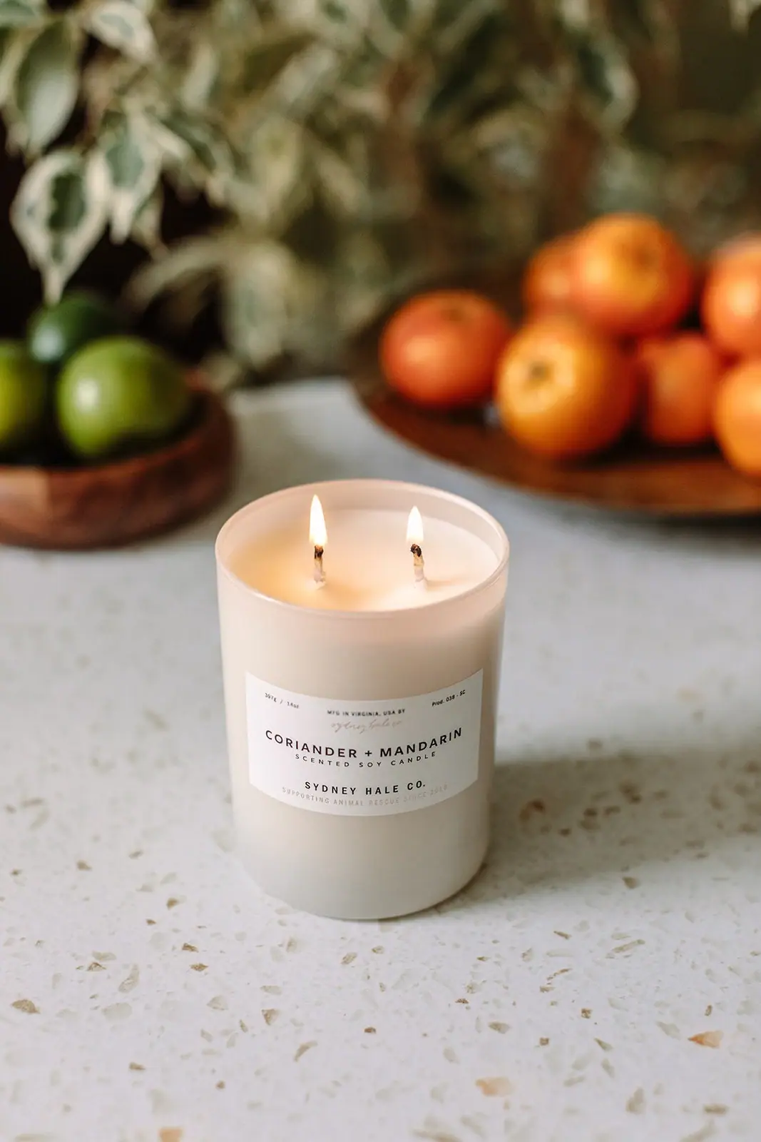
Sydney Hale’s Coriander + Mandarin candle is a pale cylindrical tumbler with a centered white label and two visible wicks. The selected image places it in a kitchen-like setting with citrus and greenery, translating the fragrance name through restrained props rather than printed illustration.
Sydney Hale lists the candle as a 14 oz tumbler with a 50-hour burn time, premium soy wax blend and double cotton wick. Its fragrance description combines coriander, mandarin, peach and iris notes.[1]
Pack construction & use
- Vessel and fill
- The official page lists a 14 oz tumbler and a premium soy wax blend. The cover shows a pale opaque vessel with two wicks.[1]
- Label
- A centered paper-like white label carries the scent name, candle type and Sydney Hale Co. wordmark in a clear hierarchy.Observed in the reference photograph
- Wick configuration
- The product page specifies two cotton wicks, both visible in the cover.[1]
What makes the design work
Editorial analysis of this packaging reference.
Scent identification first
Coriander + Mandarin occupies the strongest label position, with “scented soy candle” clarifying product type below. The maker signature follows in smaller text, so fragrance variant is easy to identify on a shelf.
Double-wick ritual
Two lit wicks sit across the broad tumbler, making the burn configuration visible in the product image.
Subtle contextual props
Soft-focus citrus and greenery reference the fragrance without overwhelming the calm white vessel. The blurred background keeps attention on the readable scent label while helping the product feel at home in a domestic setting.
Ideas for your next brief
- Give scent names more label prominence than generic candle descriptors when variants are the primary choice.
- Show the wick arrangement clearly in lifestyle imagery when it is a defining feature of the burn experience.
Sources & further reading
Researched 19 October 2026